In tune with the times
This 1970s apartment was given a contemporary face-lift, yet retains many of the charms so indicative of its era
If ever a decade could be defined by its style, surely it's the 1970s. Swirling patterned wallpaper to match brown and orange color schemes and the sunken conversation pit were prominent features in interior design back then.
Maybe it's time to reconsider those swirls and snugs to view them not so much as outrageous ideas but rather as an acquired taste.
When Roy Teo, creative partner of Kri:eit Associates, refurbished this apartment, he chose to update rather than obliterate all its 1970s features.
"There are some fabulous aspects about this apartment, such as its circular shape, which offers 360° views of the city below. This proved to be its most interesting and challenging aspect," he says.
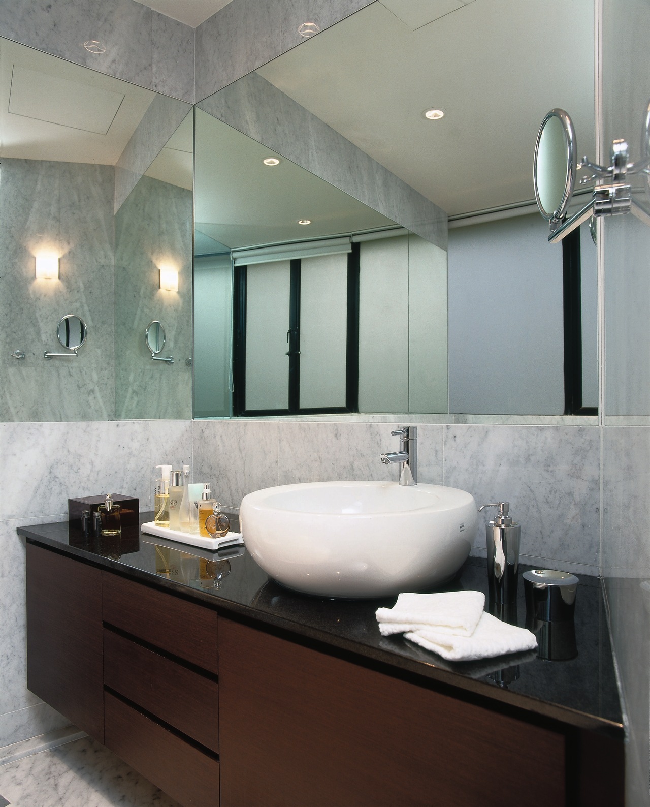
Mirrors in the living room and master bedroom were installed to create the impression of a continuous view, and to enlarge the sense of space.
The apartment's original parquet flooring was retained, with carpet rugs used to define individual zones and to provide warmth.
In the home theater room, the floor was stained black to match a wall covered in speaker fabric.
The wall conceals a storage unit. Next to the plasma screen is a transparent glass display unit, accessible from both the living and home theater rooms.
A predominantly brown color scheme, reminiscent of the 1970s, provides a neutral backdrop for the owners' collection of Asian artifacts.
In the kitchen, various light settings have been installed to ensure a flexible space.
"The kitchen cabinets have rice-paper screens, which produce a soft glow under the pedant lights when entertaining. Yet there is plenty of powerful lighting above the work spaces for meal preparation," Teo says.
The dining area is the center of the home; the place the family gather at the end of the day. The circular dining table rests on a marble platform inset into the parquet flooring.
The platform covers the conversation pit that was part of the original interior. Before the remodel, there were steps leading down to a small circular area that housed a curved sofa and a television set.
"In contrast to the sunken pit, the new dining area appears to sit slightly above the rest of the living area. The appearance of height is enhanced by the tall dining chairs," says Teo.
As the dining area can be seen from the front entrance, a curtain of aluminum chains shields it from direct view.
The hall leading from the entrance to the living area is highlighted by gray carpet with a white stripe on one edge.
"A corridor is sometimes made to appear shorter because it is considered a wasted space. But we wanted to emphasize the length of this hallway as a linear feature in a circular apartment," Teo says.
Another signature of 1970s design was boxy rooms, and this was especially the case with the bedrooms, says Teo.
To make both the master bedroom and its bathroom suite appear larger, a clear glass wall divides the two rooms.
"Being able to see through from the bedroom to the bathroom creates a feeling of intimacy," Teo says.
White marble throughout the bathroom emphasizes a sense of space and ensures continuity with the kitchen and dining areas.
In the teenager's bedroom, a bold purple feature wall and a metallic headboard contrast with the sheer white curtains.
Credit list
Kri
Refrigerator
Kitchen oven, cooktop, ventilation and microwave
Story by: Trendsideas
Home kitchen bathroom commercial design
Small space, big impact
Continuity meets subtle separation
'Worthy of Architectural Digest'


