How to choose the right paint colour, room by room
Ever been struck by paint paralysis? Anyone who’s been overwhelmed by choosing paint colours can tell you it’s a real thing.

Kitchens
The kitchen is where you will tend to spend a lot of time, especially if you are the main chef in your household. Make sure you are comfortable with your chosen colour scheme. Bright, invigorating colour schemes can boost energy levels when you have a lot of cooking and cleaning to get through. As kitchens are dominated by cabinetry, benches and the floor, treat these elements as the starting point for your colour scheme.
This kitchen is painted in Resene Buttery White with cabinets in Resene Washed Greenand a shelf in Resene Scandal.
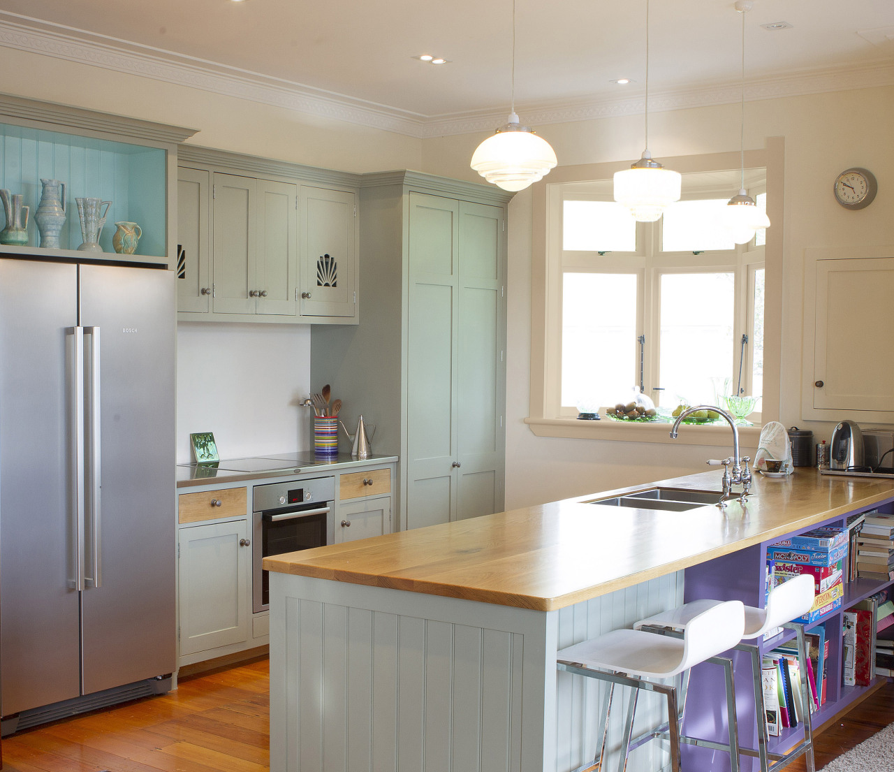
The appearance of colours in the kitchen will depend on the properties and textures of each of the surfaces. Glossy surfaces, such as laminated cabinetry, will reflect more light and look different to low sheen painted walls, so it is important to be careful when trying to match colours in different materials. Sometimes it is better to select a tone lighter or darker rather than trying to create an exact colour match. This kitchen was given a fresh, neutral palette of Resene Quarter Sea Fog on the walls and cabinets.

Bathrooms
Bathrooms are one of the smallest rooms in the house and are generally cluttered with towel rails, basins and showers/baths. While this can make them a decorator’s nightmare, it also means you can afford to be a little more courageous with colour. If your original colour choice doesn’t work, you can repaint a small bathroom quickly.
Avoid using too many colours if your bathroom feels small. Instead, paint a dado on the bottom third of each wall in your chosen colour and paint the remaining two-thirds in white. Blues and greens being tranquil and clean are popular choices for bathrooms. Being cool colours, they can also make a small bathroom appear more spacious – like this bathroom painted in Resene Hermitage (blue) and Resene Quarter Cararra.

Bedrooms
When selecting colours for bedrooms it is important to choose colours that are conducive to sleeping. You are also likely to spend more time looking at the ceiling than you would in other rooms.
As a general rule you should avoid using very bright colours and save them for other parts of your home. Most light and pastel shades are ideal for bedrooms. Blue is a popular colour choice for bedrooms because of its soothing qualities. However, if you have trouble getting up in the morning, you may wish to add an invigorating accent to get you out of bed.
This peaceful bedroom is painted in Resene Rascal (try Resene Half Rickshaw for another option), with the floor painted in Resene Unwind and bedside table in Resene Mozart.

Dining rooms
Separate dining rooms tend to be reserved for special occasions, so they are a good opportunity to experiment with colour that you might not be brave enough to use elsewhere. Red stimulates the appetite and is a good choice for dining rooms. Combined with gold cutlery, a dramatic air of formality will result. Midnight blue or aubergine and gold are also dramatic colour schemes for night-time dining. Remember, in any dining room the table will be the focal point.
This living room is painted in Resene Tana on the rear wall and Resene Half Perfect Taupe on the front wall. The floor is painted in Resene Soulmate, with a skirting in Resene Quarter Merino, coat stand in Resene Hot Toddy and chair in Resene Tussock.

Family Rooms
Family rooms call for a tough durable finish that can take the inevitable wear and tear. Families tend to spend a lot of time in this part of the home, so a bright uplifting colour scheme is recommended. Use one or two dominant colours and add accents for interest. Choose mid tone colours that will minimise the appearance of finger marks, animal fur and general light scuffing. Avoid using very dark or very light colours. Use patterned curtains and furnishing fabric in place of plain fabrics.
This blue and beautiful family room is painted in Resene Marathon (try Resene Wavelength for another option) on the left wall and Resene Awash on the right wall, with the stairwell painted in Resene Alabaster.

Living rooms
Today’s living rooms are often open spaces that link through to dining and kitchen areas. Knowing where to start and finish the colour scheme between each part of an open plan space can be very difficult. There are two techniques that you can use: 1) Paint a feature area in an area between the two adjoining rooms or spaces to create a natural colour break, or 2) Use a progression of colours, then paint a unifying colour throughout the spaces and accent with the other progressional colours.
This living room has been painted in Resene Escape (front wall) and Resene Zinzan (rear wall; try Resene Bunting for another option). The floor is finished in Resene Colorwood Rock Salt wood stain. The shelf unit is painted in Resene Soapstone with a door in Resene She’ll Be Right and feature shelf in Resene Hope. The coffee table is painted in Resene Zinzan.
Living rooms are the ideal place to create focal points or feature areas. Traditionally fireplaces acted as the focal point of most living rooms. If you don’t have a fireplace, select a focal point for your room and decorate around that. The focal point may be a feature area, lounge suite or similar. As living rooms are usually subject to less wear and tear than family rooms, you can choose light and dark colours if desired. Remember no matter what room you are painting artificial lighting can be used very successfully to complement your colour scheme and it is worth reviewing your lighting plan prior to painting.
For this living room, walls have been painted in Resene Rascal (try Resene Half Rickshaw for another option), the floor us in Resene Quarter Sandspit Brown, the sideboard is in Resene Gumboot and the shelf is in Resene Half Biscotti. The side tables have been painted in Resene Dusted Blue and Resene Spanish White.
Hallways and entrances
First impressions count! As hallways and entrances are transition areas and you spend only a short amount of time in them, you can usually afford to be a little more adventurous. Ideally hallways should be treated as linking spaces to help give continuity to your interior colour scheme.
To make a long hall look shorter, paint the end wall a vibrant warm shade. To make a hallway look longer, paint the end wall a light cool colour. Colour can provide a bridge between adjoining areas. It can be difficult to change colour when adjoining spaces are viewed together, so a feature area of colour may be a good way to create a natural colour break. When visualising a hallway or entrance colour scheme, leave the doors of adjoining rooms open so that you can see how the hallway will work as the focal point.
An entranceway has been given interest with walls in Resene Gull Grey, door in Resene Daredevil, bench seat in Resene Sunflower and floor pattern in Resene Gull Grey and Resene Cod Grey.

Story by: Sharon Newey, Habitat
Photography by: Resene
Home kitchen bathroom commercial design