Homely, inviting – and lived in
A renovation is a chance to go all shiny and new, but this kitchen makeover creates a warm vibe with a lived-in feel – balanced with touches of modernity
Designed by Candice Stanley, Mooi Design
From the designer:
The setting
This renovation has been a huge labour of love.
Over 18 months ago, Mooi Design started designing this home in conjunction with our homeowner.
Our owner’s vision was for a renovation sympathetic to the era of the home while including modern touches fit for a young family.
The design direction embraced a ‘transitional’ feel, which offered the opportunity to create an interior which many new homes don’t enjoy – the ability for a home to feel homely, inviting, warm and lived it.
Every aspect of the interior has been selected to ensure durability for family living, cohesion with the design theme and longevity both in terms of material selection and design elements.
The kitchen
The kitchen was planned and designed to incorporate a number of function spaces into a small area – kitchen, scullery and laundry.
Every inch of this design has been considered to maximise storage without compromising design.
The kitchen has been inspired by English design but with modern functionality and materials.
Originally, the design was created without a slope in the ceiling – however during construction, we opted to increase the ceiling height which resulted in a slope to the right-hand side of the design.
The ceiling line continues to fall in the scullery, following the line of the roof.
Careful planning around cabinetry, cornice details and scullery door heights all needed to be considered to create a design that felt cohesive, despite the various ceiling heights.
These are just some of the challenges of working on a renovation and despite what plans may say, everything can change when demolition begins!
Heart of the home
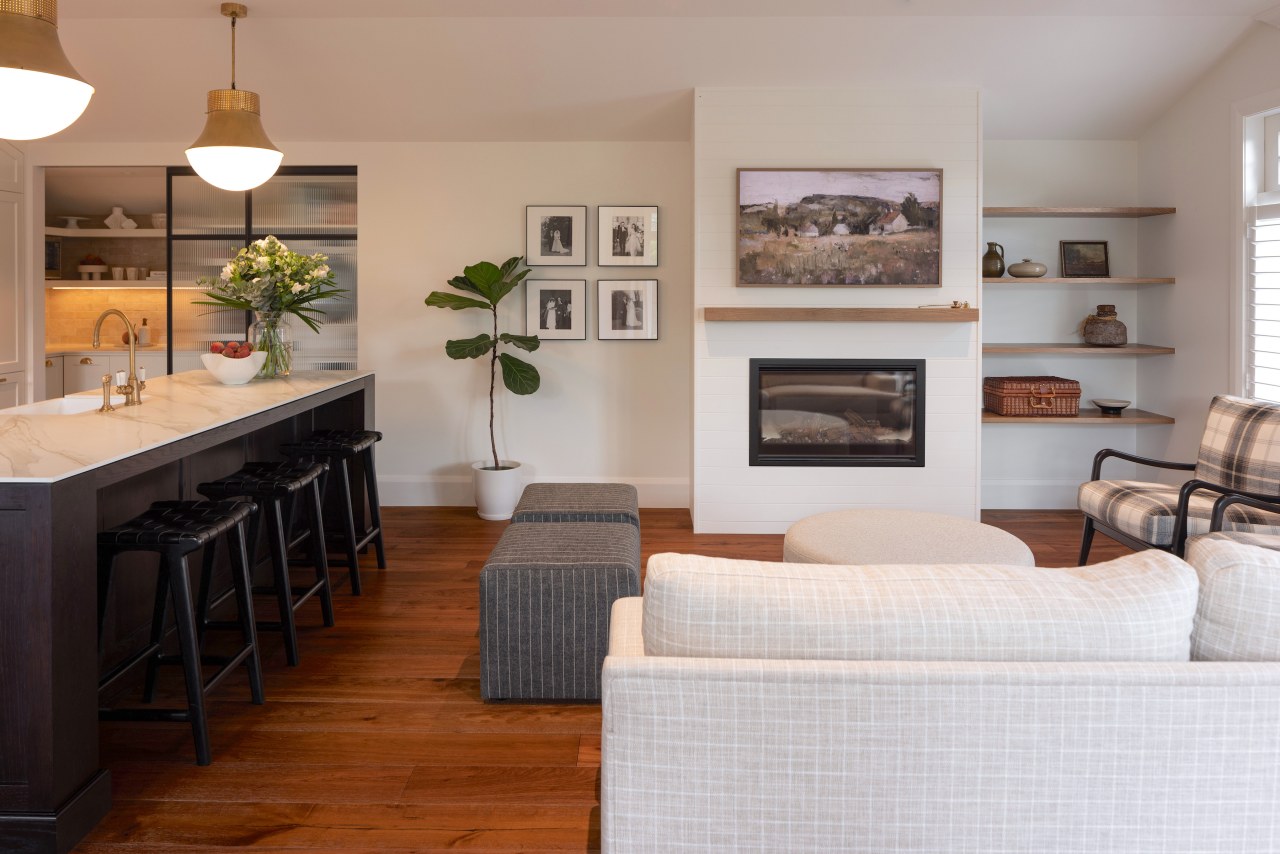
This kitchen is the heart of a family home – it’s the hub in which everyone congregates.
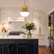
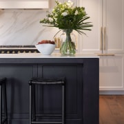
We designed a feature island crafted in solid American white oak and with shaker style panelling to be a focal point within the home.
A dark chocolate stain was selected, both to give the island dominance and to let it contrast with the rest of the cabinetry.
Along with the oak cabinetry, we also selected a lacquered finish to the back bench and scullery cabinetry.
Resene Half Wheatfield is a bleached bone white which provides the kitchen with warmth while complementing the subtle warm tones and textures in the home.
We selected a 30% gloss level to provide a surface that was easy to wipe and would be functional for the family.
Brass tapware – aging in place
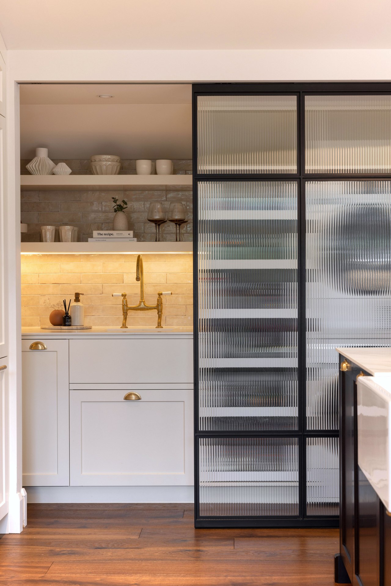
We selected unlacquered brass for all the metal work in the kitchen so that it could age and patina over time – enhancing the ‘lived in’ feel.
All kitchen hardware and tapware will age with the design and is fitting for this era of home.
The island includes a large butler style sink, with a smaller sink in the scullery/laundry made from white granite.
Lacanche centrepiece
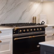
The Lacanche Range is a beautiful work of art and the design of this kitchen was centred around the range.
We opted for black to create a statement that also supports the ‘modern’ touch’s theme we embraced through this design.
The feature rangehood was custom made by Modern Age Joinery and is another focal point – its soft curve adds dimension to the design while the subtle beading detail adds a touch of elegance.
Character connecting door
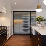
The black steel framed reeded glass scullery/laundry door also embraces this theme.
We decided to incorporate the steel door design to enclose the scullery/laundry to allow light to still filter into the space which otherwise has no natural light.
Reeded glass was selected to obscure storage behind the door, which allows the kitchen to feel uncluttered when the door is shut.
The cross-hatch design detail adds interest and helps to break up the glass screen.
The look of marble – without the downfalls
Again, embracing the modern touches brief, we selected a 12mm Neolith Calacatta Gold benchtop and splashback.
Neolith provides the look of a marble top without the downfalls of a natural stone.
We opted for an undulating subway tile for the scullery which offers textures to the space due to the uneven, handmade look to the tiles.
Floating shelves were selected for the scullery to provide an area to display items such as coffee cups, wine glasses and help the space feel more spacious due to the ceiling slope.
The owner played a huge role in the direction of this design, and we were fortunate enough to be part of the team that was able to deliver a timeless, elegant and much loved family home.
Credit list
Home kitchen bathroom commercial design


