HARD DAY'S NIGHT
The brief for the refit of this subterranean venue in Sydney was clear: create a look that could support its triple role as lunch-time bistro, evening bar and nightclub


Designing a night club requires one aesthetic, with dark colours and edgy features a clear starting point. A bar needs another look, while a lunchtime bistro aimed at the corporate crowd demands yet another. Multi-purpose entertainment refits are not unusual, but they do require careful consideration if they are to meet disparate needs.
The owner of this venue, the Hunter Bar in Sydney's CBD, was looking for an interior design refit that would appeal to all three markets. The re-design needed to attract new custom without alienating the old; it had to withstand the rigours of heavy traffic, and above all, it had to be something of a design chameleon, says interior designer Greg Natale.
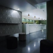
"The redesigned space had to be bright enough for people to enjoy a lunchtime meal, but capable of morphing into a bar and then into a nightclub," he says. "The bar had good bones, and the flow of traffic was working well, but it had been fitted out eight years ago and the brown and aubergine decor was looking tired and dated. This is a subterranean environment, with low ceilings and no natural light, and any refit solution needed to combat this."
Key to the design route chosen by Natale and his colleague, Stacey Pappas, is black and white print wallpaper, which introduces drama and visual interest. A geometric print wallpaper clads the wall adjacent to the main bar, and a similar print by US designer Kelly Wearstler covers the ottomans in the bar's seating area. A complementary organic print wallpaper clads the smaller bar at the entrance to the club, where the bar's curved edges suit the softer look.
"The immediate effect is to lift the space during the day, while providing a more edgy atmosphere at night, when the bar becomes a club," says Natale. "The geometric print has a mesmerising quality, which detracts from the venue's low ceilings. The patterns will also disguise wear and tear over the lifetime of the refit."
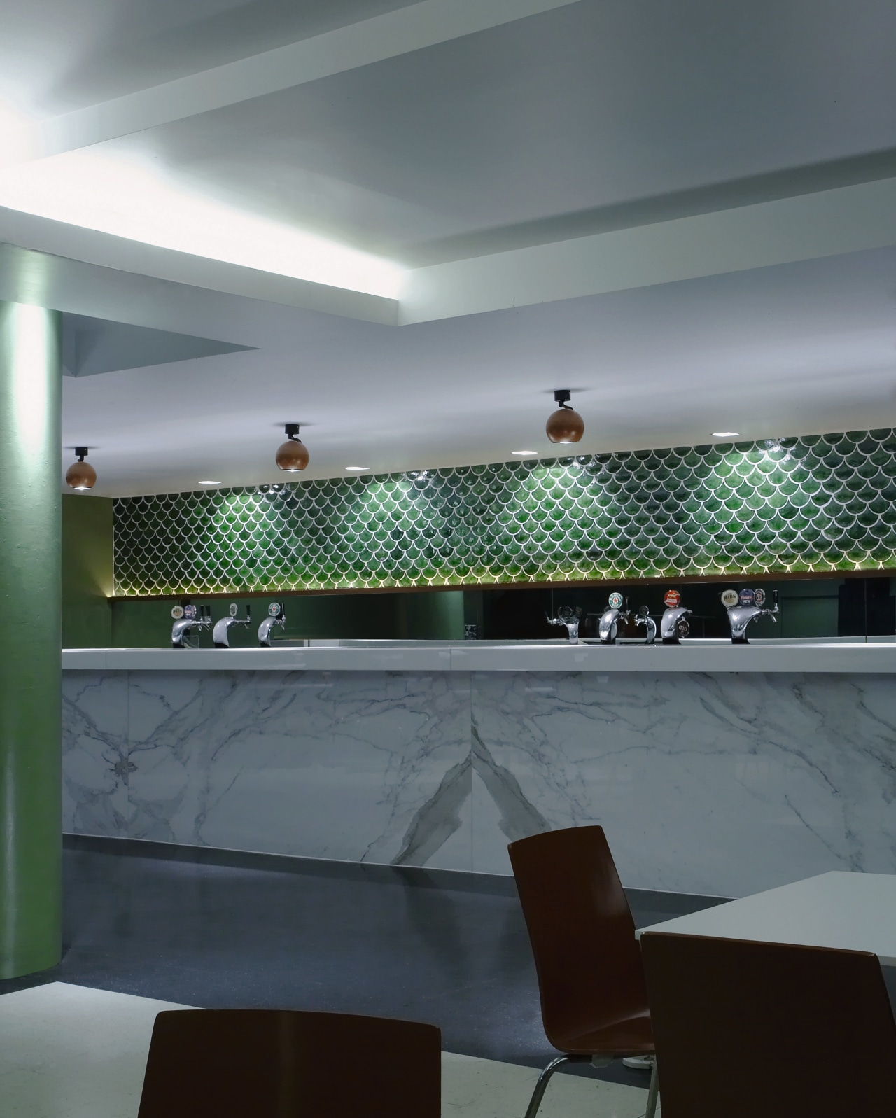
Green was selected for the feature walls, for the fish-scale tiling behind the main bar, and in a darker hue for the gaming room leading from the circular bar at the entrance.
"We chose green as it's the colour of nature," says Pappas. "We decided to use a darker green for the walls of the gaming room, as the room needed to feel disconnected from the rest of the venue."
The bar's name and signage remained unchanged, so some original elements were incorporated and updated to link the old and new identities. The terrazzo flooring was ground back and re-polished, and a curved copper wall along the entrance stairs was retained. Copper has been carried through as a key material in the refit, with new copper ball lighting and original bistro chairs sprayed with copper paint.

Much of the project's budget was allocated to custom designing the main bar, which features handmade tiles in a fish-scale pattern, and a veined Calacatta marble facade.
"The Calacatta marble used for the facing panel introduces interest and pattern in the same way as the wallpaper does. We placed the marble where it will avoid the heavy bar traffic, and chose hard-wearing CaesarStone for the bar top," says Natale.
Since there is no natural light in the venue, all lighting is artificial. A centrally controlled system allows light levels to fall steadily as day moves into night.
Story by: Trendsideas
Home kitchen bathroom commercial design
