flight of fancy
Looking much like a giant sculpture from both inside and out, the dramatic new Terminal 3 at Shenzhen Bao'An International Airport puts traveller comfort first
Situated close to Hong Kong and one of the fastest growing cities in the world, Shenzhen is an important industrial centre and an increasingly popular tourist destination. However, with growth comes a strain on existing infrastructure and resources and despite the city's airport already being the fourth-largest in China, this vital transport hub required a considerable boost in facilities.
The dramatic new Terminal 3 at Shenzhen Bao'an International Airport was designed by Massimiliano and Doriana Fuksas Architects. The tender for the building was won by global competition and despite its size it is the largest public building in the city and intricate design, the terminal was completed in three years.
The 1.5k-long, 500,000m² terminal encompasses 63 contact gates, 15 remote gates and retail space. Terminal 3 will increase the capacity of the airport by 58%, with up to 45 million passengers expected to flow through its doors every year.
Massimiliano and Doriana Fuksas describe the thinking behind the enormous public terminal's sculptural design.
"An airport is like a city nowadays. If you design an airport, now you have to throw away all that was there before and rethink completely the whole concept of airport and its system. Our client, Shenzhen Airport (Group) Company, told us: Create an airport and do it thinking about the people that are inside. A place where you can feel fine even if the plane is delayed.' That was the biggest challenge."
Large projects such as this need to be macro structures that bring quality to people's daily lives, Massimiliano and Doriana Fuksas say.
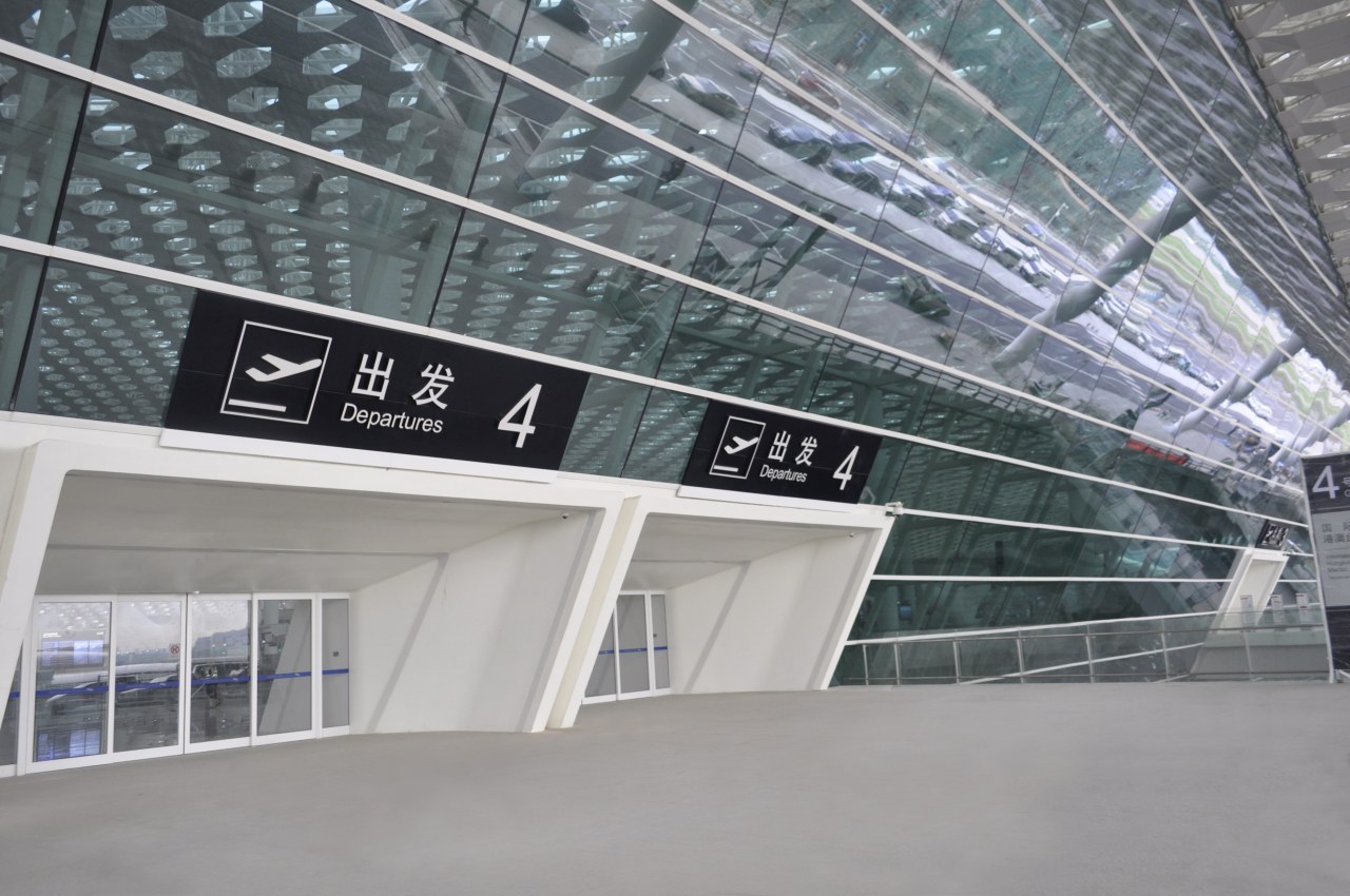
"This design supports and optimises the travel experience in function and looks. We imagined the terminal as being like a living fish a manta ray that breathes, flexes and varies, taking in and releasing light, filtering it inside.
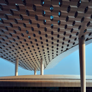
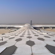
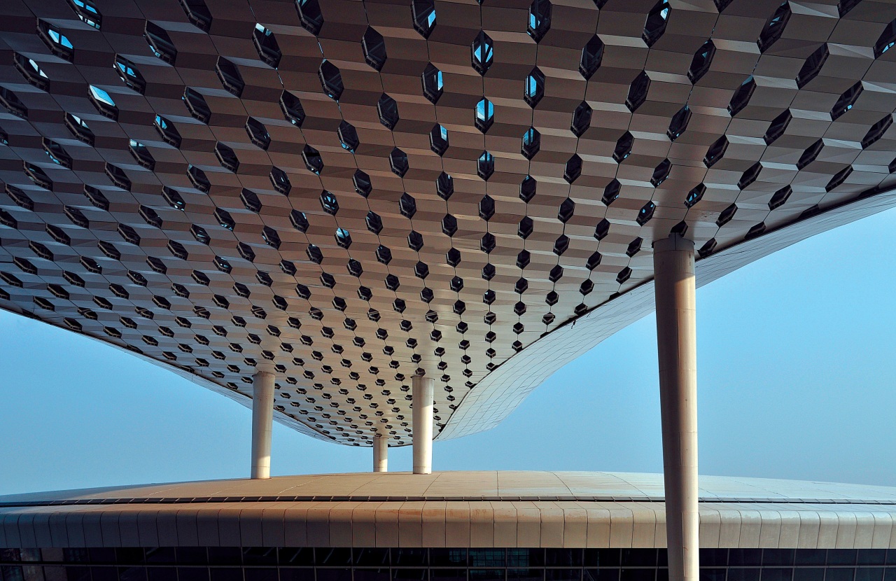
"To achieve diffuse light and minimise the need for internal supporting columns or pillars, we designed a double exterior-interior skin using an aluminium and glass honeycomb structure. The double layers of the skin' allow natural light in, creating attractive effects within the internal spaces. The cladding is made of alveolus-shaped metal and glass panels of different sizes that can be partially opened. The undulating roof has variations in height that allude to the surrounding landscape. It was specifically designed to have spatial qualities, not just lie flat.
"The design appears less three-dimensional as you rise, and more articulated near the ground."
The outer facade protects the building against rain and has a high reflection ratio of direct sun radiation. It is constructed as single glass windows with imprints, and without insulation on the opaque parts. Insulation and double-glazed windows are on the inner facade. The outer and inner windows are placed in such a way that direct sun coming into the building is reduced to a maximum of 20% of the total glass surface.
Sandwiched between the skins of the facade, there is a complex structure that minimises energy consumption and emissions, the architects say.
The construction space between the inner and outer facade is used as an exhaust air plenum, creating an air stream that expels the heat gain. Water pipes on the upper side of the insulated opaque panels of the inner facade further prevent heat transfer by absorbing the sun's radiation.
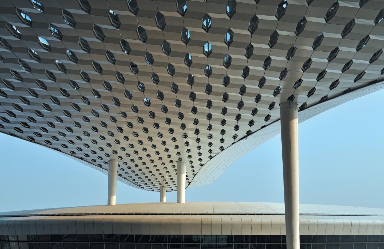
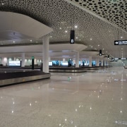
The interiors of Terminal 3 are just as dramatic as the exterior travellers may well feel they are inside the belly of a giant fish. The focal point is the concourse located at the intersection of the two principle forms. This consists of three levels departure, arrivals and services all vertically connected to create full-height voids that let natural light filter from the highest level down to the lowest.
This multifloor solid structure is constructed with reinforced concrete slabs and down-stand beams. It is supported by columns based on an 18m grid in public spaces, for a spacious, airy feel, and a 9m grid in non-public spaces. Cantilevered columns around the terminal concourse perimeter support the steel roof structure.
For travellers, the terminal has a spatial fluidity. Responding to the request for an environment that is enjoyable to engage with, the interiors reflect the idea of movement and the idea of pause. Carefully assessing the human experience of large-scale environments, the architects focused on process times, walking distances, ease of orientation, crowding, and the availability of desired amenities. And of course travellers enjoy the appearance of the terminal as they move around in it.
Among the many dramatic visual features are the white trees' that serve as air conditioning vents.These sculptural elements are dotted all along the terminal and the concourse, continuing the theme of amorphous forms inspired by nature.
And the airy, patterned ceiling that arches above passengers can also be seen when they look down. The check-in islands', gates and passport-check area all have a stainless steel finish that perfectly reflects the honeycomb lattice overhead. And the highly polished floor offers similar reflections.
"Reactions to Terminal 3 have been extremely positive," say the architects. "In fact, the client is so pleased with the design that it is taking the unusual step of pursuing copyright on it."
Story by: Trendsideas
Home kitchen bathroom commercial design
