Flat out transformation
A small basic house previously divided into two small flats is totally transformed into a contemporary inner-city townhouse
Designed by Karsten Architectural Design
From the designer:
Project Description
This small basic house, in central Nelson, has been totally transformed into a contemporary inner-city townhouse. The house was previously divided into two small flats, one upstairs and one downstairs.
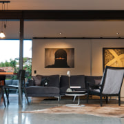
All internal walls were removed, from the lower floor, to create an open plan living space.
A steel beam replaced the load bearing wall and was left exposed to show the structure.
The existing concrete roof tiles were replaced with corrugated Colorsteel, and a new room was added to the back side of the lower floor.

Design Features and Creative Solutions
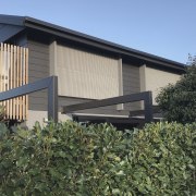
The house is located on a busy street, and privacy was desired, hence the top floor two new large windows that are screened by fibreglass mesh, which is commonly used to build walkways on commercial fishing boats in Nelson's harbour. This creates a stealth profile from the street and introduces some square contemporary forms to the exterior of the home.
The steel pergola on the front of the house also creates a clean contemporary form to the exterior and grounds what is otherwise a large two storey wall.
A new fence with rendered exposed concrete plaster, over concrete blocks housing a planter, was built in compliance with Nelson City Council rules to create a private courtyard on the sunny side of the house. Sliding doors open the living space to courtyards on both sides.
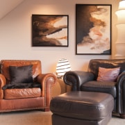
The client has a large art collection and the surfaces and structure were kept neutral to enhance the art and furniture.
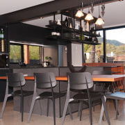
The kitchen is immaculate. Cupboard doors on the face of the breakfast bar have a Laminam tile, which was chosen because of its texture. All surfaces are a matt finish including the honed granite benchtop.
Careful consideration has gone into the textures of the interior finishes.
The existing concrete slab floor was exposed and sanded. Existing Hardie weatherboards to the upper exterior remained and were painted, and the lower exterior was finished with Exotec panels.
The neutral and subtle combination of colours and textures is the feature of this very tasteful home.
Project Summary
Teamwork was the key for this project on which we worked closely with interior designer and owner Ana Stevenson through the project.
Story by: Trendsideas
Photography by: Mark Turner
Home kitchen bathroom commercial design
Tranquil waters
Continuity meets subtle separation
'Worthy of Architectural Digest'
Windows & Doors
From garage doors to French doors to interior doors, choosing the right option isn't an open and shut case. Are wood doo...
Read More


