fIT FOR A GENERATION


Every city has one. It's the part of town on the CBD's doorstep that your mother told you not to visit after dark ... and therefore whose charms generally a dizzying mix of fashion boutiques, adult entertainment and live music venues made it irresistible. As a residential area however, you could be forgiven for thinking that this slice of Bohemia had little going for it apart from its location, even for the tastes of Generation Y. But in the right context, location is everything.
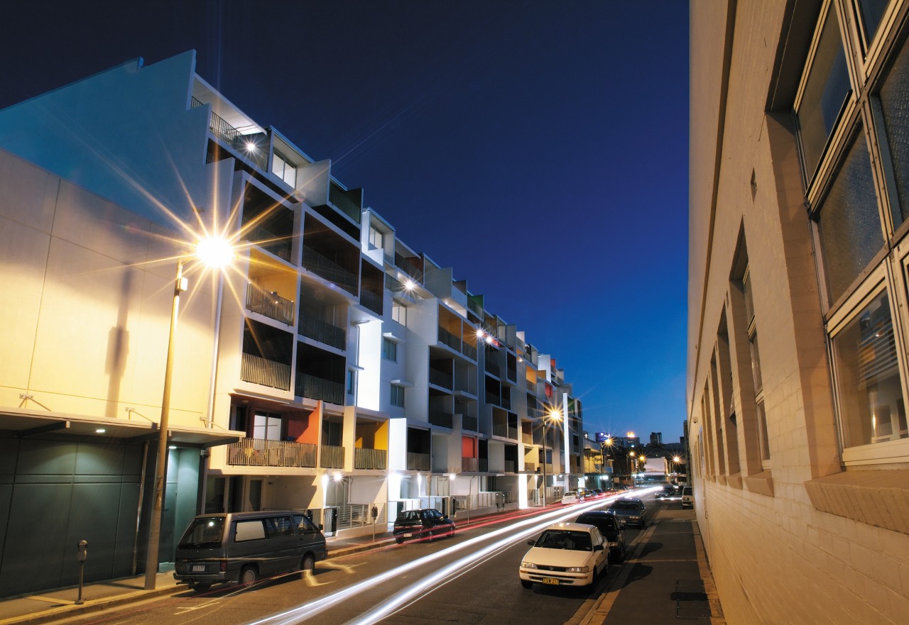
The V Human Space apartment block, designed by Bligh Voller Nield (BVN), is located in just this kind of precinct, Fortitude Valley, only one stop away from Brisbane's central station. Aimed at the investor market, the intention is that the apartments will appeal to tenants in the 18-35 age bracket. For this generation of hard-living young professionals, a funky apartment within stumbling distance of the clubs and one train stop from the office is the ultimate in both fashion and convenience.
Principal architect at BVN, Shane Thompson, says the landmark design has a raw, almost industrial quality that suits its location.
"While it is very different to the heritage and warehouse buildings in the area, it is designed to take its place within this grungy fashion and entertainment precinct," he says.
"Market research conducted by our client told us that people in the target demographic find a lot of apartment buildings quite dull," says Thompson. "They want to live in a building that feels like it was created for their generation. They want buildings that are real works of architecture, which relate to their fashion sensibilities."

BVN's design was primarily informed by the shape of the site. The long, narrow stretch of land necessitated a simple, double-loaded corridor with half the apartments looking onto the street, and half looking over the commercial buildings at the rear.
The floor plan changes from one level to another the smaller studio and one-bedroom apartments are on the lower floors and the two-bedroom apartments on the upper floors. Since the concrete shell of each apartment is clearly expressed on the exterior, the facade has considerably more relief than the traditional flat grid of concrete boxes.
This brutalist style is reminiscent of Corbusier's Unite d'Habitation in Marseille, which also features brightly-painted balconies within the frame of a concrete building, says Thompson.
"However, it is unusual for a building such as the V Human Space apartments, which was built on a relatively small budget, to have such a strong, sculptural impact," he says.
As a sculptural element, the building reveals itself to the viewer gradually. The street it sits on is quite narrow, meaning it is difficult to stand back and view the design in its entirety. Approaching from an oblique angle, the viewer slowly becomes aware of the colours within the balconies.

"We did consider using pastel or earth colours," says Thompson. "But the bright colours suit the warm, subtropical climate. Using bright paint on the inside of the balconies means the colours receive less exposure to sunlight and suffer less fading."
The use of white on the external surfaces unifies the otherwise eclectic collection of rainbow colours. The white external frames around each coloured balcony keep the colours separate and prevent one from directly bordering another and clashing.
"We've found that these bright colours also work well at night, when the balconies are lit," says Thompson. "The effect is of many glowing boxes of saturated colour, floating within a white frame."
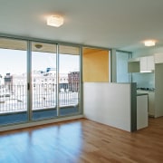
Internally, the kitchens and bathrooms have been very simply but effectively fitted out. BVN's aim, in keeping with the client's brief, was to keep the cost of each apartment down. Polished concrete ceilings, stark white walls and galvanised steel finishes keep the feeling clean and bright with an industrial edge.
Story by: Trendsideas
Home kitchen bathroom commercial design
