Firm but fair
This feminine office fit-out is designed for a company providing financial services for women. While the services are empowering, the decor gives a softer impression

Designing the interiors for a new kind of office calls for a new set of aesthetic values. One approach is to reinterpret classic themes to create a fresh design vocabulary.
This inner-city office is home to Superwoman, a company offering financial services that cater specifically for women. Interior designer Greg Natale has reflected Superwoman's niche business ethos in the design and material finishes for the open-plan space.
"While Superwoman is a corporate identity, I wanted the office design to take a different direction to classic office fit-outs one that would provide the business edge but also make female clients feel instantly at home," says Natale. "A central element of this office project is introducing reinvented residential elements in commercial-grade materials and finishes the resulting effect is both eye-catching and relaxing."
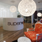
Entering the offices, the reception counter is directly ahead. While this might have been separated from the offices behind by a glass wall in a more traditional fit-out, here Natale has backdropped the curved counter with flowing diaphanous curtaining.

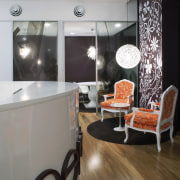
Flanking the counter to left and right are rubber plants, more usually found in domestic conservatories and hallways. Just inside the front door are waiting areas, with intimate groupings of chairs and tables. The look is warm and inviting.
"There's a decidedly feminine aesthetic at the reception, but it comes with a corporate twist," says Natale. "Louis chairs may look the picture of domestic comfort, but here they are upholstered in tough commercial Tord Boontje fabric from Kvadrat Maharam," he says. "On the walls behind, flowery wall elements are actually tough vinyl decals, also by Tord Boontje."
The tones of the orange chairs and aubergine wall decals also reflect Superwoman's corporate colours. Six consultation rooms, set off to both sides of the space, feature life-size decals depicting images that are also part of the Superwoman corporate profile.
The softened aesthetic does not stop at the reception area. The curtain behind the reception desk is repeated a few metres back, with the space between designed as a play area for clients' children.
Beyond the layers of curtaining and the play area, the open-plan Superwoman offices feature workstation dividers in the same tactile orange felt material as the Louis chairs in the reception area.
"Lighting was an important part of the design," says the designer. "In the reception, domestic lights are set low over the groups of tables and chairs, creating an intimate and welcoming atmosphere.
"However, in the office area commercial task lighting follows the lines of the workstations below. The fittings are set low to create a localised sense of operation."
Overall, the design weaves a gentler style with work efficiency both clients and staff feel at home.
Credit list
Designer
Flooring
Paints
Reception tables
Office chairs
Lighting
Signage
Construction
Wallcoverings
Reception chairs
Office furniture
Additional furniture
Drapes
Story by: Charles Moxham
Home kitchen bathroom commercial design


