Exercising restraint
A simple design, and limited colors and materials allow this kitchen to form part of a larger living space without dominating it

Adding a new kitchen to a traditional house brings up the age-old dilemma of whether to stay with the original style or strike out and create something new and modern.
The owners of this house wanted to add a new wing to their 1930s bungalow, and the kitchen was to be the transition space between the original house and the addition. As they entertain a lot, and wanted their home to be the center of regular family get-togethers, the owners asked kitchen designer Matthew Rao to create a kitchen that would work well for their immediate family, and for larger groups.
"The owners and architect Gregory Walker had decided this space would be where the two styles meet," says Rao. "My challenge was to integrate the kitchen functionally, aesthetically and practically with the adjoining living space, and to create a bridge between the traditional spaces in the existing house and the modern elements of the addition.
"To do this, the new kitchen had to be understated, simple and restrained, and without too many extra details."
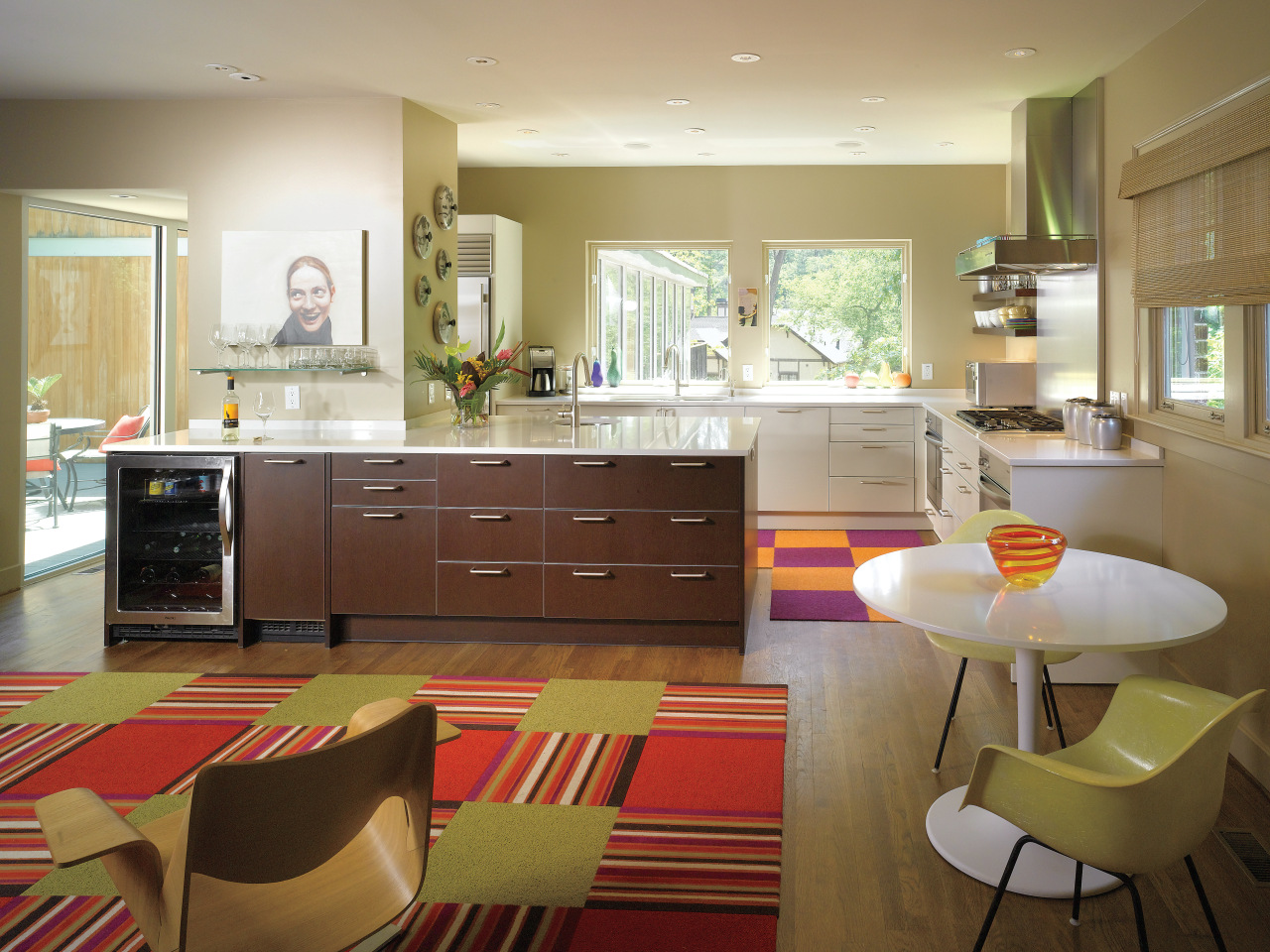
The design avoids elements such as overhead cabinetry and tall units that indicate the room's purpose as a kitchen. These have been kept to a minimum only the pantry and refrigerator are housed in tall units. The pantry is concealed behind a specially built wall. This wall intersects with the island to create a small partition that provides some privacy for this part of the kitchen. The refrigerator, on the rear wall opposite the pantry, is hidden from the living space.
Instead of including traditional overhead cabinets for storage, china is displayed on cantilevered open shelves in the kitchen, and frequently used glassware is kept on the living room side of the wall containing the pantry.
To maintain the simple aesthetic, the designer suggested an off-white laminate for the main kitchen cabinetry, teaming it with white quartz countertops. To create a contrast, cabinetry on the island is finished in a dark wood laminate.
"The off-white color creates a light, airy, casual and modern feel, while the dark wood gives the island prominence. The island works as an anchor for the large space, and with its wood finish, presents a furniture-like appearance to the living room," Rao says.
To ensure the kitchen is set up for entertaining, it has two ovens, two dishwashers, a five-burner cooktop, an icemaker and beverage center.
As the owners often cook together, the kitchen had to be easy for both to use without getting in each other's way. The two ovens are separated by the cooktop. Two sinks, one under the window and a second on the island, provide two separate work spaces. In addition, the sink on the island can be accessed from either the kitchen or from the other side of the island, close to the wine chiller.
To further extend the convenience of the kitchen, the design incorporates a buffet with a warming drawer at the far end of the living space, close to the door into the formal dining room.
Color is introduced into the kitchen and living space with the Flor carpet tiles, which are joined together to form rugs purple and yellow in the kitchen, and red and green in the living area.
"Art and color bring the room to life," says Rao. "Knowing the owners had artwork and planned to have new, modern furniture allowed me to keep everything in the kitchen simple and restrained."
The owners say this kitchen and living space, close to the outdoor dining courtyard and formal dining room, is truly the heart of their home.
"Family and friends love to congregate here and the spaces flow naturally together," they say.
Story by: Trendsideas
Home kitchen bathroom commercial design


