dressed to impress
Clean lines and bright, open spaces form part of the design philosophy that ensures the new premises for respected global company Trafigura is all class
They say we shouldn't judge a book by its cover, but when you're one of the world's most successful commodities traders, presentation counts. Opinions are formed on first impressions, so the design and set-up of an office plays an important role in shaping the image of a company.
Trafigura, a leading international commodities trading and logistics company, wanted to apply this understanding to its new offices at Ocean Financial Centre in Singapore.
So when interior design firm Designphase DBA was asked to fit out the 28th and 29th floors, the brief was for a clean, sophisticated environment that would reflect its market position. Trafigura views both clients and staff as key to its success, says lead designer Derek MacKenzie but the company felt it was important to recognise that client and trading areas had different functions and shouldn't be blended. With this in mind, the firm conceived an aligning strategy that offered a clear distinction between the two spaces.
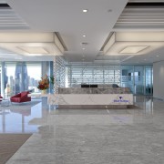
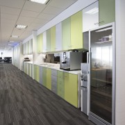
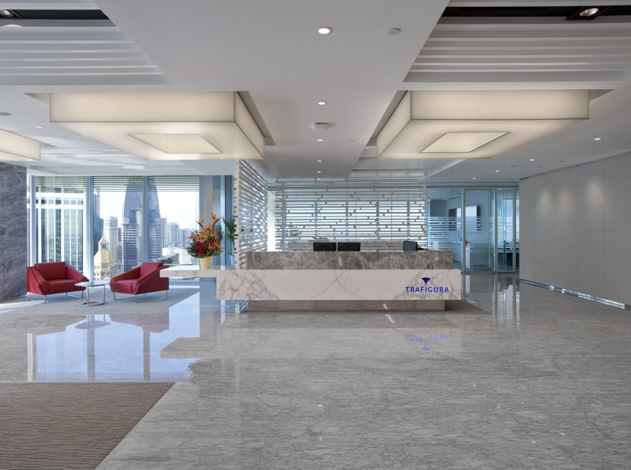
"We designed the client-facing areas to be elegant and elevated in status, with a simple white and silver palette, while the trading floors and workspaces are practical, flexible and bright, with splashes of colour," says MacKenzie.

Symbolism also played a part in the choice of colours, materials and pattern.
"A concerted effort was made to communicate Trafigura's qualities and give distinction to their brand," says MacKenzie. "We used white, green and silver because of what they represent. For example, white is understood to represent purity, simplicity and cleanliness, while green represents growth and sustainability."
Statuario Bianco marble was used extensively for its simplicity and cool-to-the-touch quality which suits the Singapore climate. These elements were combined with a motif that Designphase developed to represent the lines of connectivity Trafigura has with its people all over the world. Fabric, carpet, glass and timber finishes carry the linear motif, which is most prominently featured in the screen behind the reception desk.
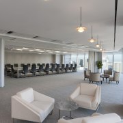
The office area totals approximately 4645m² over two levels, with ten client meeting rooms occupying half of one floor. This includes a boardroom, together with a spacious prefunction space at the head of a wide thoroughfare from the reception area. Shielded from view, a service avenue runs parallel to the structural core and contains coffee-making, storage and a full kitchen for service to the meeting rooms and two dining rooms. The 28th floor accommodates the bulk of the trading desks, together with a colourful, full-service staffroom and utility room.
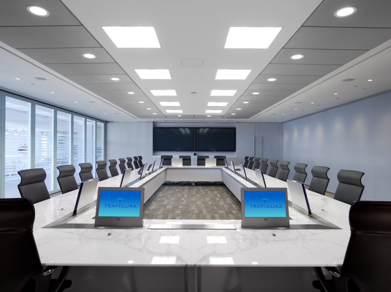
The global nature of Trafigura's business meant that technology was a crucial part of the fit-out.
"The company is very concerned with issues of sustainability, especially considering the amount of face-time each office has with its international contacts," says MacKenzie. "Through technology, a great deal of air travel can be avoided, thereby saving cost, time and the planet's resources."
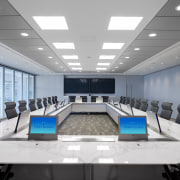
Special acoustic, audiovisual and lighting features, including pop-up touch screens built into the boardroom table, allow for frequent contact with Trafigura offices around the world.
One of the main drivers of the project was the need for a space that would allow for growth within the company, which is expected to more than double over the coming years. The entire premises is designed to accommodate and facilitate the future expansion of Trafigura. Double-glazed walls were used for all partitions to improve acoustics and ensure future adjustments take place with minimal fuss.
Story by: Trendsideas
Home kitchen bathroom commercial design
