Drama both inside and out
While blustery weather transforms the sky outside this hilltop home, it's the vibrant color inside that creates a talking point
A dramatic view invariably impacts on a home's interior design. Some designers like to keep an interior visually quiet, so it doesn't compete with the view, but for others a spectacular view is best balanced by an equally strong and dynamic interior.
The architect and owners of this new house are very much of the latter school of thought their bold design was influenced by the home's high, exposed site.
"This is a very dramatic, blustery location," say the owners. "The sky is constantly shifting and changing,reflecting the different moods of the weather. It would be very easy for a house to fade into insignificance beside the drama going on outside."
Introducing bold color to the interior was a way to give the house a visual strength of its own. But for architect John Mills, the color is also part of thecomposition.
"Color makes a space more dynamic and complex," he says. "It is also ambiguous and begs interpretation, which is all part of the art of architecture. The way color changes throughout the day, for example, determines how a space is perceived. A room that is fresh and bright by day has a lot of personality and strength. At night, however, the rich tones make the space more moody and intimate."
Mills says color is also an ideal way to introduce the unexpected.
"If all the spaces within a house were the same color, there would be no element of surprise," he says. "But color shouldn't be experimental or random. It needs to be carefully considered and proportioned."
In this house, a bright red wall in the entrance hall sets the scene for the use of color throughout the interior.
"This is a very graphic and visually warm space, which was designed to counter the grey skies on the other side of the door," says Mills. "It also brings a touch of drama to the interior, balancing the drama created by the magnificent city view."
Further color, including a splash of violet, can be glimpsed up the stairs in the double-height void of the entrance.
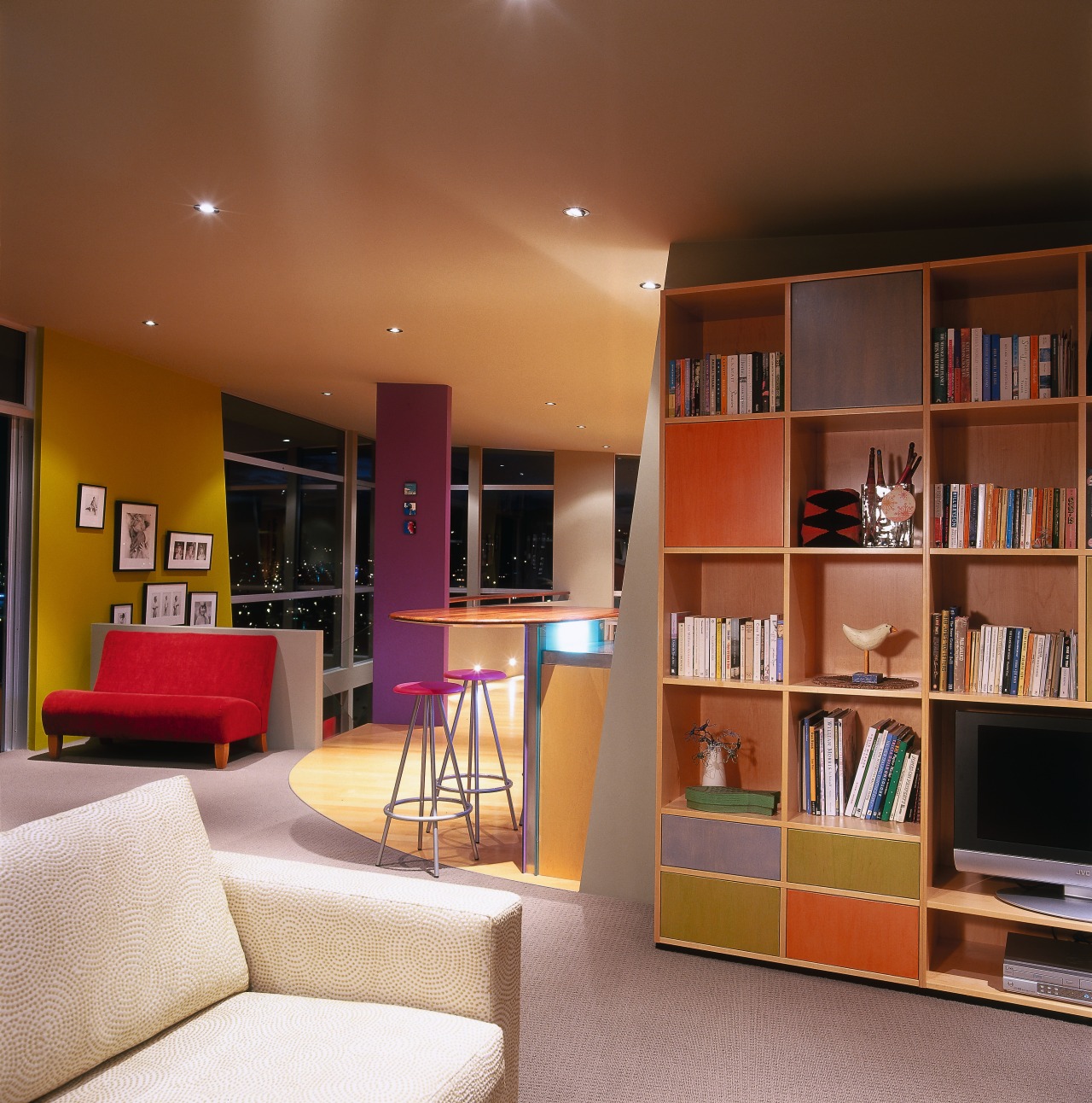
"This is a very rich shade, the color of kings," says Mills. "It's also vibrant and a bit of fun. We chose it for this structural column, as it is a strong vertical element in the heart of the house. It acts as a pivoting point at the top of the stairs everything revolves around this column, which can be seen from many parts of the house."
A warm chartreuse wall also draws the eye up the stairs. Nearby, a bright red sofa defines a breakout area where the owners can catch the morning sun. Red also features on a wall in the dining area.
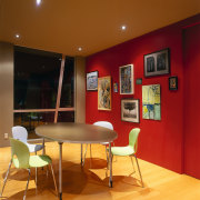
"Red works well in circulation areas and dining rooms," says Mills. "Here it provides a very dramatic backdrop to the similarly dramatic view."
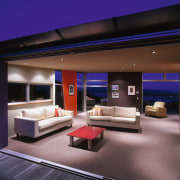
In the formal living room, the colors are a little more muted, and include a chocolate and a burnt orange wall.
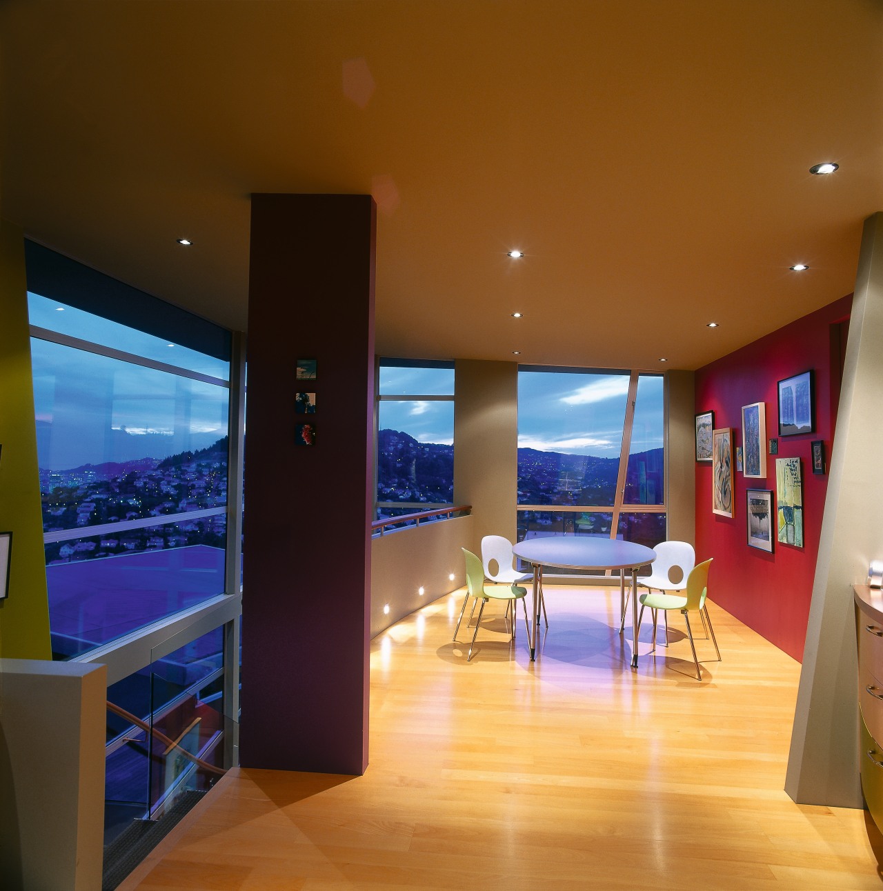
"These are classic colors, which have a 70s twist. The deep chocolate features on a solid, anchoring wall that gives some heart to the living area. It also provides a degree of visual warmth to counter the effect of all the glazing," says Mills.
Throughout the house, wing walls are angled to complement the slope of the ceiling. The retro-styled kitchen cabinetry also avoids predictability, with mismatched drawers creating a composition, rather than a homogenous look. The cabinetry imitates the brighter colors in the house, but in muted tones. Simple drawer pulls unify the piece.
"The washed-down look gives some texture to the built-in furniture," says Mills. "Similar colors feature in the shelving unit in the living room. They are also close to the shades chosen for the exterior of the house."
To balance all the color, Mills chose a dark, off-white shade for other walls and ceilings.
"This is a grey-green shade with a lot of depth to dull and soften the brighter shades. With all the natural light in the house, a plain white would have been too harsh. This shade deflects the light and softens the dark, saturated colors."
Credit list
Builder
Lighting
Living room furniture
Dining chairs
Kitchen countertops
Oven, cooktop and ventilation
Bathtub
Kitchen manufacturer
Tiles
Paints
Dining table
Bar stools
Colored glass and backsplash
Kitchen and bathroom faucets
Story by: Trendsideas
Home kitchen bathroom commercial design
Light-hearted by the sea
Surface attraction
In tune with the land


