Don't fence me in
A modern makeover restores the mid-centuryvernacular to this ranch-style home
Throughout history there have beenarchitectural styles that proved so popular in their time that they have gone on to define an era. Post-World War II, particularly in the western United States, it was the Ranch style that captured the imagination of the populace.
Immediately recognisable for its long, low-to-the-ground profile and simple, open floor plans, the Ranch aesthetic was the total opposite of preceding house styles.
While externally in the Ranch style, the house featured here built in 1945 was internally very insular. Each space was defined by four walls and physically cut off from the next, says architect Jay Serrao, AIA, of serrao design/architecture.
"Our goal from the outset was to break these boundaries and allow the various communal spaces to open up and flow into each other, while maintaining some degree of spatial definition. Opening up the space offers a great deal of flexibility. This is characteristic of the Ranch style, which allows for rooms to serve multiple purposes."
Another advantage of the Ranch style is the understated interior, which lends itself to a variety of decor options.
"Once the interior walls were removed, and two service porches incorporated into the open-plan space, the design took a much more contemporary direction. The details carry a slight Asian influence, with a functional approach," says Serrao.
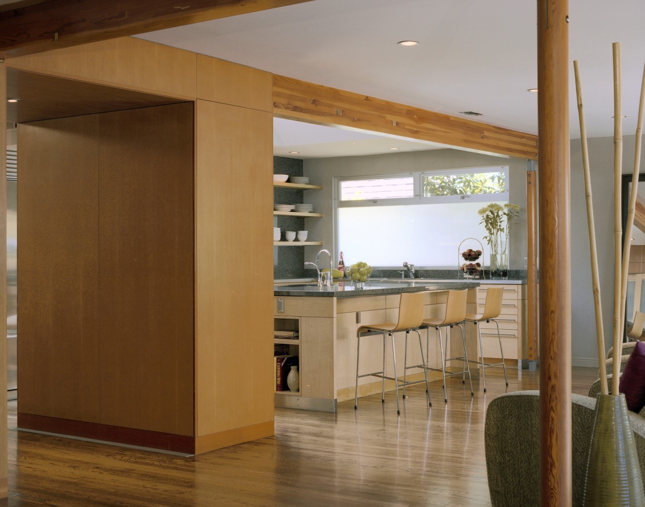
A new pantry and an existing cupboard are the only reminders that walls once divided the space. These also act as an entry portal from the front of the house to the rear, creating a sense of anticipation and arrival for the newly opened space.
The pared-back material selection enhances the airiness of the remodelled living area.
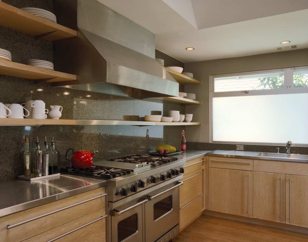
"We wanted to use wood and stone, but with a crisp, reduced palette. The materials were chosen to distinguish different elements within the space, but in such a way as to remain in harmony with each other," says Serrao.
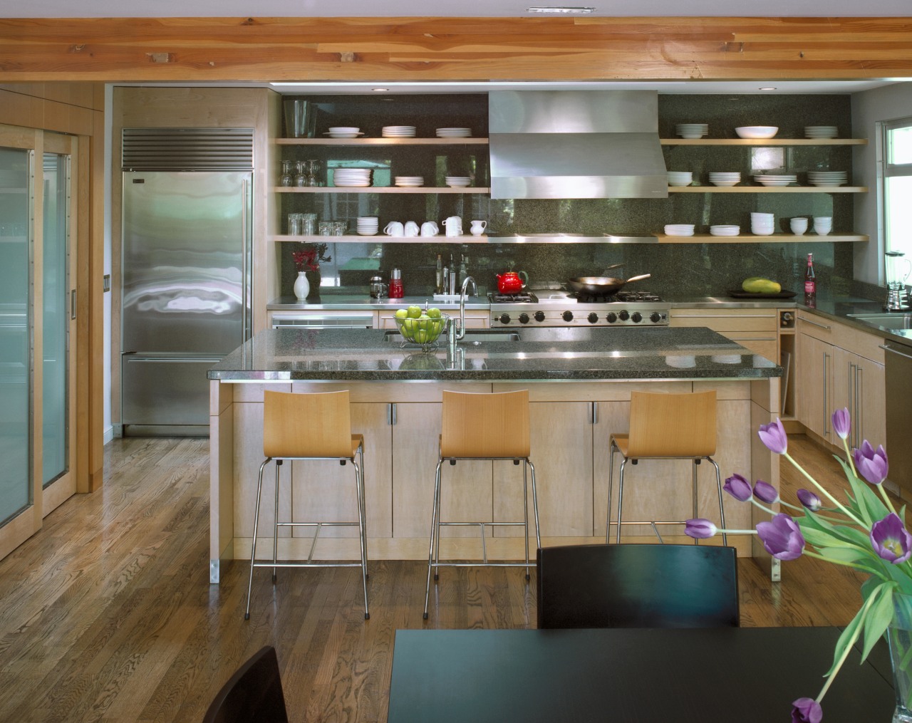
"Similarly, the introduction of stainless steel in the kitchen acts as a transition material, maintaining the affinity between the wood flooring and cabinetry, and the granite-clad wall."
Exposed shelving contributes to the overall feeling of openness, while revealing the true extent of the granite wall, which in turn provides a heightened sense of scale and drama for the space.
"The owners were immediately attracted to the idea of open shelving, as it was appropriate to how they envisaged the space casual, unpretentious and ultimately livable," says Serrao.
Credit list
Interior/kitchen designer
Flooring
Sink
Oven
Microwave
Dishwasher
Cabinets, benchtops and splashback
Lighting
Taps
Ventilation
Refrigerator
Story by: Justin Foote
Home kitchen bathroom commercial design
Small space, big impact
Classic dovetails contemporary
'Worthy of Architectural Digest'
