dance nation
Catering to four distinct groups of party-goers under the one roof and staying true to all of them required more than fancy footwork in this nightclub redevelopment

The hospitality business is a fickle beast at best and nowhere is that more apparent than in the club scene. How do club owners ensure their patrons' experience is such that they'll want to come back, especially when the club is catering to distinctly different groups?
When undertaking the redevelopment of the Singapore nightclub Zouk, the design team was mindful of satisfying a demanding audience, as well as preserving the existing philosophy that had made the club such a success previously.
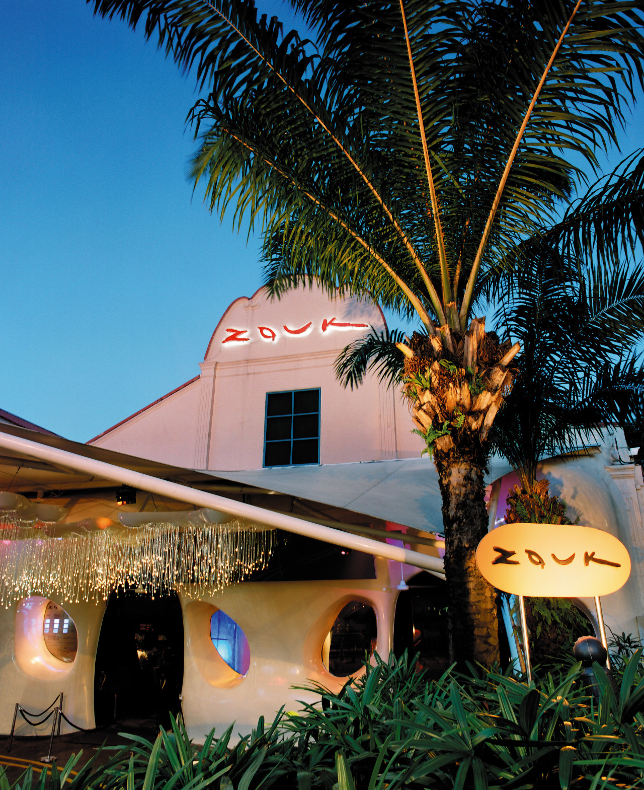
Designer Phillips Connor says the solution was to expand on the base philosophy, giving it a contemporary update that was realised as a modular shell that would sit over the existing facade, creating a look that could then be further expanded upon within.
"Zouk has always had a strong organic ethic, so the shell reinforces that, and the forms developed within are a continuation of that foundation."
The design brief called for inclusion of the most innovative products available and these start at the entrance with the use of Italian metamorphosi lighting a three-colour mixed lighting system that projects white light onto surfaces while objects within the space cast tri-coloured shadows in red, green and blue.
Continuing the new design experience, patrons move from the foyer to the main club through a light tunnel. Constructed of multi-layered resinous panels containing hundreds of LEDs, the tunnel is linked to the club's lighting and sound systems, making it an ever-changeable, almost amorphous experience for patrons of the main club.
"As with any club, access needs to be controlled - that's why the entry experience is so important. The lighting system, the tunnel and the rest, all work to build anticipation, to concentrate attention on what is going to happen, not what is happening."
Another factor to consider in the redesign of any club is the historical success of the venue and the potential to undo all that has gone before. In this instance that was particularly true of the venue's Velvet Underground club.
"Although we took that on board, we didn't get too intimidated by it. Zouk, as a brand, is synonymous with innovation, that's what people have come to expect, and Velvet is establishing its own brand identity within that."
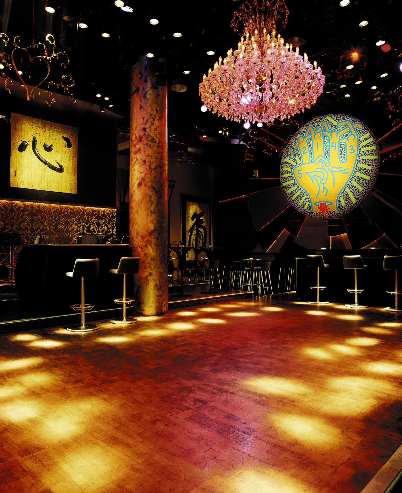
Following the ethos if it ain't broke don't fix it', the layout of Velvet Underground has remained true to its original. However, innovation takes pride of place most noticeably in the form of the handcrafted mesquite dance floor, the only one of its kind.
Lighting effects, from wireless LEDs in table surfaces to integrated spaces for its original artworks for which Velvet Underground is renowned all combine to encapsulate the design brief.
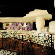
Perhaps the most eye-catching change is to the venue's Phuture club. Inspired by the Bolidism movement an Italian design movement started in the mid-80s with the central theme of retro-futuristic imagery the detailing and palette for Phuture is certainly striking.
However, it is the club's resin furniture, developed over a 12-month period exclusively for Phuture by Phillips Connor, that gets immediate notice.
"The furniture evolved pretty much out of necessity and was driven by need right from the start. Phuture is a youth club and fairly rough and ready people dancing on the furniture, drinks being spilled, cigarettes being dropped the furniture needed to be hardy and scratch resistant, which left us with very few choices for materials."
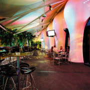
Taking the intensity down a notch is The Wine Bar, the purpose of which is to provide patrons with a break from the energy of the other clubs.
Relaxation is the name of the game here and comfort is the focus. Deep hues such as burgundy and gold and the integration of pliable materials in the seating reinforce this theme.
The only space within the venue to offer both indoor and outdoor areas, The Wine Bar proffered its own unique design concerns says Connor.
"It became rather important to integrate the two areas, which previously had been divided. The solution was the extension of the facade into a series of piers, which gave patrons a visual link to the club as a whole, as well as making the voids between piers much more open in contrast, therefore promoting a strong link between the indoor and outdoor spaces."
It is still pertinent to remember that while each of these clubs is a stand-alone venue in its own right, they still form part of the 3900m² whole and that in itself is enough to be problematic.
Keeping disruption of regular operations to a minimum meant the construction process was limited to 30 days. As a result, the majority of the new fit-out was built off site in a score of small specialist factories throughout Singapore, Malaysia, India, the Philippines, Europe and the United States.
On-site work was planned out to the hour so that builders' works could carry on around the clock, simultaneously with sound system, lighting, video, electronics and bar service works.
"It's not as bad as it sounds. The off-site work had been ongoing for the previous six months, so it was really a case of reconstructing the pieces on site.
"Of course as you get closer to the deadline, inevitably compromises have to be made to small details, like finishes, but these don't detract from the whole and can be completed at a later date," says Connor.
Any public venue succeeds only if it caters to its patrons' wants and this most recent incarnation of Zouk is proof of that.
"Everyone has been rather excited about the refurbishment. They had 5000 people on opening night and have continued to have record numbers for the succeeding month."
Story by: Trendsideas
Home kitchen bathroom commercial design


