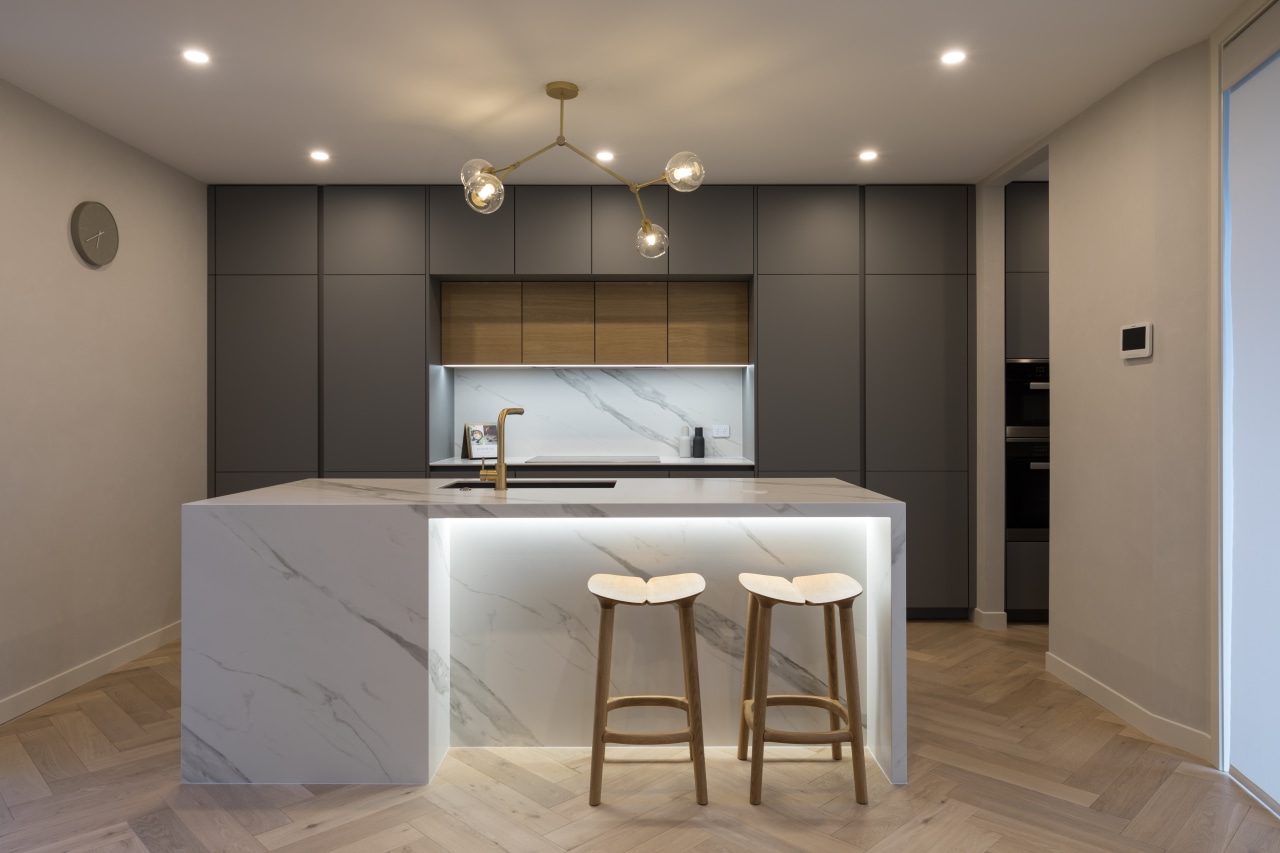
Crisp and contemporary, this kitchen avoids fussy details such as cabinetry handles for a clean, almost sculptural aesthetic
The practical is downplayed in this kitchen while marble look surfaces, modern stools and chic lighting hold sway
There are things you want to highlight in a design, and so it makes sense there must be other elements less intended to draw the eye.
The owners asked designer Lara Farmilo for the focus of this kitchen to be on the sculptural design, the casual stools, the modern pendant, and on the ‘stone’ benchtops and splashback.
“To accentuate these features, they wanted to avoid distracting handles on the cabinetry and to downplay the appliances,” says Farmilo.
“We took several approaches to achieving the pared back yet material rich look requested."
To keep the appliances tucked out of sight, the fridge-freezer, dishwasher and rangehood are fully integrated while the ovens are relegated to the modest scullery that serves the kitchen and helps keep it minimalist and uncluttered.
The grey and wood cabinetry and stone-look benchtop and splashback are to the fore in the modest kitchen. Push-to-open mechanisms for the wall units and push-to-open runners for all of the drawers and pull-outs avoided the need for cabinet handles or pulls that would have broken up the lines of the design.
And to further the pared-back nature of the design, even the cabinetry’s vertical negatives were colour matched to the stone-grey exteriors and the interiors of the tall doors. The effect is all the more striking with the cabinetry extending up to the full 2700mm stud of the townhouse.
Above the flush hob, and housing the extractor, the timber veneer fronted cabinets give the whole design a central focal point. The wood provides a perfect contrast to the contemporary stone-grey cabinetry used everywhere else.
Working with a minimalist aesthetic, even the smallest imperfection can stand out – but this was definitely not the case here. In pursuit of perfection, the ‘marble’ benchtop sections, hob bench and splashback were all grain matched.
The only ‘jewellery’ on show in the kitchen is the island sink mixer in brass.
Credit list
Designer
Kitchen sink
Oven, cooktop, dishwasher
Refrigeration
Flooring
Cabinetry
Benchtops and splashback
Mixer
Ventilation
Pendant lighting
Awards
Story by: Charles Moxham
Photography by: Mark Scowen

Poggenpohl Kitchens
Cabinetry that will last for years
Innovative Design, Custom Made Solutions, Unsurpassed Quality.
Home Trends Vol. 36/2
The selection of materials is a key element in the design of a new kitchen. Not only will they dictate the aesthetics of...
Read More


