Contemporary loft-style office interior in Art Deco Chicago building for social media team
Contemporary fit-out of penthouse floors in Art Deco building creates perfect home for Kimberly-Clark team specialising in social media research

Modern business isn't necessarily best suited to a state-of-the-art contemporary building. Sometimes, the most inspiring workplace is one imbued with character that has developed over many decades.
When global manufacturer Kimberly-Clark went looking for a new Chicago office for its social media research team, it was the 85-year-old Civic Opera House building that came up trumps.
Architect Tom Zurowski of Eastlake Studio, who has been involved in the building redevelopment, says the Civic Opera House had long been hailed as an iconic Art Deco building.
"The interior, however, was not somewhere a young workforce would aspire to it was regarded as a somewhat stodgy old building with lots of small, enclosed offices.
"On the plus side, the building is right on the Chicago River, so it has extensive views. And the penthouse floors where this office is located had the advantage of large windows on three sides."
Eastlake says the new building owner had already gutted the floors, leaving just a bare shell with exposed services.
"Our job was to make the spaces habitable, by ensuring they met local building codes, which was challenging. This included creating a second egress on the upper level of this office."

The architect says the building was redeveloped to meet the needs of young professionals, who are commonly looking for older character buildings that cater to modern technology requirements, and have additional amenities this building features a fitness centre, entertainment deck and bar.
"This office also reflects a growing trend in office design, whereby personal space is shrinking and shared space is growing."
Interior designer Cindy Howery of Potter Lawson, who was commissioned to design the interior for Kimberly Clark, says the office epitomises this new workplace model.
"This is social media research in action," Howery says. "It is more about working in cafes than cubicles, and using laptops, tablets and phones.
"The team wanted to walk the talk with an office that reflected the way they worked. This was never going to be a typical corporate workplace."
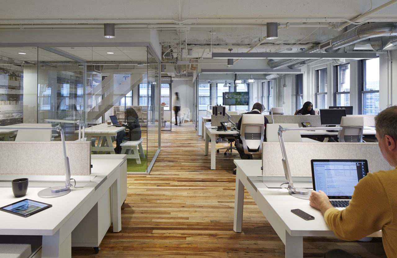
In keeping with this design brief, the entire office is open and transparent. Demountable Muraflex glass walls provide acoustic privacy for meeting areas but ensure visual connections remain.
Staff are encouraged to use the entire office, not just the workstations. No-one is assigned a particular desk; workers log in each morning and work wherever they need to be. This may be at a collaborative table, workstation or in one of the many breakout areas, which include an area with a green carpet and picnic table. Sun loungers and a kitchen island with bar stools are other options.
Howery says the head of the department loved the raw, exposed loft-style aesthetic of the original, gutted interior.
"He would have liked us to do nothing," she says. "But we needed to ensure the materials were durable and that it would be fit for purpose. The floor, for example, looked like raw concrete, but was actually a softer subcrete that had to be covered. We didn't want carpet, vinyl or tiles, so opted for reclaimed maple wood from an old factory. This not only works with the look, but also references the company's Midwest origins. The wood helps to warm the space visually, but doesn't detract from the very clean, crisp feel."
Reclaimed barn wood from the Midwest is another key feature. The wood wraps a large structural column in the centre of the office, and also clads the stair core.
A new HVAC system was left exposed in the ceiling, along with the existing pipes and cables, which were painted white to match the ceiling. Stairs that lead up to meeting and training rooms were also painted white, and much of the furniture is white.
Large 80in televisions are suspended from the ceiling in many areas. These can be used to share information from individual computers. The office also has a dedicated lab with a bank of screens.
The natural lighting that illuminates most of the interior is supplemented by unobtrusive strip lighting, cylinder cans and pairs of pendant lights.
Story by: Trendsideas
Home kitchen bathroom commercial design
'Hygge' in the highlands
Playing with blocks
Holidaying at home
Commercial Design Trends Vol. 30/9
Commercial Design Trends is aimed at our professional readers, and showcases commercial buildings. The book features reg...
Read More


