Comfort and grace
The reconsidered interiors of this Victorian presbytery combine a sense of eclectic whimsy with a high level of refinement


Reworking interiors in a classic home does not have to be an exercise in period restoration, nor a complete contemporary departure. Balancing elements from the past with custom and modern touches can give a home a personality all of its own.
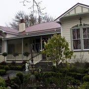
Built in 1913, this house, originally a presbytery, sits alongside a church of the same period. Owner and interior designer Karen Sandler was so taken with the building's charm that she turned it into chic accommodation with a difference.
"I had owned the house for a year before the tenants moved out and I was able to really discover the richness of the space," says Sandler. "The interior was a bit of a rabbit warren, but the ceilings were 4.2m high and the original kauri floors were exceptional."
Sandler stripped out all 12 rooms, retaining only the ceilings and floors, and reinvented the interiors.
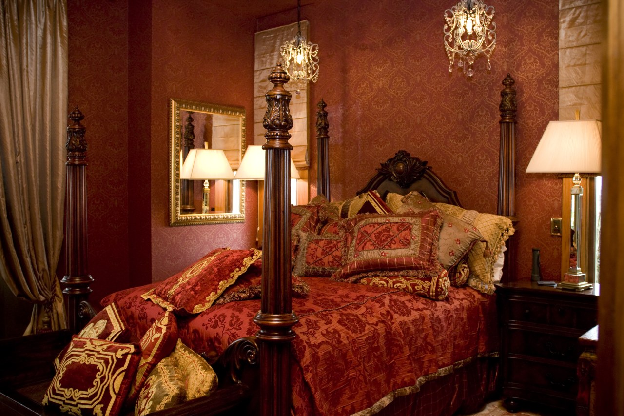
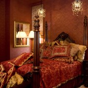
"In place of the original cramped layout, I introduced four large bedrooms with ensuites, one at each corner of the residence," says Sandler. "These serene, private spaces open onto a communal central kitchen, dining and living area."

The existing ceilings and floors were refinished where walls had been removed, with some wood from the walls reused for the alterations.
"My idea for the new interiors was for guests to have a sense of comfort, refinement and even a feeling of surprise," Sandler says. "After all, while many of the furniture pieces are from the same period as the building itself, it is unlikely that the presbytery would originally have had the level of finish and eclectic exuberance that it does now."
When it came to creating the interiors, the owner had the advantage of having work connections in the United States and Asia. The majority of furniture pieces are originals sourced from the United States or new elements custom made to the period style in China, she says.
"I drew the pieces together original period chairs, replica chandeliers from China, a reproduction Victorian bed from the United States, and authentic antique rugs mostly by instinct, working with tones and themes that might be inspired by a single piece."
For example, an ornate headboard initially destined for a bedroom proved an ideal front for the kitchen rangehood. Once in place, this provided the starting point for the decor of the entire room. The soft bronze and black tones of the piece are followed through on the cream-coloured cabinetry and contrasting black island.

"We repeated the rangehood's laurel motif on the island I hope that guests will enjoy discovering connections like these for themselves."
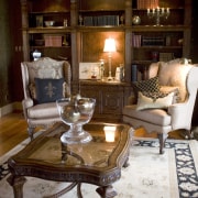
They will have plenty of opportunity, as decorative links abound in the house. In the living and dining rooms, the rugs have similar patterns but reversed colour schemes, and classic-look chandeliers are placed in the same context as modern standard lamps. However, uniting the interior is the presiding colour scheme of gold, brown and black.
"Some of the original moulding designs were picked up and carried through in adjacent spaces, but colour and a sense of fine detail are the main rallying points for the interior," says Sandler. "Texture, or the appearance of it, is everywhere from the gold leaf in the wallpaper to the silk ruffles and smocking on the curtains."
The result is a surprising, eclectic yet well co-ordinated interior that is much more than the sum of its varied parts.
Credit list
Architect
Kitchen designer and cabinetry manufacturer
Flooring
Audiovisual equipment
Coffee machine
Refrigeration
Refrigerator
Story by: Charles Moxham
Photography by: Tim Whittaker Comfort and grace The reconsidered interiors of this Victorian presbytery combine
Home kitchen bathroom commercial design
8 kitchen islands to inspire
Bathing pleasure unlocked
Enduring aesthetic
