Coffee break Resene colours in community centre
Resene paints at Hammondville Village Community Centre


Whites and neutrals have been popular, safe colour choices for years. But in recent times, there has been a noticeable warming of the neutral colour palette, and this is demonstrated in the new aged care facility shown on this page.
The interior design team from Gilmore Interior Design (GID) was commissioned to create the colour palette for the Hammondville Community Centre in New South Wales. The interiors needed to be suitable for the residents residing in the centre's Independent Living Units.
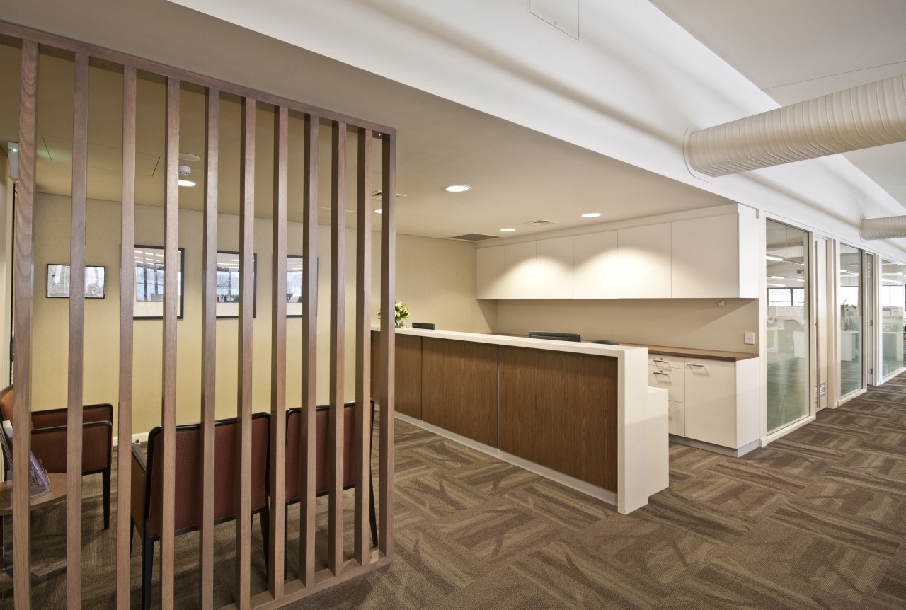
To complement the use of timber screens in the main reception area, the designers chose Resene Coromandel for the walls. This is described as a "mayonnaise of deep cream and mustard".
In the lounge, activity and craft rooms, which are flooded with natural light, Resene Double Wheatfield features on the walls. Appropriately, Resene describes this shade as a "green-edge neutral with tones of afternoon light". Other shades to feature in the public areas include Resene Beachcomber, Resene Quarter Canterbury Clay, Resene Buffalo and Resene Double Colins Wicket.

Resene recommends Resene SpaceCote Low Sheen for broadwall surfaces prone to everyday wear and tear in projects such as community centres, schools and other public areas. This waterborne paint is low-odour and Environmental Choice-approved. It is also durable, easy to wipe down, and comes in a special kitchen and bathroom variant with anti-bacterial silver and MoulDefender to provide extra protection in bathrooms, kitchens and other wet areas.
For more information, contact Resene, phone tollfree 1800 738 383 or visit a Resene ColorShop or reseller. Website: www.resene.com.au.
Story by: Trendsideas
Home kitchen bathroom commercial design
At home in the country
Eclectic meets elan
More than an addition