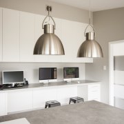
Clean-lined kitchen designed to accommodate wheelchair access
A large island and wide door openings mean this pale toned kitchen and its adjacent scullery are easy for all the family to use

A key part of the owners' brief to architect Mona Quinn for the redesign of this kitchen was to create a relaxed feel while incorporating easy wheelchair access to most areas for one child. Achieving a decent-sized study area within the kitchen was also part of the design programme.
"We decided early on in the piece to avoid having a separate dining area and this freed up much more room for the kitchen. It also meant we could have a large adjacent, walk-in scullery that helps keep the main kitchen mess free."
Broad door openings between the kitchen and scullery and the kitchen and adjacent hall mean all areas are unobtrusively wheelchair friendly. The pocket doors to the scullery don't take up space while the kitchen has an open connection to the hallway.

The sculptural, stepped cantilevered island is the centrepiece of the kitchen and again plenty of under-bench room was included for easy wheelchair access. Substantial steel engineering underpins the long cantilever.
"The island's crisp upper benchtop is in Caesarstone Snow while, mindful of budget, we chose to finish the long, lower countertop in concrete-look Formica," Quinn says. "The perimeter benchtops and large scullery bench are also in this finish."
As well as physically offering plenty of room for all, the kitchen adds to it sense of space in other ways, too. The design is clean-lined and minimalist, led by the elongated form of the island. The induction cooktop sits flush in the Caesarstone countertop and the cabinet handles are also understated.

"One reason this space works so well is that everything flows on from one thing to the next," says the architect. "The island countertop steps down to its broader worksurface while the perimeter cabinets also step down to form the window seat."
The kitchen's subtle two-tone colour palette of white and grey adds to the peaceful feel that the owners wanted for the space. The colours are complemented by the wood-look vinyl floor which adds another natural accent to the design.
In terms, of function, the scullery holds a raft of small appliances along with a substantial refrigerator. The dishwasher is tucked into the perimeter cabinetry while on the other side of the kitchen there is a dedicated workspace for several computers.
Credit list
Architect
Flooring
Kitchen sink
Oven
Ventilation
Dishwasher
Cabinetry
Benchtops
Lighting
Taps
Cooktop
Refrigeration
Awards
Story by: Charles Moxham
Photography by: Aramani Brouwer
Home kitchen bathroom commercial design
'Worthy of Architectural Digest'
Small space, big impact
Classic dovetails contemporary
Home Trends Vol. 34/1
If you're designing a bathroom for a new home or renovating your existing one, you'll quickly discover how involved the ...
Read More


