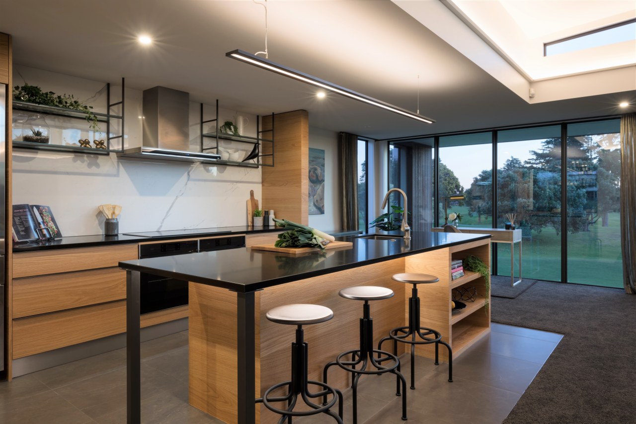
Clean lined but with an emphasis on natural materials, this kitchen doesn’t get in the way of its golf fairway views
With views to the rolling greens of a golf course, this kitchen strikes its own hole in one with a distinctive wood and black colour palette
Context was key for this airy kitchen, part of a new build for a retired couple fulfilling their dream of living on the edge of a golf course. And while ‘playing through’ is a popular golfing term, ‘seeing through’ was the apt phrase when it came to tweaking the initial layout.
Designer Chelsey Mathieson worked with the architect from early on to remove framed wing walls dividing the scullery and kitchen.
“Their removal allowed us to open up views to the golf course from the alfresco living at the front of the house,” says Mathieson.
“The walls were replaced with a mitred veneer column on one side and a low peninsular island on the other, for a seamless flow between the spaces.”

This side island provides a dedicated cafe servery, while suspended metal shelving above helps retain a sense of separation between the kitchen and scullery without blocking sightlines. Plus, locating the second sink in the cafe island means this can also serve the scullery.
Another challenge was achieving sufficient storage, while accommodating the high window in the scullery area. In response there is plenty of perimeter under-counter cabinetry, together with a large appliance garage with a roller door in the scullery to avoid a cluttered look. The counter height has also been raised in that area of the kitchen for the owners’ ease of use.

In terms of looks, white and ordinary were not options for the couple, who were open to ideas re the materials as well as the layout.
Inspired by the environment, American oak veneer was utilised to bring the outdoors in. And this warm-wood finish is matched by natural honed granite benchtops and a marble-look, large-format porcelain-sheet splashback.
“The cabinetry’s horizontal grain elongates the space and creates a modern European look.”
Credit list
Designer
Splashback
Oven, cooktop, refrigeration, dishwasher
Flooring
Cabinetry
Benchtop
Sinks
Ventilation
Awards
Designed by: Chelsey Mathieson, Vekart
Story by: Charles Moxham
Photography by: Mark Scowen
Home kitchen bathroom commercial design
Small space, big impact
Classic dovetails contemporary
Tranquil waters
Home Trends Vol. 36/1
While a bathroom may no longer be regarded as 'the smallest room' in a home, the extra space now allocated to it doesn't...
Read More