Civic pride
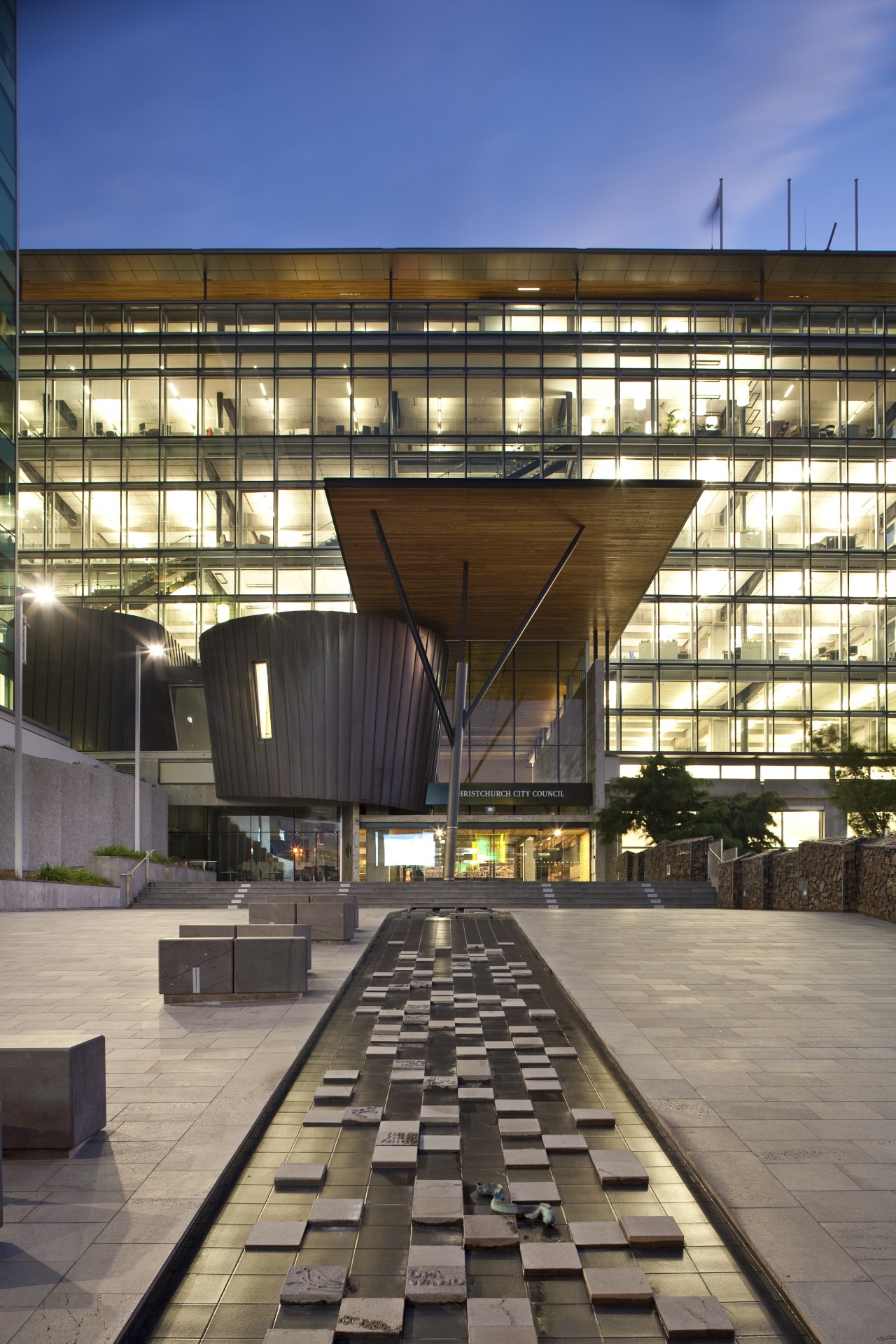
This refurbished civic building sets a precedent on many levels it's the first building to achieve the New Zealand Green Building Council 6-Star Green Star Built V1 rating, and the first iwi-city council joint venture
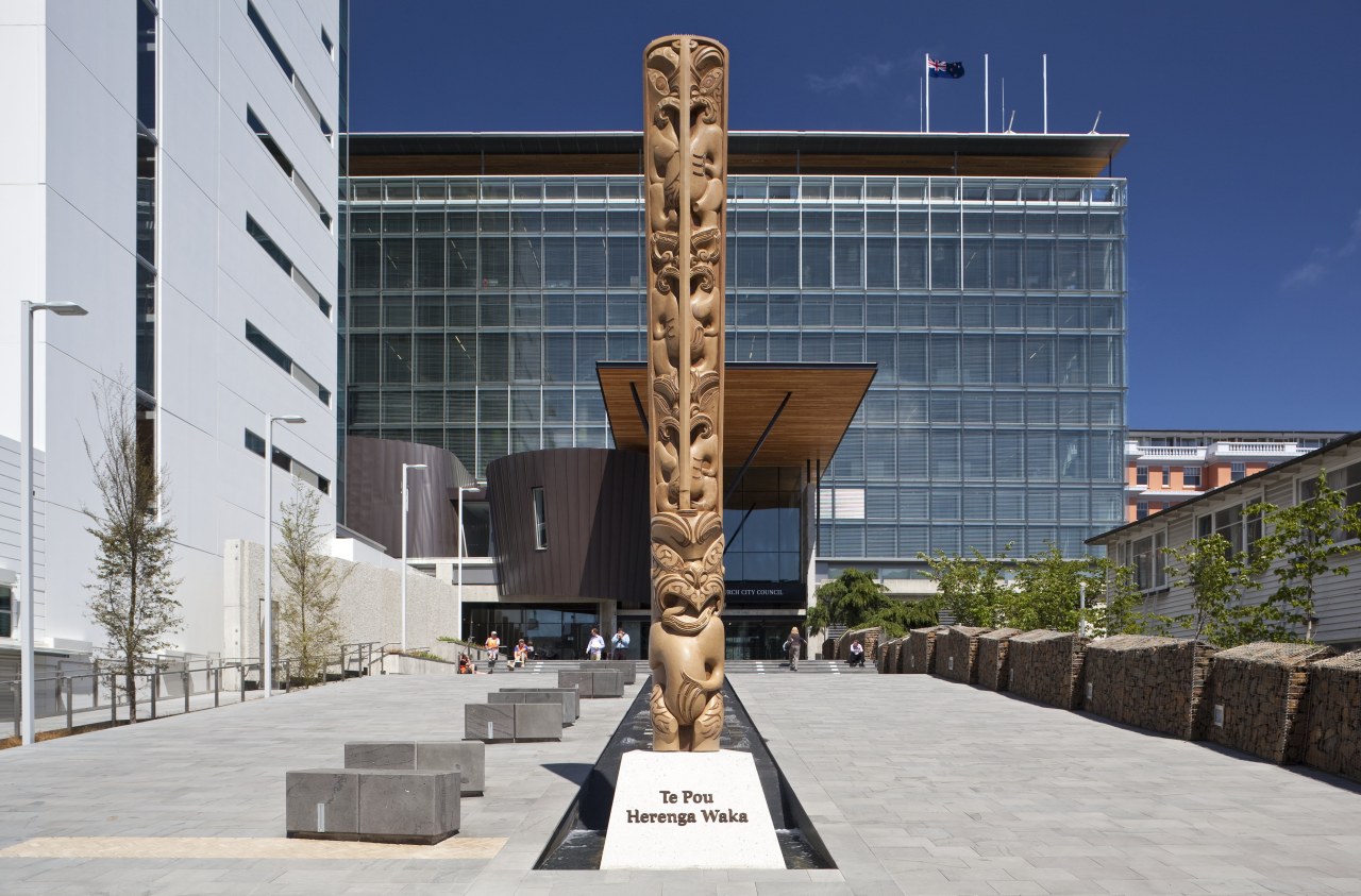
accessibility; it created a more open, interactive workplace; and it was a way to maximise natural light and consequently provide energy efficiencies.
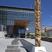
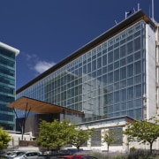
To achieve this, all the large aggregate concrete panels on the north facade were removed with some reused in the landscaping - and the building was extended 8m. The new facade features a dramatic glazed double-skin curtain wall system. Every second precast panel on the south side was also replaced with glazing, and several panels on the east and west sides were relocated. Reduced glazing on these facades helps minimise heat loss in winter.
The double-skin facade, which features a 700mm-wide air space between the outer and inner Adaptive reuse is increasingly a focus for developers looking for maximum efficiencies
and a minimal carbon footprint. It also has the backing of local body authorities, including the Christchurch City Council, which is leading by example.
To develop its own new premises, the council entered into a joint venture with Nga-i Tahu Property, which had secured the site of the former New Zealand Post city headquarters.
Nga-i Tahu Property development manager Gordon Craig says the prime inner-city location, between Hereford and Worcester Streets was a key reason for its selection.
"We also liked the idea of refurbishing the very solid 1970s building on site," he says. "Sustainability is one of our core values and from the outset both Nga-i Tahu and the council elected to aim for a 5-Star Green Star Office Design rating from the Green Building Council of New Zealand. As the project progressed, however, it was clear it was going to be a very big 5, so we thought why not go for the full 6-Star rating."
Architect Trevor Watt of Athfield Architects, the firm commissioned to design the new premises, says it was easy to see the building's potential.
"Built by the Ministry of Works, it was a very strong, robust, industrial-style building, so there was no real reason to remove it. There were also cost efficiencies in restoring rather than demolishing the structure, and there was a sense of rightness about resurrecting the former Post Office building and giving it an important role.
"But it was a large structure dominating an important inner-city block. We could see there was potential to open up the building and provide an urban link through the block, which would enhance connection between the city centre and the cultural areas of the Christchurch Arts Centre and Art Gallery."
Watt says introducing a sense of transparency was a priority for several reasons. Visually, it reinforced the council's focus on improved public glass, is a thermal and solar buffer zone. A building management system controls dampers at the top and bottom of the facade that regulate the airflow and cavity temperature. There are also automated aluminium louvre blinds on the inside of the external skin that help regulate solar gain.
The design created a pedestrian street through the building, providing a formal entry to the north and a business entry on the lower level on the south side.
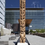
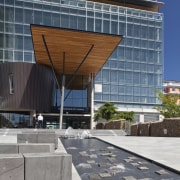
"The north side of the building was the original truck dock for the old Post Office," says Watt. "The forecourt ramps up and this entry is a floor above the entry on the south side. This arrangement gave us plenty of space to create a civic entrance on the north side, with a ceremonial forecourt and a soaring, timber-lined canopy."
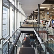
Inside the building, the lower three floors were effectively gutted, with several concrete beams and floor panels removed to create a triple-height atrium. The cut ends of beams and reinforcing iron have been left exposed, enhancing the industrial nature of the building.
"Wherever possible, we have retained elements of the original building so people can easily read what is old and what is new," says Watt. "We didn't want to pretty up the existing structure. Rather, we wanted to acknowledge its history, leaving traces of what had gone before. The exposed reinforcing rods, for example, illustrate its robust nature."
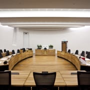
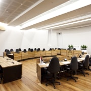
In contrast, the new elements appear as modern insertions into the space. A circular reception desk, a white-plastered box containing meeting rooms, and the circular copper- and cedar-clad council chambers are seen as separate elements that contrast with the strong orthogonal lines of the original building.
The new materials are also a lot more refined, highlighting the contrast between old and new.
The curve of the copper-clad council chambers pod extends to the exterior on the north facade, reinforcing the link with the community.
"Containing the chambers within this distinctive form was also a way to enhance its importance and highlight its role at the heart of the city," says Watt.
The glazed north facade is also activated by a staff staircase positioned beside the windows.
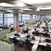
Watt says the extensive glazing brings plenty of natural light into the office floors, which have ceiling heights of more than 5m. These spaces also feature plants integrated into storage units that define key circulation areas on each floor.
Other significant sustainable design initiatives include a tri-generation system that allows the building to generate its own electricity from biogas piped from the council's Burwood landfill site. In addition, solar power provides 85% of the building's hot water. The decision to reuse an old building rather than build from scratch is estimated to save 65,700 gigajoules a year equivalent to a saving of 6440 tonnes of CO2 emissions.
Rainwater harvesting provides one million litres of water annually, and is used for toilet flushing, landscape irrigation and a water feature.
In keeping with the green directive, all materials used in the building were chosen for their low environmental impact. These include low-emission paints, carpets, adhesives and sealants.
Credit list
Architect
Project manager
Town planners
Greenstar consultant
Main contractor
Joinery
Mechanical installation
Lifts and escalators
Plant suppliers and maintenance
Client
Quantity surveyor
Services, fire and structural consultant
Building commissioning
Glazing
Copper cladding
Suspended ceilings
Heating
Story by: Colleen Hawkes
Photography by: Jamie Cobeldick
Home kitchen bathroom commercial design

