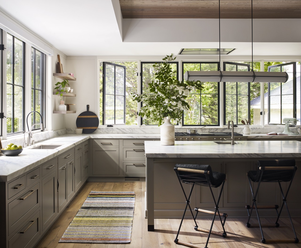
Character windows, contrasting cabinetry and a wealth of dedicated cabinetry solutions all play a part in this airy, hard-working kitchen
Classic cabinetry meets more modern chevron-fronted pieces in this kitchen that also deftly balances a clean look with discreet modern functionaity
Want a kitchen with one foot in the past and the other – in terms of function – firmly in the present? This kitchen effectively marries the two.
The kitchen by designer Sarah Robertson of Studio Dearborn forms part of a Victorian home that had tremendous historic charm but hadn’t seen a kitchen renovation since the 1950s.
“The owners wanted to take advantage of their views of the backyard and had raised the roof and pushed the kitchen into the back of the house, where expansive windows could allow southern light into the kitchen all day,” says Robertson.
“Essentially, they wanted us to create a large, family friendly eat-in kitchen with a spacious feel and great natural light"
In terms of aesthetics, the kitchen was to combine classic design details with more contemporary wood accent cabinetry. The owners also wanted a mix of warm paint finishes and light-coloured wood to create a unifying, casual elegance that carries right through the home.
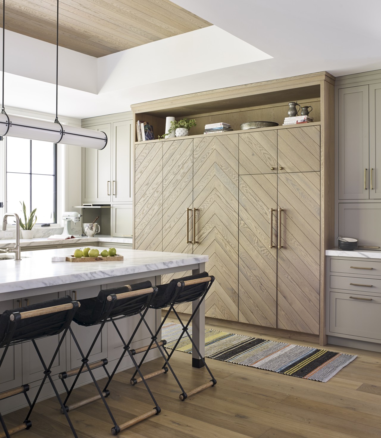
One challenge for Studio Dearborn was the design and fabrication of the intricate chevron paneled cabinets that integrate the refrigeration and pantry and keep symmetry on that wall.
Another tricky aspect was combining classic details with some decidely contemporary twists, while pulling the whole look together.
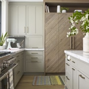
To address the overall look, a warm beige was chosen for most cabinetry, contrasted with a character tall oak cabinetry and bar station, both finished in a more modern chevron detail.
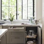
To avoid a cabinet-heavy feel, wall cabinets were all but eliminated at the rear of the kitchen in favour of large, Victorian farmhouse-style windows, painted black.
The range ventilation was tucked into the ceiling in this area, too, further ensuring an open view of the backyard.
Along with the windows, there were other classic-look elements introduced such as the solid brass hardware with an age worn look on the equally classic paneled cabinetry doors, both at the sides of the kitchen and underbench.
“This dignified cabinetry is contrasted with the two relatively contemporary chevron-fronted elements – a furniture-look bar station on one side and the balancing tall fridge and pantry wall cabinet opposite,” says Robertson.
“These elements were crafted from character oak to tie with the flooring throughout the house. Importantly, they also connect with the paneling on the raised kitchen ceiling, in the same oak."
Credit list
Designer
Cabinetry
Taps
Garbage disposal
Flooring
Windows
Smart technology
Awards
Architect
Benchtops
Sinks
Icemaker
Dishwasher
Walls and ceiling
Lighting
Seating
Story by: Charles Moxham
Photography by: Adam Kane Macchia
Home kitchen bathroom commercial design
Classic dovetails contemporary
Small space, big impact
Tranquil waters
Home Trends Vol. 36/1
While a bathroom may no longer be regarded as 'the smallest room' in a home, the extra space now allocated to it doesn't...
Read More