A playful brick extension connects this home to the outdoors
Featuring a carefully chosen colour palette, arched window frames and patterned brickwork, this home's new extension opens the interior up to the back garden in an architectural way
Architects: (ma!ca) architecture
From the architects:
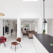
The house, with its large north-facing garden, had very little natural light and the living space on the ground floor was segmented into too many sections with low ceilings. Load-bearing walls and partitions have been removed in order to create a homogeneous and airy place.
The new choreographed sequence of the spaces results from the regular structural grid made of load-bearing rectangular beams. The open-plan living space is comprised of the entrance, dining and living room, which connects to the new extension. Featuring an open kitchen, the extension looks like a large brick cube that stretches out onto the garden.
Taking advantage of a generous and dramatic ceiling height, a wrap-around roof light in the kitchen block enhances the feeling of a connection to the green outdoor environment. Bathed in natural light that penetrates through the skylight, the kitchen creates the impression of an overall unified living experience blurring lines between the inside and out.
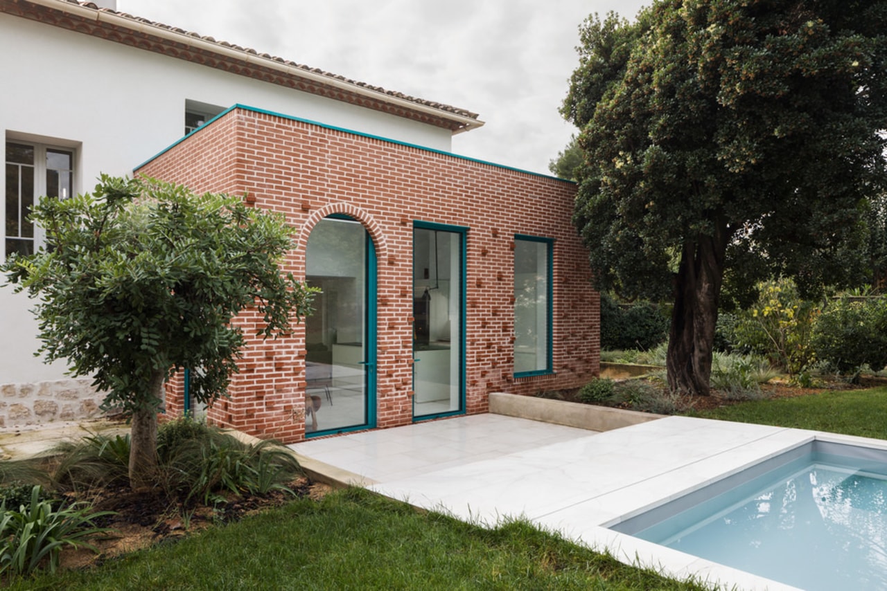
The set of arched windows frames all views from the kitchen to the garden courtyard; the softness of the rounded shapes reflects the original house’s sculptural form and character; deliberately merging the new and the old in this project.
The additional space consists of red terracotta bricks. This colourful graphic language interspersed with contrasting glazed bricks, varying depths, produces a vivid and playful pattern of light and shadow on the facades.
The extension volume is strictly minimalist but changing. The colorimetric composition of terracotta red mixes with the green shades of the pool and garden. The reference hue RAL 5021 chosen for external joinery composed of aluminium clad evokes this colour palette. A bright and daring colour which boldly contrasts with the raw-aesthetic design of volumes and surfaces and stands out even more against the immaculate white decor of the interior making the most of natural light.

Custom-designed furniture fills the space between the supporting grid of concrete columns and includes what is required to support daily life: multi-purpose built-in storage that can be used as a toy-box, a customisable work area, a display shelving unit, a fireplace, a wine cellar and an entrance wardrobe.
The pool offers a constant flow from indoors to the vibrant outdoors. The cohesive use of colour and material for the floor infuses in the house a natural continuity creating abstraction.
Home kitchen bathroom commercial design
Curvaceous and connected
With deep affection
Sculptural centrepiece


