Brand together
Red, white and rolled-out around the world. Puma's store fit-outs feature a number of consistent ideas that expand and activate the retail space


Just prior to the 1970 FIFA World Cup final, so the story goes, Pele stopped the referee with a last-minute request. The TV cameras zeroed in, and the maestro as per the request of his sponsor crouched down and tied his bootlaces, giving millions of viewers a close up of his Pumas.
That creative, unconventional and debatably cynical ploy is an example of how changing times and technologies spawn changes in marketing and branding techniques. When major companies look at today's global marketplace, they might consider that, although it must certainly help, quality of product line is no guarantee for success. A consistent, readily identifiable corporate brand is also essential.
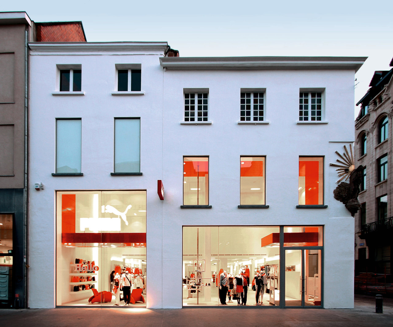
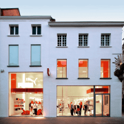
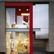
Although an international sportswear company, Puma had for some years an almost non-existent high-street profile. Today, the company has a global retail presence, with dozens of concept stores, mostly dressed in instantly recognisable red and white. American firm Kanner Architects was responsible for defining the Puma retail identity, and Puma Antwerp was the first store to fly the new colours, says Stephen Kanner, the firm's principal.
"Puma was looking for an architect to come up with a unique retail concept, as at the time the company didn't have its own retail environment," says Kanner.
"Early on, we produced three designs, which were submitted for a range of consumer testing. Thankfully, the option the consumers liked was also our preference, in red and white. At that time, Puma's corporate colours were a more inconspicuous hunter green and tan. The red-and-white combination is the key to the concept," he says. "Red captures the eye; it's modern, edgy and bold, allowing the white logo to really stand out."

What started as a relatively small concept quickly evolved into something much larger. The flexible concept was rolled out throughout Europe and the United States, and adapted to fit numerous building styles.
Some sites required delicate handling, such as in Rome, where a 17th-century building was chosen, and Glasgow, where a turn-of-the-century Charles Rennie Mackintosh structure was selected.
The concept was also implemented in modern mall environments, and in other stores that could be completely reworked to meet the architect's vision, such as in London, Chicago and San Francisco. In the older stores, including Puma Antwerp, existing columns were covered with panels to integrate them into the overall aesthetic. The columns were then connected with headers along the ceiling.
"This has the effect of creating arches that define space and facilitate movement," says Kanner. "Articulations in the columns reveal glimpses of the original materials, creating more creative merchandise display spaces. These articulations and reveals are repeated throughout folded planes that turn ceilings into walls."
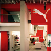
In many stores, the design aesthetic is anchored by a large red wall at the rear. With a white back-lit Puma cat logo at the top, such a wall is a beacon for consumers, drawing them through to the back of the store, where shoes are generally displayed. On the way, customers pass shelves and other merchandising display systems that are laid out in stories.

"We tend to look at each distinct product line as an independent story. Collectively, they tell the narrative of the urban brand. The idea was to pull people through the space and tell stories with merchandise," says Kanner.
To help express the various stories, Kanner Architects worked with London-based multimedia firm GBH. Merchandising items such as tags and display units were overhauled, and a series of amusing devices were developed including a 360° roof-mounted camera projecting a puma walking on and peeking over various displays. In some stores, dressing rooms were also reworked with themes not normally associated with retail sportswear: forests, supermarkets and bowling alleys.
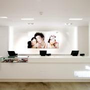
Overall, the material palette is contemporary. Stainless steel and glass are combined with red and white factory-finished panels, laminates and painted walls. Displays are minimalist, but varied. Some comprise overlapping rectangles with built-in lighting, while in other areas side-lit walls help give more conventional shoe displays a floating effect.
Kanner says retail design isn't a static science. For visual impact, and to sate savvy shoppers' appetites for new experiences, continuing design and innovation are always necessary.
Credit list
Architect
Multimedia design
Story by: Trendsideas
Home kitchen bathroom commercial design
