Brand new approach
One NZ's evolution from Vodafone is much more than a name and logo change – as evident in its new experiential fitout design by Warren and Mahoney
Designed by Warren and Mahoney
From the designers:
In partnership with One NZ and our research partners Perceptive, we sought to unlock the magic of technology and localise the customer experience for all of Aotearoa by placing users at the core.
The One NZ experience has been transformed by adopting an experiential approach to design, prioritising user and brand engagement.
Our challenge was to revolutionise the physical footprint of a ‘retail space’ with a future focused lens, and to reinvent the brand through a newly defined experience that was directly informed by the voice of the customer.
We used the provocation ‘leave your device at the door’ to look beyond the existing retail model – One NZ isn’t just a phone supplier, rather a digital experience creator.
Their launch initiative to partner with SpaceX and provide 100 percent mobile coverage across the country is a bold statement of this. In response, the new retail strategy is designed to focus on welcoming, hosting, inspiring and engaging with community and businesses to create brand resonance - not just selling products.
In addition to customer satisfaction, performance and commercial data, our team conducted a bespoke emotional research process that revealed the need for users to navigate their experience in a way that best suits their purpose for being in store.
Instead of relying on the conventional brand-coloured retail networks of the past, we chose a confident design language and spatial layout that responds to the functional and emotional needs of the users.
Our strategy was to create two distinctive zones:
The Social Lounge — A calm and welcoming lounge for personal service, diagnosis, problem solving and tailored product alignment. Includes meetings, click and collect, and unveiling. Made of recycled Rimu and locally sourced materials, it's a space that instills confidence and brings face-to-face interaction to the forefront.
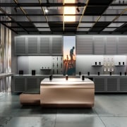
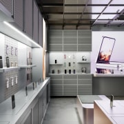
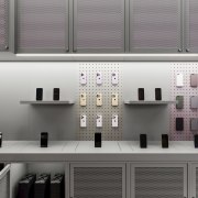
The Capsule — The ultimate tech cave, filled to the brim with devices to touch, interact with and buy. A vivid and memorable experience with a raw and industrial look and feel. Back of house in realtime with integrated storage and display.
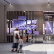
The hosting capabilities of the space allows for live events, music, food and drink, and in-store activations, as well as being a space for business customers to utilise for brand partnerships.
Meanwhile, semi-private workstations allow digital services to be done locally during quieter periods of foot traffic.
The result is a flexible design system and material palette that is fully tailored to the unique context of each store location, user preferences, and embodies the identity of an innovative and forward-looking nation, Aotearoa.
Initially, the design has been implemented on seven new stores across the nation, and will extend to over 60 physical locations that will continue to be refitted over the next 2-3 years.
Credit list
Project
Project principals
In association with
Story by: Trendsideas
Home kitchen bathroom commercial design


