Behind the scenes
The picket fence and decorative fretwork at the front of this traditional square-fronted villa belie a highly contemporary extension at the rear
From their bullnose veranda roofs to the detailing of the fretwork, traditional villas have always had plenty of street appeal. But the attractive facades are not always balanced by the living spaces inside.
Adding a modern extension to the rear of such houses is a popular way to provide a larger and more functional interior for a family. However, not every house is ideally situated to the sun sometimes the extension has to be on the shady side of the house.
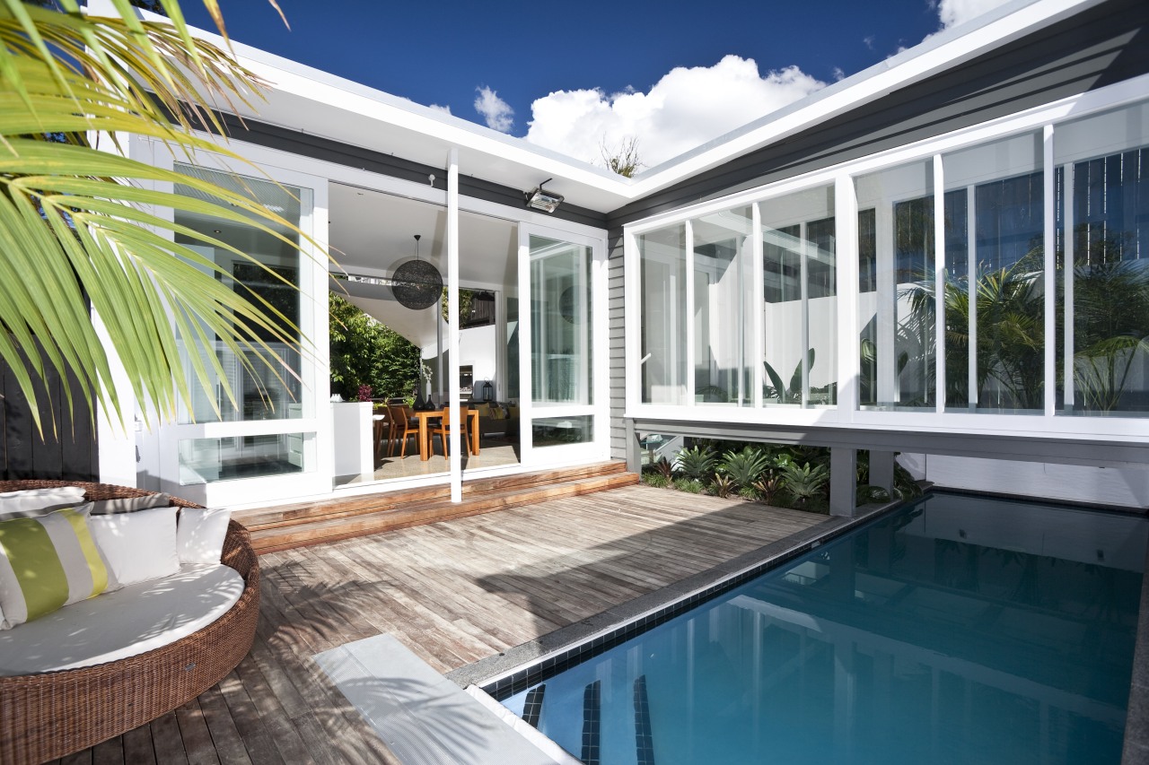
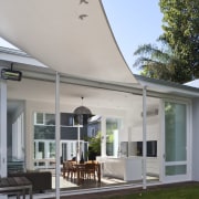
Cameron Ireland, the designer and builder of this renovation project, was faced with such a challenge. His solution? A new pavilion set 8m from the house and linked by a narrow bridge.
"Separating the two buildings by this distance allows the sun to penetrate the new pavilion, which accommodates a living area and kitchen," Ireland says.
To create enough space for the new building and an outdoor living area, several unstable lean-tos were removed from the back of the house, and more than 70 truckloads of soil were excavated and removed. This flattened the sloping site to make a viable building platform, and created room for another floor below the main level of the existing house.
"It was important to ensure there was a visual continuity with the pavilion, even though it is an obviously modern addition," says Ireland. "Consequently, the non-glazed areas of both the bridge and the pavilion are clad in grey painted weatherboards that match those on the original house."
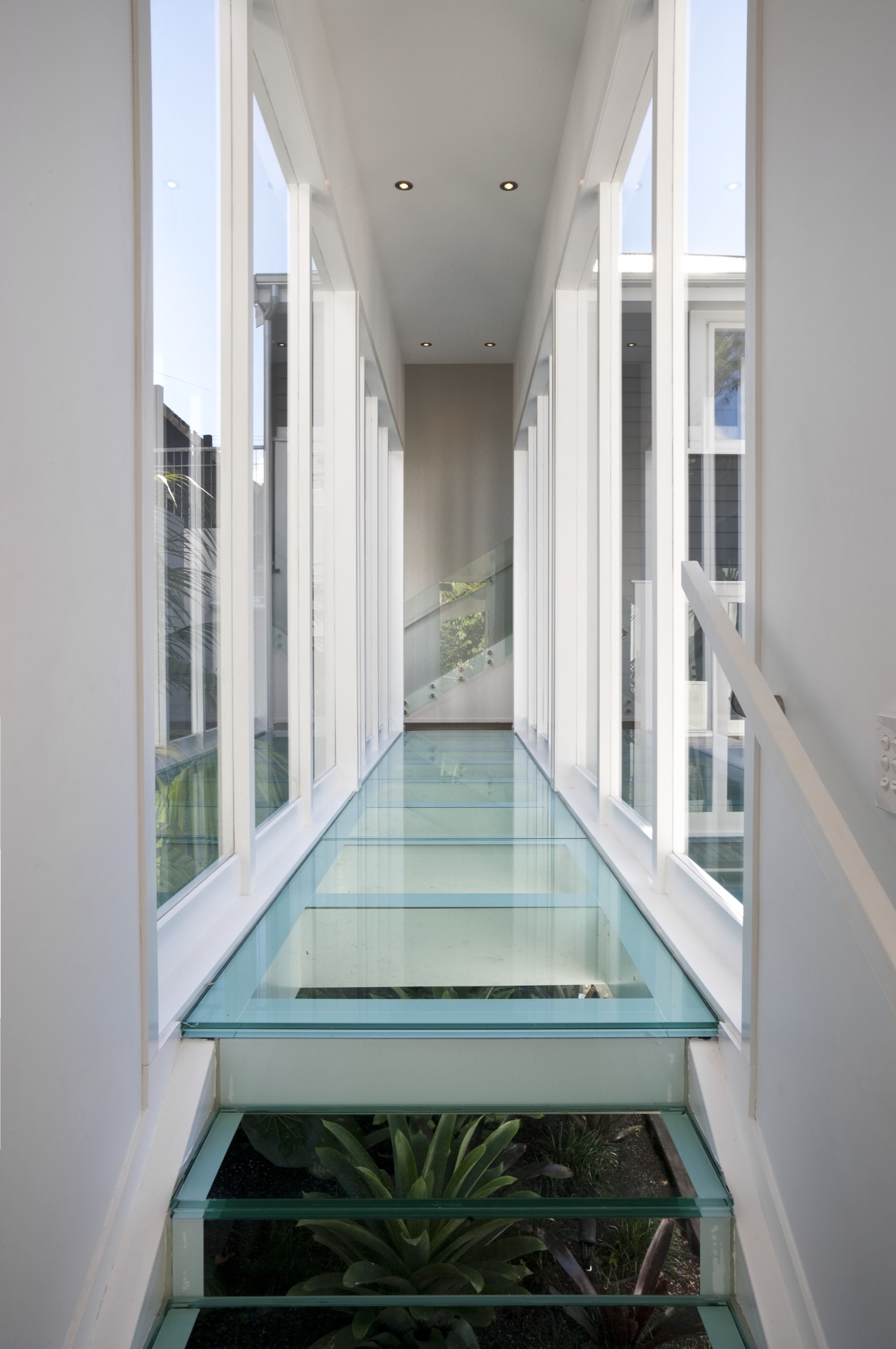
But, it is the extensive glazing that sets the new structures apart. The 8m-long bridge features double-glazed walls, as well as a solid glass floor and steps. A lap pool runs underneath the bridge, at right angles, alongside a timber deck and landscaped garden.
"We didn't want to introduce too many different types of materials, hence the decision to use the glass underfoot," says Ireland. "It also allows a good view of the pool and landscaping, which were designed to bring a little fun to an area that could otherwise have been quite dead."
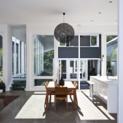
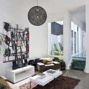
Inside the new building, a 4.5m-high ceiling creates a spacious, open-plan living space. The glass walls on two sides slide back within themselves, reinforcing the idea of an open-air pavilion.
The galley-style kitchen features white lacquered cabinetry and Corian benchtops. A large island provides plenty of space for food preparation and doubles as a casual seating area.
"It's a very simple design, which fits with the architecture," says Ireland. "It was important that the kitchen didn't block the light by taking up valuable window space."
The pavilion is not the only room to overlook the pool. A new master suite on the lower level of the existing house also opens to the pool deck. The suite includes an extra-large dressing room and a large ensuite bathroom wrapped in charcoal tiles, with a dark oak vanity unit.
A lounge room, which doubles as a home theatre, is positioned on the floor directly above the suite. This room also overlooks the pool area and pavilion.
Story by: Trendsideas
Home kitchen bathroom commercial design
Radical yet respectful
Sculptural centrepiece
Curvaceous and connected
