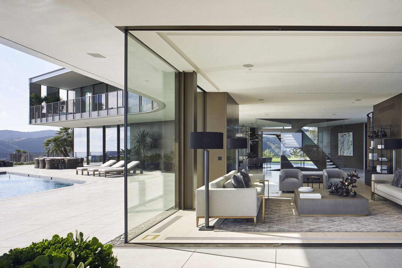
Balancing scale, views and comfort was the biggest challenge in the design of this substantial home
Organising the space planning in a Y or propeller shape ensured this home met all of the owner’s specific requirements while making the most of the spectacular views
When architects SPF:a were initially approached to create a home for this Bel Air hilltop site, it wasn’t immediately clear what direction the design would take.
Principal Zoltan E Pali says that given its prominent position above a relatively developed neighbourhood, the home needed to meld into its surrounding, while at the same time making the most of sweeping views of the Los Angeles Basin from the Getty Center to Long Beach.
But it also had to meet some very specific requirements from the owner.
“She wanted a luxurious house in which she could put on large events and host her extended family,” says Pali.
“Yet she also wanted it to feel warm and welcoming.”
Balancing scale, views and comfort would prove to be the biggest challenge in the design of the 1675m² home. And to meet that challenge, SPF:a came up with an innovative layout.
“To meet all these demands, we needed the home’s spaces to flow into one another with ease. Our answer was to organise the plan across three ‘blades’ that radiate from a central node.”
The result is a three-storey structure in the shape of a Y or three-winged propeller, with a dynamic glass and steel staircase extending through the core.
“The staircase provides a very straightforward guide to the vast home’s circulation, while at the same time it visually joins what would otherwise be disparate areas in one’s line of sight.”
Two of the storeys sit above ground, while the basement floor burrows into the hill below. On the ground floor are the entry and communal spaces – living, dining, kitchen, pool and outdoor areas – while the top floor is dedicated to the home’s private spaces.

Dividing the house into its three wings also effectively reduces the scale of the building, and allows nearly all rooms to access the range of views.
“The upper southwest and southeast wings hold the master and a ‘mini master’ for guests, both of which have 270° views of the city and ocean due to their slim profile. In contrast, two smaller bedrooms in the northern wing look out onto the hillside and rear garden and have an intimate feel – like being in a treehouse.”
All this access to views is enhanced by the large expanses of glass on the ground and first floor, which are the result of further innovative approaches.

SPF:a creative director Judit M Fakete says the light in Los Angeles can be both calming and energising.
“As the house is high above the city with almost no visual impediments, we wanted to capture the spirit of these two qualities,” she says.
“The huge panes of glass provide the inhabitants with a strong connection to nature and the daily rhythm of light.”
The glass curtain wall wrapping all of the top floor is a highly sophisticated system, custom developed in part with Schuco/Glasbox.
It consists of five different widths of glass, which were produced with four levels of opacity – clear, reflective, translucent and opaque – achieved by specialised films that were laminated into the panels.
As a result, the upper level achieves varying levels of privacy despite being fully glazed, and also provides an everchanging, shimmering facade.
“At times, the upper level seems to disappear into reflections of the sky,” says Pali.

In another innovation, the dramatic bends in the facade at the centre of the home were formed from three curved glass panels, and include motorised, curved glass doors.
The ground floor outdoor area has its own kitchen, two firepits and an LED-lit pool. All roof, balcony and hardscape water is directed into a 26,500 litre underground tank for landscape irrigation.
On the other side of the house, the garage is also a multi-use space – it can convert to an event space that completely opens on two sides to allow through views.
Meanwhile, the basement contains a home theatre, gym, spa, cedar sauna and a wine room big enough for 1000 bottles.
A service kitchen on this level acts as a commercial kitchen for caterers to use when the owner is entertaining. For transfer of prepared plates, a dumb waiter connects it to the pantry behind the main kitchen on the ground floor.
For Pali, the success of the project lies in the way the plan kept the spaces intimate despite it being a large home.
“The plan organises the site into three different areas of usage,” he says. “Once the organisational principle was established, it pretty much designed itself – everything just fell into place.”
Credit list
Architect
Roofing
Decking
Lighting
Home theatre
Main level flooring
Guest bathrooms
Surface materials
Builder
Doors and windows
Air conditioning
Home automation
Veneer
Master bathroom
Appliances
Story by: Paul Taylor
Photography by: Matthew Momberg and Bruce Damonte
Home kitchen bathroom commercial design
Thrice as nice
Marvellous in marble
The beauty of understatement
Home Trends Vol. 35/3
There's a sense in which we've established a layout plan that is the basis for nearly all new kitchens – one in which th...
Read More


