Art oF GLASS
This modernist tower makes extensive use of glass, light and water tocreate a distinctive presence in Surfers Paradise
Creating a clear identity is a key requirement for any project. When the development is only a few blocks away from such iconic structures as the Q1 tower, the task is even more pressing. The architects of this residential development, Kevin Blair and Paul Tseng of Archidiom Design, set out to design a building that would work with the rich urban grain, yet still have a distinctive personality.
The developer, Raptis Group, was keen to maximise plot ratios and returns on the brownfield site, which is situated at the southern end of Surfers Paradise in Queensland. The local council wanted evidence of architectural and urban design merit before the proposed plot ratios could be agreed. Providing a strong presence at street level was also important, as a busy pedestrian route to the beach ran past the site.
Archidiom's design for Artique was informed as much by the site itself described by both architects as challenging as by these differing requirements.
"The site had a narrow north-south footprint, with shadow restraints and set-back restrictions. At the same time there were dramatic views of the Gold Coast and we wanted to maximise those," says Blair.
The result is a long, cigar-shaped tower with a mix of apartment layouts, from one bedroom to penthouse, and two four-storey villas. The tower is oriented so that 85% of the project's 174 apartments have a sunny north-facing aspect, with 180º views to the ocean. The other units look towards the extensive canal system of the hinterland.
Visually, the building is anchored in the modernist tradition, with a simple comb-like form to the lower tower, says Blair.
"We needed to decide how the tower would look sculpturally increasingly, investors are looking for iconic forms with an element of prestige. The building envelope was difficult to deal with initially, but we dealt with it by breaking the form down into different elements."
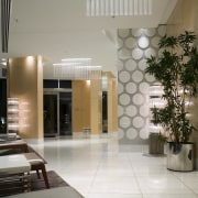
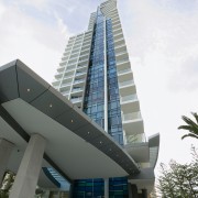
The first two storeys are delineated by the use of darker materials, a porte cochére and a frameless glass box the gymnasium that is clearly visible from all approaches to the site. A translucent film across the glass provides some privacy, while allowing passers-by to view activity inside. At night, backlit circular coffers in the gym's ceiling provide further visual interest.
The architects say that this reduces the scale of the building, allowing people at street level to relate to it more easily, rather than trying to understand a seamless, monolithic structure.
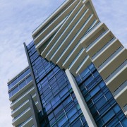
Another distinctive element is the tower's rooftop, which has two sculptural wings that arc through space.
"The wings provide some cover for the penthouse rooftop entertainment area. Visually, they appear to float without visible support, providing an iconic feature that makes the tower recognisable from a distance," he says. "They also echo the wings that shade the porte cochére, and those on the top of the villas."
Reinforced concrete was specified for the tower roof's wings and then skim coated for a flat, uniform finish. At ground level, the porte cochére has reflection ponds that complement the project's tropical gardens, creating a resort feel. The effect is heightened at night, when the movement of the water throws up reflections on the underside of the porte cochére.
One of the developer's design signatures is the use of blue glass. At Artique, glass is used to form a Mondrian-style feature curtain wall of blue, bronze and green glazing in clear and anodised framing.
Construction of the tower was relatively straightforward, says project architect Paul Tseng. Foundation piles were driven into the sand before construction of the tower and two villas, which comprise mainly concrete and curtain wall glazing.
Sustainable features include stormwater harvesting for irrigation of the tropical garden and replacement of pool water lost to evaporation. When stormwater supplies run out, a basement pump takes water from the underlying ground-water aquifer, rather than using the town's potable water supplies.
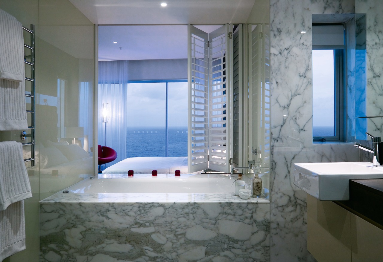
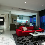
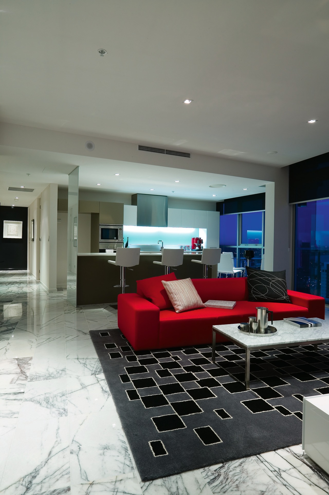
Creating a comfortable living environment was achieved partly through the amenities, which include the gym, steam sauna and pool at ground level. The pool has a north-west aspect to capture the afternoon sun. At basement level, the amenities include a 15-seat theatre and video golf driving range. Interiors are light and airy, with open-plan kitchens, dining and living areas and large outdoor balconies.
"The apartment layouts are designed to provide views, and fill the interiors with light and air," says Blair. "We're very focused on breaking down the barriers between inside and out, mainly because of the climate. The light and airy feel is also helped by a colour palette that is dominated by white both indoors and out and warm greys internally."
Credit list
Developer
Interior designer
Ceilings
Structural engineer
Earthworks
Fire consultant
Roof
Columns
Architects
Construction
Paints
Mechanical and electrical engineer
Landscaping
Cladding
Facade design/construction
Story by: Trendsideas
Home kitchen bathroom commercial design
