Art for art's sake
Is it a case of life imitating art, or art imitating life? Either way, this gallery in an upmarket shopping centre is bringing art to the masses
Destination shopping is a retail concept that grew out of the increasing tendency for shopping centres to act as a social hub as much as a convenient place to do all your shopping under the one roof.
More and more nontraditional tenants have found a niche within the shopping centre context one of the most recent is fine art gallery Ode to Art, which has established a retail outlet in Kuala Lumpur's premier Pavilion KL shopping centre.
The task of ensuring the gallery format would fit seamlessly into the shopping centre platform fell to design consultancy firm Designworx Interior Consultant, says interior consultant, Terri Tan.
"The gallery unit is located at the end of the Home Precinct an area which Pavilion designated for furniture shops, home furnishings and the like. Our challenge was twofold: firstly, to make the shop front stand out from the dark ambient background of the public corridors, and secondly to entice the customers coming up the escalator to walk all the way to the end of the precinct.
"What we have done is to create a bright shop front viewed against the dark surrounding, it is similar to a stage. To draw customers towards it, we incorporated a large, flat-screen television near the gallery entrance. The moving images and sounds draw customers to take a closer look at the gallery."
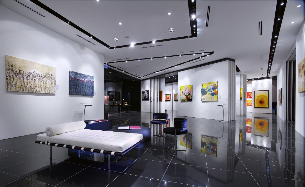
When it came to designing Ode to Art's interior, the challenge was to produce a design which complemented the shopping centre's interior architecture and realised the client's brief to maximise the space.
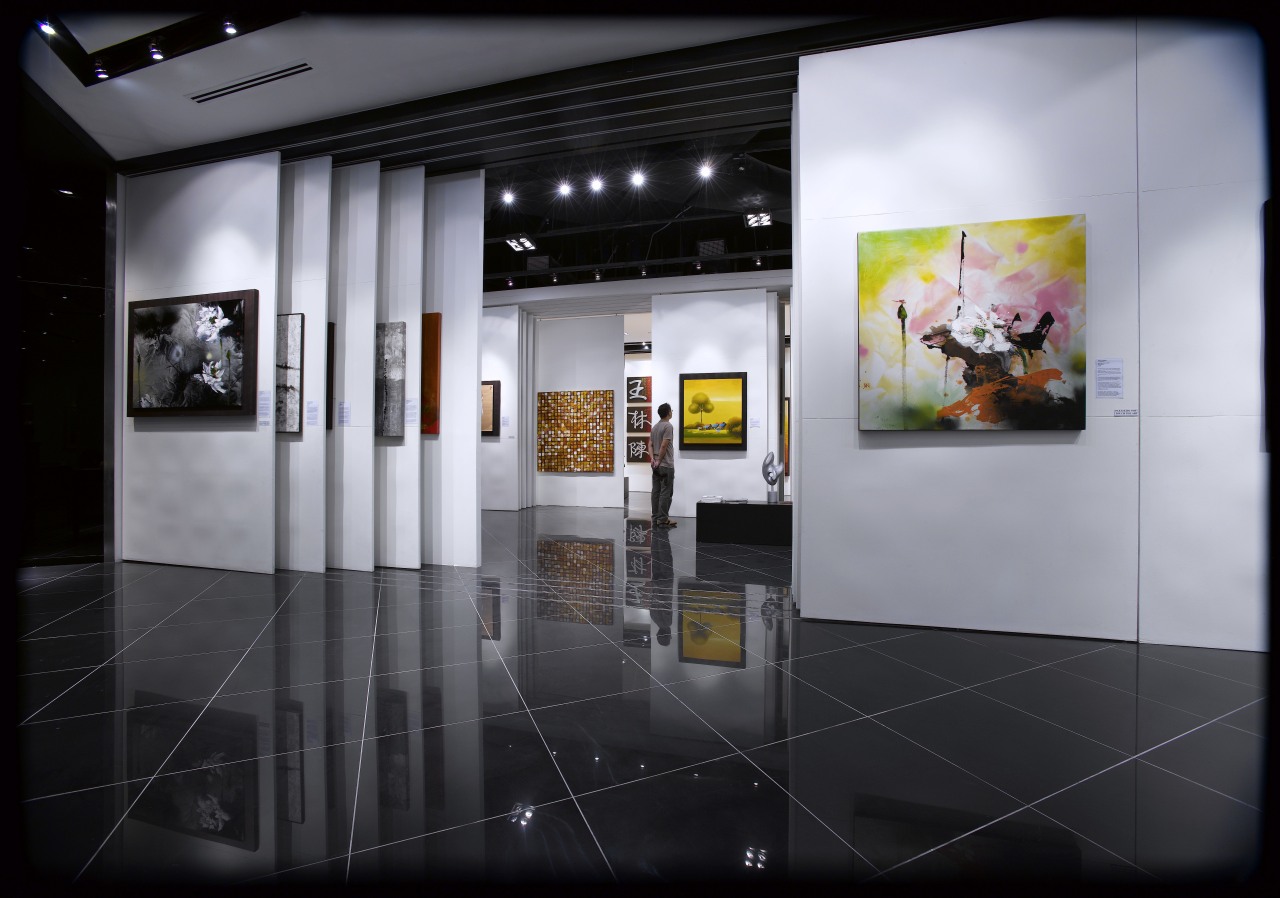
"Our role was to combine function with aesthetics," says Tan. "Hanging space was limited, therefore the main requirement was to maximise display area for the artworks. To this end we devised a series of sliding panels so as to create more wall space.
By adjusting the different layers of sliding panels, the space can be reconfigured easily and quickly to direct the way visitors and customers move through the gallery."
The placement of art on the panels is carefully considered, allowing the work to direct visitors too.
"Artworks have been strategically placed at focal points to act as visual cues to move customers through the space. Sightlines are manipulated via the sliding panels, drawing viewers towards specific artworks without the need for signage that could detract from the overall look of the gallery space," Tan says.
Story by: Trendsideas
Home kitchen bathroom commercial design
