Apple-fresh approach
The architect of this remodelled kitchen set out to create a room that was as cool and light as the 1920s original and far more spacious

Since many of us enjoy spending time in the kitchen, especially when there is space for casual dining and entertaining, fresh air and natural light are key requirements.
That was the thinking behind the design of this kitchen, says architect Maria Arango. The homeowners wanted a large and well-ventilated space, with room for relaxing, and generous storage space.
"Previously, the kitchen was small and un-modernised, but it had one big advantage. Typical of its era and location, it was completely exposed at one end to allow cooking smells and heat to dissipate, and cooling air to circulate," she says. "The brief was to create an enclosed kitchen with similar levels of natural light and ventilation."
Fortunately, the kitchen was being remodelled as part of the home's three-storey extension. Arango added two courtyards, positioning one so that it backs directly onto the kitchen and provides easy indoor-outdoor flow. The architect introduced one high window in the cooking zone, for privacy, and installed floor-to-ceiling glazing leading to the courtyard at the other end, for cross-ventilation. Mechanical air conditioning was installed for additional cooling.

Arango extended the kitchen lengthways in both directions, creating one of the largest rooms in the house. However, the house is only one room wide, so the option of an open-plan kitchen, dining and living space was not available. Instead, the kitchen has been planned into three distinct zones.
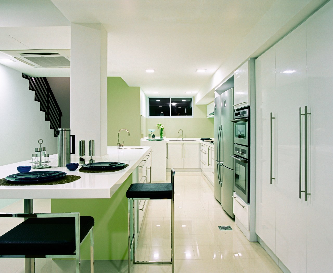
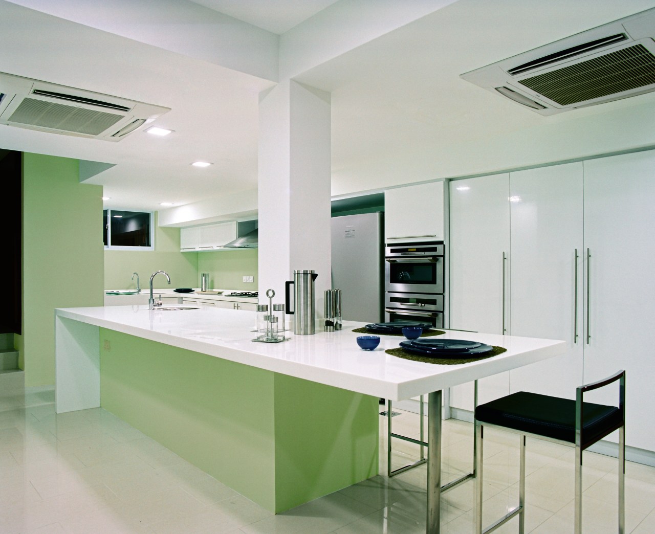
Cooking is contained at one end of the kitchen, furthest from the courtyard. The kitchen island provides two more areas, one for preparing food, and the other a breakfast area where the family can eat together and relax.
"The eating area is closest to the courtyard, so the family can enjoy good light and fresh air from here," says Arango.
White was selected as the main colour, as it visually enlarges the space and introduces a psychologically cooling effect.

"The kitchen was the one space in the house that the owners were happy to introduce colour, especially as the room loses some natural light in the afternoon," says Arango.
Apple green was chosen as the accent colour for the walls and kitchen island base, where it helps to give the illusion that the cantilevered island top is floating in space.
The homeowners' request for more storage space was accommodated with three metres of perimeter cabinetry running along one side of the kitchen. Altogether, says Arango, the kitchen is now 30% larger than before.
Credit list
Cabinetry
Splashback
Microwave
Dishwasher
Story by: Alison Wall
Home kitchen bathroom commercial design
Sculptural centrepiece
Radical yet respectful
Curvaceous and connected


