'Uninhabitable' Paris building gets a new lease on life
A complete refurbishment turned a small, unhealthy building into a functional family home

By Alia Bengana & Capucine de Cointet architects
From the architects:
This small building tucked away in the back of a courtyard in Paris' 10th district formerly housed small, dark apartments over two levels that were not well suited for habitation.
“Given the presence of mould in particular, we had to entirely recreate the building, only keeping the outer building envelope, which was remodelled as well,” architects Alia Bengana and Capucine de Cointet say.
The owners’ brief was to make the place fit for a family while managing the construction and the site in the most environmentally friendly way possible. The project took 8 months.
The small building became a comfortable 120m² family home spread over 4 levels. In addition to the ground floor and first and second floors, 38m² of vaulted basements are now home to the laundry room and a multi-purpose space that can be used as a game room or home cinema.

“Our main focus was letting as much light as possible in the house while still maintaining the privacy of the residents,” the architects say.
“This is a typical Parisian apartment with a small courtyard where the neighbours are never far away. ”Certain levels were thus opened with half-height floors in order to capture as much light from the south as possible.
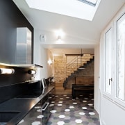
As for the large staircase, located opposite the façade, it is crowned with a glass roof which floods the ground floor with light. And because the spaces are restricted to one exposure (except for the skylights), the architects used glass walls inside, such as in the master bedroom.
“It diffuses light while allowing the parents to keep an eye on their kids,” they say.

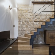
The emphasis was on using raw, simple materials. From the larch for the windows and solid oak for the staircase to the gritstone wall and raw metal for the railings, everything was pared back and simplified.
“We kept the wall in its patchwork state with its different additions and multiple materials. It’s a witness to the history of this building”.
In the bathrooms and the kitchen, the same hexagonal tiles can be found, but each room has its own colour scheme. The same goes for the railings and the outside metal, where diagonal lines soften the horizontal and vertical lines.

As for environmental performance, the building was insulated from the outside in order not to remove any living space. Recreating the floors allowed for the easy installation of ducts for heat recovery ventilation.
Finally, planters were buried in order to provide enough soil to allow plants to grow that will cover the façade along the wires strung up to the top of the building.
Story by: Trendsideas
Photography by: David Cousin-Marsy and Benjamin Chelly
Home kitchen bathroom commercial design
Marvellous in marble
Thrice as nice
How to get your bathroom right
Trends 37-04
There’s a variety of design creativity to inspire in this edition. A curvaceous seaside home features a pool with a diff...
Read More


