2021, in colour
Pantone has revealed its Colour of the Year, and it may not be quite what you expected.


Every December, the Pantone Colour Institute headquartered in New Jersey releases its forecast Colour of the Year. The institute is widely regarded as a leading authority on all things colour as it highlights the top seasonal runway colours, forecasts global colour trends and advises companies on product and brand colours.
To arrive at its selection each year, Pantone’s colour experts comb the world looking for new colour influences. This can include the entertainment industry and films in production, travelling art collections and new artists, fashion, all areas of design, popular travel destinations as well as new lifestyles, play styles and socio-economic conditions. Influences may also stem from new technologies, materials, textures and effects that impact colour, relevant social media platforms and even upcoming sporting events that capture worldwide attention.
The announcement of the Pantone Colour of the Year has become something of a pop culture phenomenon. It commands the attention of the global design community and serves to inform billions of colour enthusiasts.
When Pantone ushered in its Colour of the Year 2020 - Classic Blue - nobody could have guessed what the year would bring. Pantone described Classic Blue as “timeless, enduring, and elegant in its simplicity. Suggestive of the sky at dusk, the reassuring qualities of Classic Blue highlight our desire for a dependable and stable foundation on which to build as we cross the threshold into a new era. A reflective blue tone, Classic Blue fosters resilience.”

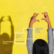
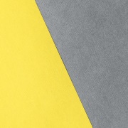
Classic Blue was meant to be a colour that represented a new chapter for the world as it entered a new decade. Suffice to say things didn’t quite work out the way Pantone anticipated in 2020. No doubt the events of 2020 have informed the institute’s pick for 2021. In a departure from tradition, the institute has announced that two colours will represent 2021: Ultimate Gray and Illuminating.

According to Pantone, Ultimate Gray is “emblematic of solid and dependable elements which are everlasting and provide a firm foundation,” while Illuminating is “a bright and cheerful yellow, sparkling with vivacity, a warming yellow shade imbued with solar power.”
Says Leatrice Eiseman, Executive Director of the Pantone Colour Institute: “The union of an enduring Ultimate Gray with the vibrant yellow Illuminating expresses a message of positivity supported by fortitude. Practical and rock solid but at the same time, warming and optimistic, this is a colour combination that gives us resilience and hope. We need to feel encouraged and uplifted; this is essential to the human spirit.”
This is the first time since 2016 that Pantone has chosen two colours. In 2016 Rose Quartz and Serenity (a soft rose and tranquil blue shade) were the colours of choice.

Eiseman explains that 2021’s selection is reflective of what’s happening around the world. “The selection of two independent colours highlights how different elements come together to express a message of strength and hopefulness that is both enduring and uplifting, conveying the idea that it’s not about one colour or one person, it’s about more than one.”
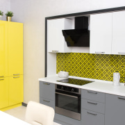
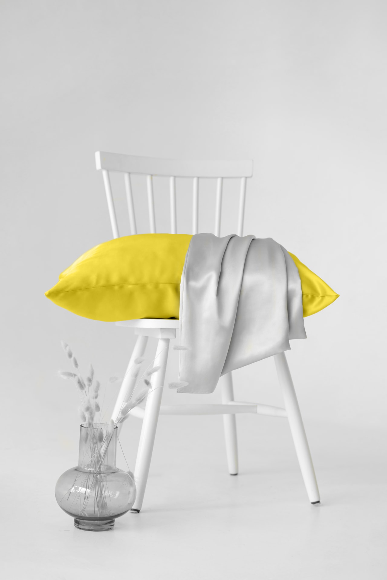
From a home décor and interiors perspective, there’s plenty of scope for Ultimate Gray and Illuminating. According to Pantone, the colours can be juxtaposed in table linens, sheeting and home accessories to infuse vitality and liveliness into just about any space. Pantone adds that the colours are an ideal combination for any office, whether in the home or in a commercial space with Ultimate Gray providing the firm foundation for Illuminating.
Of course, if Ultimate Gray isn’t quite your thing and Illuminating is too close to New Zealand’s yellow COVID announcements for comfort, there are plenty of other colours to choose from. Look online and in magazines, create a mood board or simply pop into your local paint store for inspiration. Test pots and swatches are also a handy way to see what colour or colours might work best for you.
PANTONE® and other Pantone trademarks are the property of Pantone LLC. PANTONE Colors displayed here may not match PANTONE-identified standards. Consult current PANTONE Color Publications for accurate color. Pantone LLC is a wholly owned subsidiary of X-Rite, Incorporated. © Pantone LLC, 2020. All rights reserved.
Story by: Jackie Gray-Parker
Home kitchen bathroom commercial design
Trends 37-01
In this edition, we showcase a spectacular grand home renovation along with other enviable award-winning homes. There’s ...
Read More