2020 TIDA Australia Bathrooms
See the winners, runners-up and highly commended entries in the 2020 TIDA Australia Bathrooms awards
Winner – Wolf Architects & In Design International – 2020 TIDA Australia Architect-designed Bathrooms
Symmetry plays an important role in the design of this ensuite. The round, statement bathtub wonderfully contrasts the material palette of warm wood and brushed copper fixtures.
Winner – Darren James Interiors – 2020 TIDA Australia Designer Bathrooms
This bathroom is an artistic meeting of form and functionality. A reimagined layout and rich material palette combine to create a refined space.
Winner – Mark Gacesa, Ultraspace – 2020 TIDA Australia Designer Suites
With secret panels, glittering surfaces and a pop-up television, this impressive bathroom looks like it's straight out of a Bond film.
Winner – Giorgi – 2020 TIDA Australia Architect-designed Suites
The blonde wood cabinetry and natural stone elements used in this bathroom create an aesthetic that feels like a calming day spa.
Winner – Penny del Castillo, In Design International – 2020 TIDA Australia Powder Rooms
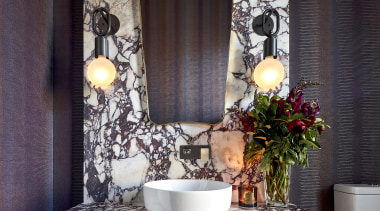
Vibrantly veined stone slabs and striking vinyl-faced wallpaper add plenty of personality into this powder room.
Runner-up – Studio Prineas – 2020 TIDA Australia Architect-designed Bathrooms
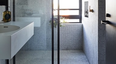
This bathroom was redesigned to celebrate the ritual of bathing, with Carrara mosaics creating a luxurious and tactile design.
Runner-up – Debra Brockman Interior Architecture + Design – 2020 TIDA Australia Designer Bathrooms
Mottled, hexagonal tiles bring a soft focus effect to this new ensuite in an addition to a family home that had undergone poorly thought through renovations in the past.
Runner-up – Iris Lev, IL Design – 2020 TIDA Australia Designer Suites
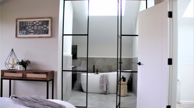
Set in the attic of a Californian bungalow, this bathroom was carefully designed around the sloping ceiling. Steel framed glass doors offer a glimpse into the ensuite.
Runner-up – Urbane Projects – 2020 TIDA Australia Powder Rooms
Carefully placed lighting in this powder room makes the polished plaster walls look like they’re peeling open. Curved edges and textured finishing add to the organic feel.
Highly Commended – Leon House Design – 2020 TIDA Australia Designer Bathrooms
A close connection to mother nature was important to the design of this bathroom. A sculptural bathtub sits pride of place to soak up the views.
Highly Commended – Penny del Castillo, In Design International – 2020 TIDA Australia Designer Bathrooms
Located in the Victorian Railway Headquarters from the 1890’s, this project sought to reverse an unsympathetic renovation, whist still creating a contemporary space.
Highly Commended – Urbane Projects – 2020 TIDA Australia Designer Suites
A raised plinth and sliding window allows ocean views to be easily enjoyed from the bathtub in this master ensuite.
Highly Commenfed – Giorgi – 2020 TIDA Australia Architect-designed Suites
The client’s love of concrete was a driving factor behind this bathroom design. An impressively long vanity bench runs the length of the bathroom creating a dramatic effect.
Highly Commended – Dean Welsh, Thinkdzine – 2020 TIDA Australia Designer Bathrooms
After removing the bathtub, this ensuite now feels much larger. Pairing a deep green vanity with bright brass fixtures and fittings adds to the opulent feel.
Highly Commended – Penny del Castillo, In Design International – 2020 TIDA Australia Designer Bathrooms
A semi-industrial palette was chosen for this bachelor’s bathroom design. The key objective was to create a space to relax and unwind.
Highly Commended – Wolf Architects – 2020 TIDA Australia Architect-designed Bathrooms
A curved mosaic-tiled wall, which follows the form of the round bathtub, is the standout design feature in this bathroom.
Highly Commended – Marc Homes – 2020 TIDA Australia Architect-designed Suites
Maximising storage without compromising design was the biggest challenge for this master suite. Mirrored overhead cabinets provide a stylish solution.
Highly Commended – Penny del Castillo – In Design International – 2020 TIDA Australia Designer Suites
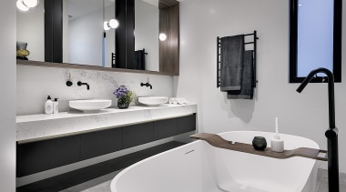
The solution for this busy family bathroom was to do things by double – double basins, double tap ware, and double showers. The result is a relaxed yet functional room.
Story by: Trendsideas
Home kitchen bathroom commercial design
Classic dovetails contemporary
Small space, big impact
Tranquil waters


