Yin and Yang
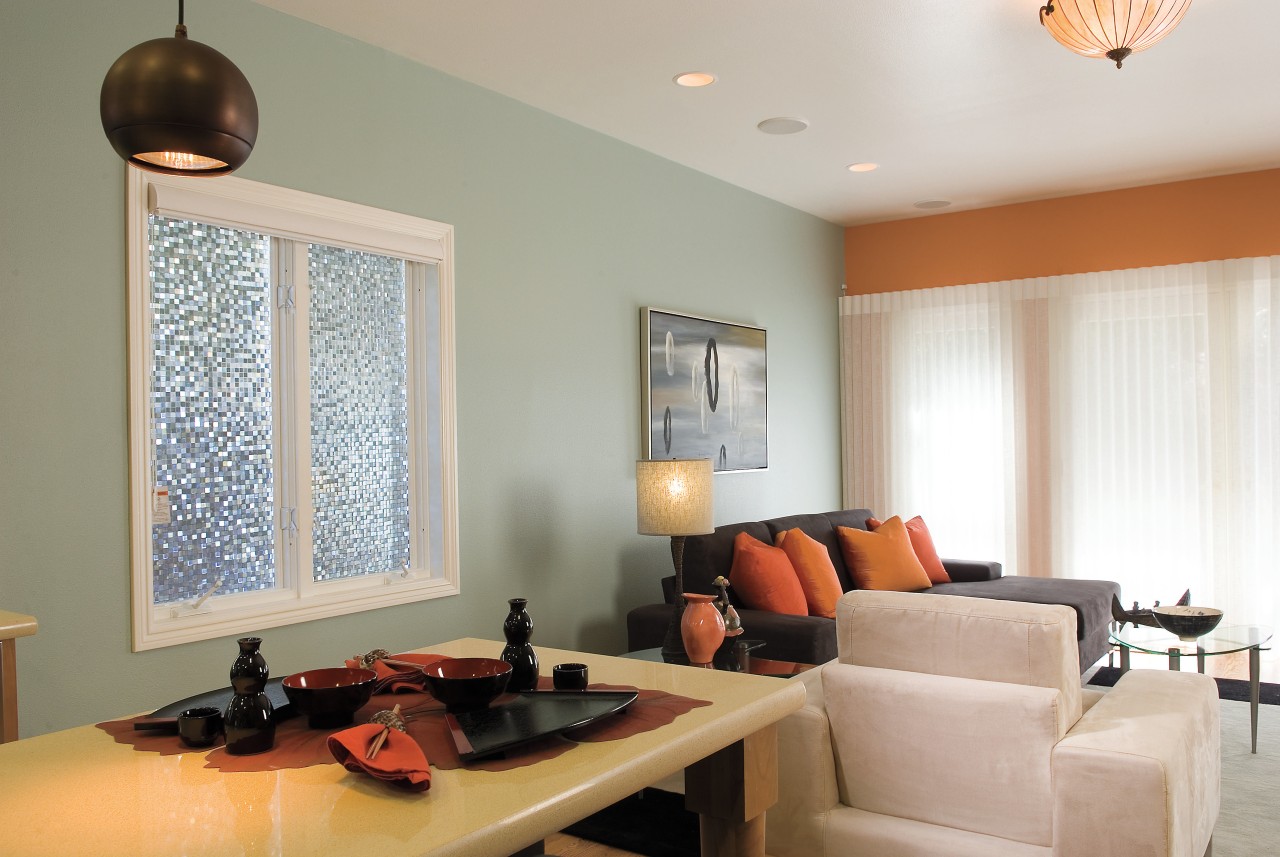
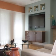
This home interior is both tranquil and welcoming, thanks to a subtle mix of cool and warm tones from the Kelly-Moore paint palette


Designing a home interior can pose a color dilemma do you opt for cool tones to enhance a sense of retreat, or choose something more edgy to provide a lively, stimulating environment?
For the design team at SEA Construction, the solution for this remodeling project was to provide a mix of both. Several walls in the family living room are painted in Kelly-Moore Mystic Lake a soft turquoise-blue tone that creates a tranquil look.

Designer Alie Varner says the blue-gray shade echoes the color of the flecks in the new kitchen countertop. The color also links the interior to an Asian-inspired outdoor area, which features a koi pond and Japanese maples.
To add a little spice to the interior, however, the team combined the blue with Kelly-Moore Prairie Island, a warm, orange-based color that provides a bright accent. This shade is also repeated in the accessories, such as the pillows and ceramic collection.

SEA Construction president Steve Albert says his team frequently specifies Kelly-Moore paints. The company, which works on many high-end residential projects in the San Francisco Bay area, appreciates the quality of the surface finish provided by Kelly-Moore paints. The extensive color selection is another bonus.
For information on Kelly-Moore colors and paint types, contact Kelly-Moore Paint Company, phone tollfree (888) KM Color (562 6567). Website: www.kellymoore.com. To contact SEA Construction, phone (650) 287 4202.
Story by: Trendsideas
Home kitchen bathroom commercial design