Victorian secret
In an age of contemporary spaces, it is important not to overlook the charm of classical decor

The merits of minimalism are welldocumented the clean lines, the lack of clutter and an appreciation of what's not there rather than what is. Yet there are still many homeowners who gravitate towards the rich feel that antique furniture and art can bring to a home.
Antique dealer and interior decorator Roy Williams says the skill of tastefully combining furniture and accessories has all but disappeared during the latest minimalist movement.
"During the 1980s there were many excellent examples of homes decorated in a classical style. The minimalist ideal is about stripping everything back to its core ingredients, while classical tablescapes use complex arrangements to create depth. It takes an experienced eye, because each item must be exactly in its place."
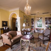
The Victorian home featured on these pages has been decorated to have an organic feel to it. The owners did not want to give the impression that the house had just been thrown together over a short period of time, but had rather developed over many years.
"The homeowners and I have shared similar tastes for a long time, and the decoration represents the culmination of a 17-year project," says Williams.

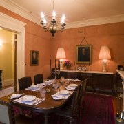
The owners are also on the growing list of Williams' clients who prefer to entertain dinner guests in the comfort of their own home, resulting in a greater demand for larger tables like the Victorian one in the formal dining room.
"Rather than going out to a restaurant and having their conversation ruined by the noise, my clients often prefer to hire a chef and a waiter and have their dinner parties at home," says Williams.
With such a large main living area, one consideration was how to configure the space with respect to the seasons. The owners wanted separate living areas that would function in different weather as well as with varying levels of formality.
"The breakfast area is right next to the kitchen and looks out onto the back courtyard and swimming pool. This is the place where the owners spend a lot of time during the summer months. It has plenty of early-morning sunlight as well as French doors that allow a cooling breeze to flow past the table. The owner specified that the breakfast table needed to be large enough to solve the age-old problem of two people reading the newspaper simultaneously," says Williams.
The tertiary living area is slightlymore formal and forms a break between the breakfast area and the winter living area. The owners use this area to watch television, which they conceal inside a large linen press, with other multimedia equipment.

The kitchen is in the English town house style and as such is not the central point of the home as it is in many modern houses. It is also quite small, but some well-designed cabinetry and the central island make it very functional. The change in levels is meant to separate the kitchen from the breakfast area, which prevents it from interfering, but the clear line of sight still allows verbal and visual communication between the cook and the diners.
Besides the dishwasher and the oven, there are very few clues that there have been any significant modifications since the home was originally built. Williams and architect Doug Shields agree that the owners' brief for the kitchen was simple.
"Convenience combined with the warmth of an old country kitchen. All materials, mostly marble and real wood, were chosen for their beauty, robustness and durability, and the fact that they age well. One does not have to be careful or precious about them," says Williams.
The bedroom and ensuite continue the trend of modern convenience matched with the classicism of Victorian features. Shields says his biggest challenge was getting the details correctly proportioned.
"It was important to find a compromise with the vanity and the shower. If we made them too small, they looked mean. But if we made them too large, they would look overblown and too modern. Then we had to fit them into the limited space we had in which to build a bathroom and a dressing room," says Shields.
Story by: Trendsideas
Home kitchen bathroom commercial design


