Up and running
Solid, but not flashy this new head office for a Waikato trucking firm reflects both the professionalism and streamlined efficiency of the business, says the team at Insight Architecture

Running a successful company isn't necessarily dependent on smart premises, but there comes a time when working out of the back of an old office building and Portacoms doesn't quite cut it.
For Hamilton-based Regal Haulage, a large trucking company employing nearly 200 staff and drivers, that moment had well and truly been reached. The firm consequently commissioned Insight Architecture to design a new, purpose-built office building and it needed to be completed in time for the company's 21st anniversary celebrations.
Architectural designer Matt Hodson says Regal Haulage is a highly successful, solid company with a professional and efficient operation.
"The new premises needed to reflect this image," he says. "But at the same time, there needed to be a recognition that margins are tight and this was not the time or place for an overtly flashy, expensive building. It was important that the architecture acknowledge the longevity of the company and its solid, industrial background, without appearing wasteful."
Hodson says the design of the building was restricted by the boundary setback from the highway, the existing workshop, and by the need to leave room for trucks to manoeuvre on site.
"This left a narrow strip of land for the building site, which is very flat to the road. For this reason, it was essential to visually anchor the entrance on the street front. We needed to create a sense of arrival and give the building a presence, without going over the top."
Working closely with the main contractor Andy Dew of Form Building & Developments, the team delivered the project on budget and within tight timescales. Dew says, from start to finish, the project took only ten months. All the building works took place without obstructing day-to-day operations of the haulage business and were completed in time for Regal to celebrate its 21st anniversary.
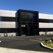
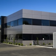
The design team chose to clad the building in bands of Aliclad aluminium composite wall panels, which also wrap around a large square archway at the entrance.
"The Aliclad introduces a very modern look," says Hodson. "While the bands on the building are grey, the panels around the entry arch are glossy black, not unlike a polished granite. To enhance the link between indoors and out, we continued the black panels into the reception area. This also brings the semi-industrial feel into the building."
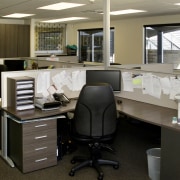
Hodson says it was important to create a quiet zone inside the office, as the industrial noise levels outside are very high. For this reason, the windows are double glazed and do not open. And the glass is tinted to minimise solar gain.
"The dark windows blend well with the Aliclad panels and create a sense of visual layering," says Hodson. "It's a very seamless look, designed to reflect the streamlined efficiency of the business."
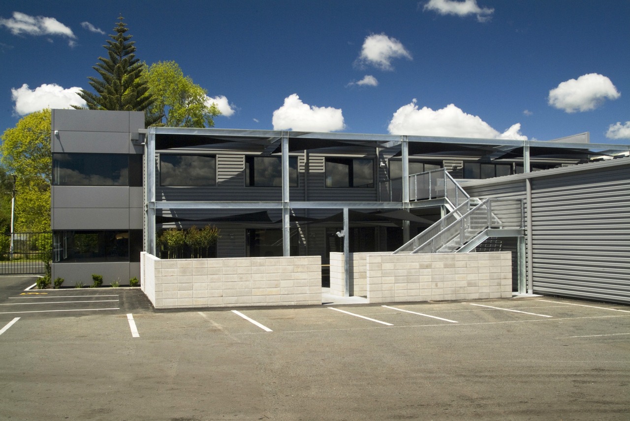
Dew says the semi-industrial look is more evident at the rear of the building, where the structure of the building is expressed visually.
"Exposed steel beams and columns frame shaded balconies, highlighting the engineering aspect of the firm's business. Regal Haulage manufactures its own truck bodies and trailers, for example, and we wanted to incorporate some of this culture into the building's design and construction."
Dew says perforated metal stair treads were installed in this area, so the dirt gets knocked off the workers' boots before they enter the building.
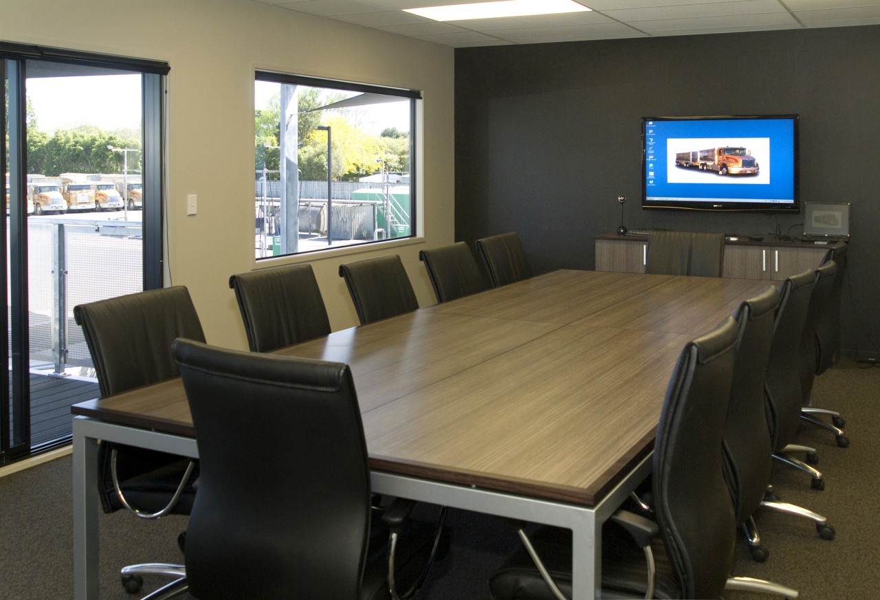
Inside, many of the spaces, including the managing director's office, boardroom and staffrooms, overlook the truck yard, ensuring there is always a strong visual connection with the core business.
There is also a double-height void at the entry, with a mezzanine landing on the top floor. This maintains a visual link between the offices and reception area.
"There are two clearly defined areas in the building one for the office workers and one for the truck drivers and workshop staff," says Hodson. "For example, there are two staffrooms, one on the top floor and one on the lower level. Both of these open up to the outdoors, and can be used for social events."
The boardroom also opens up to the upper balcony. Operable doors link this room with the staffroom, so the entire space can be opened up for large gatherings.
The balconies feature large shade sails and a low-maintenance composite decking, which is made from a resin and wood fibre product.
"This material is ideal for the location," says Dew. "The decks will never need painting or staining, and will not warp over time."
The project did not simply involve the construction of a new building, however. It also included the renovation of an existing workshop building, and the demolition of another building. Wherever possible, concrete floors were salvaged for re-use.
Brett McHardie of Regal Haulage says the new building is a credit to all involved.
"We appreciate everyone's contribution, from the way in which the project was planned and designed, through to the way in which every person involved in the build worked with us. Although sometimes intense, the project was always a pleasurable experience."
Hodson says the Regal Haulage project recently won the Commercial/Industrial ADNZ/Resene Regional Design Awards for the Bay of Plenty Region, and will go forward to the National Awards in October.
Insight Architecture regularly works on commercial projects, both large and small. The firm, a member of Architectural Designers New Zealand Inc, also undertakes residential work, master planning, feasibility studies and interior design work.
Story by: Trendsideas
Home kitchen bathroom commercial design


