Tranquil appeal
A minimalist, yet refined feel defines this kitchen
The U-shaped kitchen is a classic design, but it can easily be given modern relevance the secret lies in the forms and fine detailing.
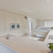
This crisp kitchen remodel was created by designer Kira Gray. The owners had asked for a restful, contemporary and spacious design that would blend with the beachside environment and optimise outlooks to the views, says Gray.
"Their first request drove the look," says Gray. "They did not want an island, so I designed a U-shaped kitchen and set it between the lounge and the family room. With fold-around cabinetry on one side and a wall of ovens, refrigerators and storage on the other, the central space offers uncluttered sightlines to the sea from the rear of the open-plan room."
Another advantage of the U-shaped layout is that the cabinets break up the flow of the space, making the elongated room seem wider.
True to the owners' requests, Gray gave the protruding cabinets a quiet, clean-lined air.
"I introduced a set of raised cupboards in washed ash veneer at each end. These ground the workspace and because the owners didn't want seating, they also act as leaners. In addition, these taller elements shield any kitchen clutter from the adjacent living spaces.
"Aluminium edge detailing on these cabinets ties with the recessed handles on the drawers and high toekicks, which are in the same material."
To reduce the heaviness of the substantial pieces, Gray cantilevered the cabinets at both ends. However, it is the finer points that give the kitchen an air of craftsmanship and refinement.
"The CaesarStone waterfall benchtops and upstands add to the serenity of the design."
The wall opposite houses dual pantries, two refrigerator-freezers and two ovens but only a flat plane is visible from the end of the room.
The sandy hues of the two-tone kitchen echo the beachscape beyond.
Story by: Trendsideas
Home kitchen bathroom commercial design
'Worthy of Architectural Digest'
Small space, big impact
Classic dovetails contemporary


