Time and tideline
This attic studio renovation is divided by a tide line – everything is new, sleek and finished above the line while everything below it is old or a reflection there of
Designed by Firm Architects
From the architecture firm:
The aim for this project was to create an honest, masculine, and architectural space with the largest possible usable floor space.
This was to be no standard home, with no compromises.
The brief was for a unique and made to measure, sustainable apartment.
From here, Firm Architects designed and realised a conceptual living environment from scratch.
Environment
This top floor of the building, located in the popular district De Pijp, Amsterdam, was formerly used as an attic and was not suitable for living in.
To turn this old attic into a livable space, the previous owner raised the roof about fifty cms a few years ago. After this, it was sold as a renovation object to the current owner.
Concept: “reflections”
The new elevation of the space was realised by making a ring of dirty masonry around the old base, laying the largely renewed roof beams on top.
This principle of the space itself, a new elevation on an old basis, has become the starting point for the design.
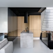
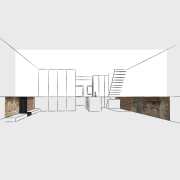
In the design, the entire space is visibly ‘cut through’. This cross-section is placed at a height of 95cms above the floor.
Above the horizontal cross-section, everything is new and covered in rendered and isolated walls, sleek and finished.
Everything below this line is old or a reflection of it.
The walls here are bare and rough and the use of dark mirrors, unfinished zinc sheets, and rough bricks creates a special composition of materials.
The zinc part above the line reflects a lot of light into the room, but the reflection itself is blurry.
The dark mirrors reflect less light but do give a sharp image.
This makes everything above the “section” a new interpretation and everything below a reflection of the old. The line at 95cms has both a practical and a more poetic origin.
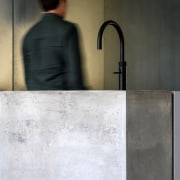
It is the height of kitchen doors and railings – and it is the central point of a man’s body.
Standing with your lower body in the old and your upper body in the new reflects being rooted in the past and looking to the future.
Firm Architects thus centralises the physical user in its design.
The concept, therefore, is named “reflections of the past.”
This gives the premise of the space itself an architectural translation in the design and creates a clear difference between old values and new interventions.
This conceptual approach to space and its rendering in all custom-made elements is characteristic of the work of Firm Architects.
Space layout and material use
The journey through the apartment starts when you open the front door.
The hall is painted all black and the old staircase is bare and rough.
Above that is a custom perforated zinc staircase.
This hangs 95cm above the floor and connects the apartment with the roof terrace.
The light of the roof hatch shines through the perforations down to the dark entrance and if you look up, you can see the sky.
At the top of the stairs in the living room, your gaze is directed outwards through the sliding glass door, which occupies the entire width of the building.
The profile of this frame is concealed in the walls, floor, and ceiling.
This creates an almost frameless facade of glass in a place where originally there were only two small windows. The living room is an open/light space that can be connected to the master bedroom by retracting a large wooden sliding wall.
A television and cupboard space is located behind 90cm wide custom doors that draw smoothly to the side. In order to make the space appear as large as possible, Firm architects has chosen to place a single volume in the space.
Except for the living space and the master bedroom, all other functionalities such as bathrooms, toilets, laundry room, and guest room are concealed in this reflective box.
Access to it is rendered invisible by a pivot door finished in the same materials.
A particular part of the mirror cladding of the block is actually not a mirror, but reflective glass.
This allows for a semi see-through view from the living room to the bathroom.
Plus, a skylight has been placed above the shower so that you can shower under an open sky. The skylight also floods the bathroom with daylight.
Climate/sustainability
The fully openable glass facade on the south facade provides natural heating.
The 17cm floor insulation, the insulated walls, and the form of the outside insulated roof ensure the inside temperature remains stable.
The single large net curtain can cover the entire rear facade, but when opened it does not block any part of the sunlight coming in due to the curved rails on which it hangs.
The curtain ensures maximum heating on cold days, while on sunny days – in closed state – it ensures not too much heat enters the house.
In the meantime, the wind can blow through it and the ventilation it provides is important for good temperature management.
The roof hatch above the entrance on the side of the house is electric and can be opened on hot days while the perforated zinc staircase under the hatch reflects most of the sunlight. And because the warmer air can escape at the highest point of the space, a natural draft is created.
Firm Architects borrowed this natural ventilation principle from tropical architecture and this arrangement keeps the house pleasantly cool in the summer.
In winter, the insulation keeps the heat in.
As a result, the gas consumption for heating is only a 1/5th that of a regular apartment.
Credit list
Renovating architect/project architect
Designed by: Firm Architects
Story by: Trendsideas
Home kitchen bathroom commercial design
Small space, big impact
Classic dovetails contemporary
Tranquil waters
Trends 37-10
Check out all the latest stories in Kitchen, Bathroom and Home design featured at trendsideas.com over September. Whethe...
Read More


