The layout of this playful apartment was redesigned to create more space
You can't add space to an apartment – but could you make better use of the existing space? That's exactly the outcome for this clever rethink of an existing dated layout.
Designed by Lim+Lu
From the designers:
First and foremost, Lim+Lu considered how the modern-day individual uses the home. More often than not, homeowners need to be adaptable in multiple situations.
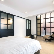
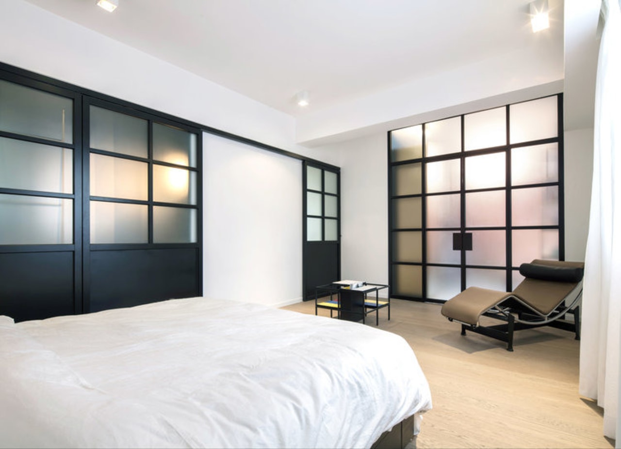
The idea was to free up the space all the while maintaining the option for privacy. Equipping the space with suspended glass and black powder coated stainless steel sliding doors, Lim+Lu has created a flexible and adaptive living environment that better reflects today's transient lifestyle.
Prior to the renovation, the interior had the typical characteristics of a Hong Kong apartment; a long and narrow corridor devoid of light, which serviced three bedrooms and distinctly demarcated spaces for the kitchen and living room, all in a tired and muted color tone.
Lim+Lu’s apartment transformation creates a flexible living environment that reflects the versatility of modern day living. Simply by way of removing and restructuring certain walls in the space, the resulting interior is designed to appear more expansive.
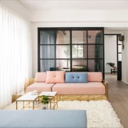
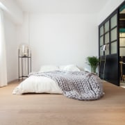
The core living space comprised of the living room and the bedroom are unified by the continuous warm oak flooring which also blurs the boundary between the public spaces and the private spaces in a home. The narrow corridor was demolished in favor of the new master bedroom.
The designers also converted the bedroom adjacent to the main living area into a flexible space with suspended sliding doors. This shape-shifting room is adorned with a striking jade green drapery that allows the option of being an extension to the living room space or enclosed as a guest bedroom.
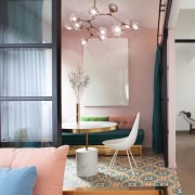
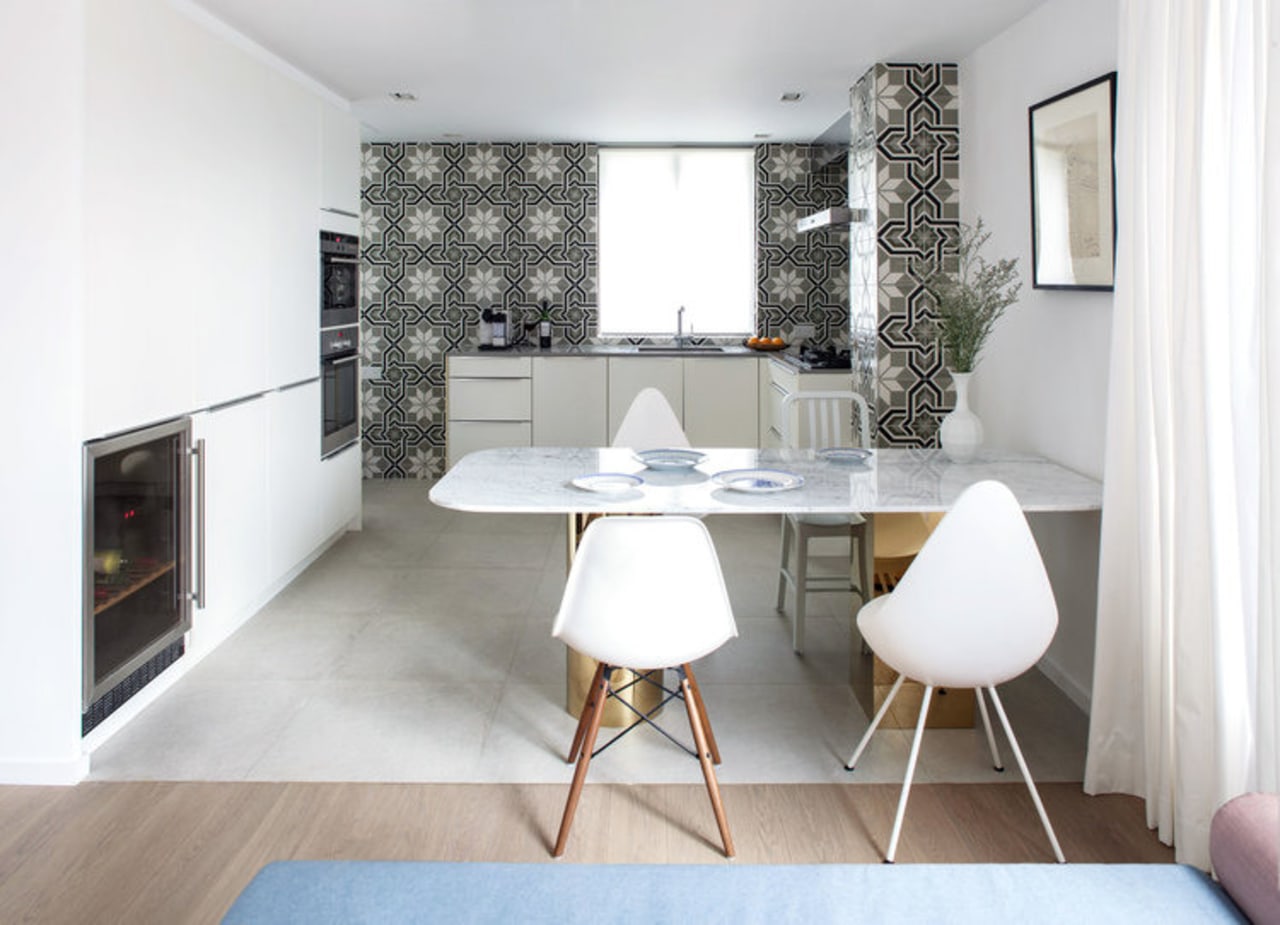
Colours were deliberately chosen to inject fresh life into the space. Walls in the living room and bedroom are painted white with black accents, signifying spaces of rest and relaxation. Meanwhile, the kitchen, study, walk-in closet and master bathroom are all host to rich pastels and dark hues, tastefully combined with patterned ceramic tiles provide contrast with the core living space.
The thresholds created by the subtle distinctions of colour, texture and material maintain a fluidity to allow the space to still blend effortlessly together as one.
Home kitchen bathroom commercial design
Classic dovetails contemporary
Small space, big impact
Continuity meets subtle separation


