Taming grandeur
This interior succeeds in making a grand, contemporary residence feel more like a warm, family home and less like a commercial space or hotel


Interior design by Michael Habachy Designs
From the interior designer:
Our homeowners are a family of seven – including three sons, a grandmother and a Bernedoodle.
They were in the beginning stages of building a 929m². custom home in the Tuxedo Park neighborhood of Buckhead, when they asked us to design the interiors.
Clean, minimal and neutral
They wanted a clean and minimal look that would complement the home’s modern architecture, as well as a neutral palette throughout.
With all of this in mind, we decided to create interiors inspired by their favourite Aman resorts.
It was important to make the spaces feel not only luxurious, but also organic and inviting. We were involved in all aspects of the design from the start, coordinating with the architect, Robert Tretsch with Harrison Designs, from the beginning very planning stages.
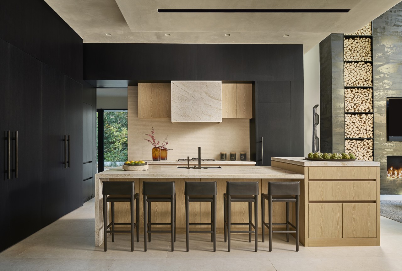
Our firm designed many interior architectural features, from the custom kitchen and bar, to the Shou Sugi Ban clad wine room, to the towering kindling fireplace feature in the great room.
Engineering underpins drama
We also designed other built-in millwork features throughout – we love to push boundaries, but that can require some engineering feats.
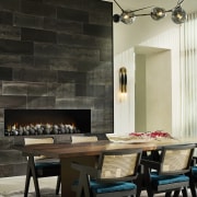
The great room fireplace, has an asymmetrical firebox opening and the vertical steel-clad wall juts out and cantilevers to the right.
In order to achieve this aesthetic, we had to ensure that the structure would not sag from all of the weight above and to achieve this several internal steel structural brackets were added.
Another challenge was designing the towering shelving, which stores all of the wood kindling.
This needed to look seamless and minimal, so we kept the shelves thin and they are constructed from .6cm steel plates – the steel boxes stack on top of one another, fastening to each other and the walls internally. Another challenge was the grand scale of the home.
The ceiling heights are high, and if not addressed properly the house could have felt cold and uninviting.

A human scale
We used various design elements to bring the eyes down to a more human scale.
One example is the custom kitchen millwork – the kitchen ceiling is 13.6m high, so we created a visual division with the cabinets using natural and ebonised rift oak.
The lighter wood finishes out around2.7m off the floor, which really helps the kitchen feel more approachable and inviting.
Cooking considerations
We also had to take into account their lifestyle.
The owners wanted light countertops and floors, but needed materials that would hold up and be forgiving.
The family does a lot of cooking and uses spices that stain easily, like turmeric and cumin – they also love lemon juice in their recipes, which can etch some countertops – so we specified leathered natural quartzite slabs, which were sealed with Dry Treat for extra protection.
They also wanted a second working kitchen, but we didn’t locate it in a separate room – the grandmother often does the cooking, so we didn’t want to keep her alone in the back.
To avoid this, we managed to integrate the second 'working' kitchen within the main kitchen, and kept it concealed behind four massive, folding doors, which close off the space to conceal clutter.
This second kitchen is fully equipped with two dishwashers and a massive galley sink for prep work, as well as other appliances.
Individual yet harmonious spaces – bathrooms included
The homeowners wanted us to make each space uniquely different, yet ensure that materials and finishes flowed harmoniously throughout.
Each of the seven custom designed bathrooms has unique features.
The formal powder bathroom is dark and moody, and is clad in floor-to-ceiling ebonised wood panels – blackened steel flat bars frame the smokey bronze, antique mirror and a custom marble vanity with fully integrated basin.
The bathroom off the pool has a more playful and relaxed vibe – this features an accent wall of patterned cement tiles, a unique vessel sink (part of the counter is cut out and inserted inside the basin to hide the drain), and a pair of whimsical pendant lights.
We also brought in blackened steel again with the custom fabricated mirror, which brackets and suspends from the ceiling.
Theatre & bar
For the theatre, we enveloped the walls in dark plaster and designed a live-edge walnut media cabinet for storage – the organic textures and plush leather seating create a perfect environment for nestling in for movie night.
The nearby custom bar is clad in walnut, and features our own graphic tile collection on the bar die.
Flooring
When selecting light floors, we had to keep in mind that three boys and a huge dog can cause a lot of wear and tear.
Most floors on the main level are large format, white limestone looking, Italian porcelain tiles.
Other floors are wire-brushed, character grade, white European oak hardwoods that do a good job of camouflaging scratches.
Plaster on most walls and ceilings provides durability, as well as giving a warm and inviting feeling. (If the walls are scuffed, a fine grit sandpaper should get the scuff right off.)

Light yet durable furnishings
The need for durability was also challenging when selecting furnishings that we wanted upholstered in light fabrics for a resort look-and-feel.
We specified some performance fabrics suitable for hospitality projects, such as worsted cashmeres and wools, and contract grade Sunbrella and Crypton.
Master bedroom feature
We created the feature wall in the master bedroom using a collection of architectural millwork panels called Fractal by Smith and Fong’s Plyboo.
They offer multiple graphic patterns which have been CC carved and constructed from 100% bamboo.
To give it a floating appearance we had the builder create a trough / light well that would surround all of the panels and illuminate them with a soft glow for ambience in the evenings.
Rich textures – limestone & charred Cyprus wood
To add rich textures, we clad the fireplace in the dining room with a leathered / antique brown limestone, sourced through Walker Zanger.
The finish looks as if it had been worn for centuries and it contrasted the clean white walls and white limestone floors.
On the other side of the dining room is the enclosed wine room, completely clad in an age old Japanese material called Shou Sugi Ban which consists of a charred black cypress wood.
Both the limestone and charred wood surfaces add a lot of warmth, and richness to the space.

Statement lighting
Decorative lighting can really make a statement in a space – a chandelier or lighting element can feel more like a work of art or a sculpture than a utilitarian design fixture.
The dining room was surrounded by windows with no walls to place art – so Lindsey Adelman’s sculptural chandelier in hand blown glass with cast bronze details, from her Burst collection, provided the perfect focal point.
The globe light fixtures seen over the bar – TR Bulb suspension, from Danish company Menu Design – they also make a statement, just offer more of a fun, retro look and feel.
The wall sconces in the theatre are minimal but impactful when installed in multiples – they are made from walnut and steel and illuminate the wall with an indirect glow – also the lighting accentuates the dark charcoal plaster walls.
In the jungle – bedroom theme
As we got to know the three boys, we were able to base each of their room designs to reflect their passions and interests.
The youngest son had recently gone on an African safari with his family and absolutely fell in love with all of the animal life there.
So, when we came across the Bellewood wallpaper mural from Rebel Walls, we knew it was perfect for his room.
We love doing murals because they are so impactful and of course we were able to scale it perfectly for the two walls that enveloped the boy's bed.
The monkey lamps from Seletti complete the fun and whimsical look.

Colour and cohesion
One of the main ways we kept things cohesive in the home was through choice of materials and the overall colour palette.
The owners wanted a neutral palette – one loves blacks and whites, but we knew that could end up looking quite harsh, so we softened the use of these tones with lots of other neutral cool and warm shades and wood tones.
We were big on keeping the spaces on the upper levels light and airy with the occasional dark accents, and on the lower terrace level ( where the bar and theatre live), we did the opposite by selecting dark rich finishes for the walls with lighter furnishings as accents.
Simple yet warm and inviting
The couple did not want a cluttered look, so we kept all the spaces simple and not overly decorated – yet it was important for us to make the rooms feel warm and inviting.
A big part of that came from our selection of neutral and organic materials seen throughout.
Textured fabrics like wool boucles ( a loop pile fabric), nubuck (buffed) leather, alpaca and linens were all a big part of making such a grand, contemporary home feel more like a home and less like a commercial space or hotel.
Credit list
Interior designer
Awards
House architect
Home kitchen bathroom commercial design
