T2 stores rolled out around the globe, defined by dark interiors, colourful packaging
T2 tea retail stores designed by Landini Associates feature dark interiors with raw and exposed materials, tea library, tea-making demonstrations

Baristas move over tea has become the hip drink of the western world. And one store can take a lot of the credit for renewed interest in a drink that can trace its roots right back to the Tang dynasty in China in 206 BC.
The T2 brand, launched nearly 20 years ago, has recently undergone a major overhaul by Sydney-based Landini Associates. Designer Mark Landini says the first project to be completed was the new T2 headquarters in a former industrial warehouse in Collingwood, Melbourne.
"The aim was to respect and celebrate the original building, while providing a dramatic statement that would represent T2's company ethos," he says. "This ethos is the antithesis of what you would expect in other words the polar opposite of a traditional tea house. It's all about making tea cool and hip, and attracting a whole new audience."
Landini says perceived constraints, including a street frontage that was lower than the main entry, were turned into an advantage.
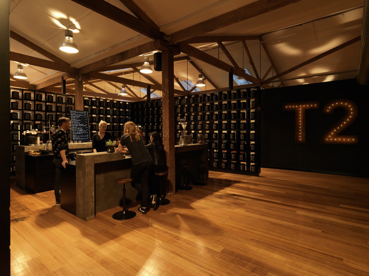
"The public is ushered into the space through an oversized steel-framed pivot door in a double-height space. Instead of a conventional reception area, there is a Tea Bar, which is an informal place to stop and sample tea.
"The Tea Bar personifies the T2 identity, and also acts as a trial concept for T2's latest tea retailing concept, T2B. The dark shelving and raw materials, including the large concrete bar, are similar to those used in the T2B project."
In contrast to the public entry, the staff entry is from the upper level car park at the rear, with a wide catwalk leading into the centre of the office. The catwalk and a sleek black steel panel alongside form the visual spine of the building, dividing the office in two. The warehouse origins are recalled in the warm, raw industrial interior of this space, which features exposed steel brick walls and timber rafters, and a mesh frame balustrade."
A similar look continues on the upper level, where there is a tea-making and tasting workshop, and the CEO's office. Here, however, a lighter colour palette was introduced to create a white, clean space that is flooded with natural light.
Landini describes the change to the T2 stores as more of an evolution than a revolution.

"The look has evolved with each store," the designer says. "The original DNA the dark interiors and Chinese wallpaper was already in place in the 20 existing stores. But we have expanded on this base, limiting the use of bright colour to the packaging rather than the decor.
"The T2 HQ trialled the tea-making service offered in the second project the first T2B store in Sydney. This in turn was followed by the first Shoreditch T2 store in London, which introduced the new trading format. And this was not just about the design but also about location. Shoreditch was a somewhat unexpected choice, which was deliberate. Once T2 established its credentials in this cutting-edge location, we felt we could then go mainstream."
The T2B store, shown on these pages, is primarily in the business of selling brewed tea to take away or be consumed on the premises.
Landini consequently exemplified the team's expertise and love of tea by introducing a sense of theatre. A large cast-concrete bar showcases the art of making tea, and the store encourages customers to experiment in designing and blending their own brews.
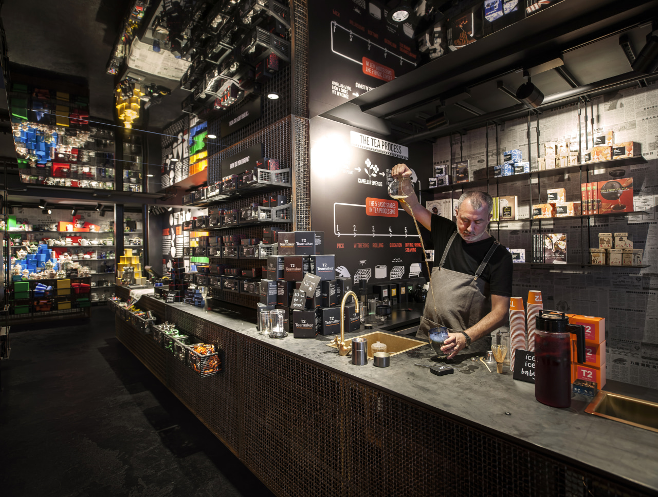
"We added further drama with an angled ceiling mirror installed over the bar," the designer says. "Other features include the Tea Library at the rear of the store, made from black oxidised steel shelving and canisters. This dark palette allows T2's trademark orange packaging to stand out under the intense lighting."
A narrow steel ledge provides a dry bar a place to stop, drink and chat. It also serves as a safety rail, protecting customers from a dramatic change in the floor level.
Two back-of-house areas are hidden behind a vertical bank of screens that display film of rushing seas and swaying forests. There is also a massive pivoting door concealed behind the tea packaging.
Landini says in all the stores, the little cube boxes with four tea packets in each are a strong graphic component and part of the interior design.
"They celebrate the ordinary," he says. "In all the locations we have tried to introduce a neutral personality with the decor. It is important that the store does not dominate the product, which is the most important element."

The Shoreditch store, shown on these pages, incorporates promotional graffiti signwriting that reinforces the new hip image of tea. The black oxidised metal of the shelving reappears on the exterior, where it envelopes the front of the store.
"As with all the new stores, Shoreditch has a raw, stripped-back interior that serves as an antidote to the polished slickness of traditional British tea houses," says Landini.
"A 30m-long tea library, housing more than 250 different varieties of tea, immerses customers in a knowledge bank of blends from around the globe. At the heart of the store tea-tasting stations and aroma tables invite customers to stimulate their senses of taste, touch, smell and compare the different ingredients and fragrances."
Transparent display counters made from layers of interwoven welded steel expose the inner workings of the drawers from pulls to brass pipes, fittings and sinks. In addition, the store showcases teaware from around the world.
T2's presence in the United States is also creating a stir. Landini says Americans may love their coffee, but there's a quiet, lightly caffeinated trend brewing.
"The global rivalry of bean versus leaf has finally reached its boiling point, with the opening of T2 in Soho, New York. The store demonstrates that tea is a vastly richer, broader, more colourful drink than coffee ever can be. The sheer visual contrast of the industrial metal interior with the brightly coloured cubic boxes that cascade from ceiling to floor grabs the attention of passers-by on the busy street. As customers enter, they are met with myriad aromas and tastes, as diverse as the population base."
Landini says the New York store features the largest T2 tea library to date. The double-height oxidised steel shelving houses a similar variety of teas to the Shoreditch store, gathered from around the globe.
Not surprisingly, the T2 store concept will be expanded gradually to other cities, further extending the global reach of the brand.
Credit list
Project
Designer
Story by: Colleen Hawkes
Home kitchen bathroom commercial design
Commercial Design Trends Vol. 31/7
Commercial Design Trends is aimed at our professional readers, and showcases commercial buildings. The book features reg...
Read More


