Sweet success
From mixed assortments to mixed use the Heards sweet factory in Parnell is now home to a collection of high-end apartments, boutique offices and retail outlets


Mixed-use development has often been touted as the ideal solution to the increasing demand for high-end, urban residential accommodation. But there's nothing new about the concept in New Zealand in the 19th century many high-street shops were built with dwellings on the upper level.
Despite many studies on the benefits of such developments, however, acceptance for the concept has been slow. A North Shore City Council report in 2005 said developing a mixed-use project is often seen to be more complex than developing a single-use project. This can lead to some developers, investors, marketers, and lending institutions being more reluctant to take on an unfamiliar type of development.
But the same report says there are numerous examples, both in New Zealand and overseas, that illustrate that if a mixed-use development is well sited, planned and designed, it can be extremely successful.
The latest such project to come on stream in Auckland is the Art Deco Heards building in Parnell, which has been redeveloped by the Medina Group. Originally a sweet factory producing liquorice allsorts, toffees and other confectionary lines for Heards, the building fell into disrepair after the company moved its business to Waiuku in 1973.
Athol McQuilkan of the Medina Group says the sheer size and solidity of the landmark building, and its heritage value, appealed to the company.
"We recognised it had a lot of potential they don't build buildings like this any more," he says. "Everyone on the team was passionate about preserving the distinctive heritage aspects of the facade. We also saw an opportunity to create a very upmarket mixed-use development the location is highly sought after."
The Medina Group commissioned Ashton Mitchell Architects to design the refurbishment. Architect Peter Ashton says the five-level building was effectively gutted to accommodate two floors of apartments, two office floors, and ground-floor retail outlets.
"The project was originally planned to be a staged development, with more apartments. But as the planning progressed, the brief changed and it was decided the top-floor penthouses would be more upmarket, so they are larger than originally planned, and there are fewer of them. Similarly, floors that were going to allotted to smaller apartments became boutique office space."
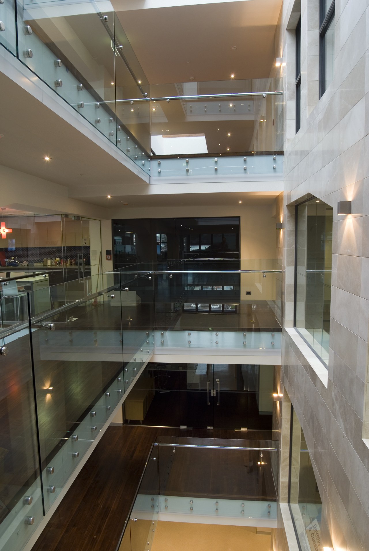
Ashton says the size of the factory's continuous floor plates, and the existing stud height meant little natural light penetrated the interior.
"To overcome this problem, a large hole was cut right through the centre of the building, creating a void. This not only introduces light and air, it was also a way to give the building a living, beating heart."
Both the boutique offices and the apartments are open to the light well, with walkways and bridges helping to animate the space. Large windows in the apartments overlook the void, ensuring plenty of natural light enters rooms on this side of the building, while shutters provide privacy.
Ashton says existing structural elements determined many of the architectural features, including the shape of the large openings overlooking the void.
"This is a very gutsy building, originally built to hold the heavy factory machinery. Consequently, there are immensely thick walls and beams haunched back into the columns for structural rigidity. The shape of the openings accommodates the angled corbels. These structural elements are part of the intrinsic character of the building, so we didn't really have a problem in leaving them exposed."
Ashton says one of the most significant discoveries was the fact that the building wasn't square, or level.

"In any heritage building there are buildability issues. For this project, we couldn't be entirely sure whether the structure at the top was going to line up with the rest of the building. This meant we were constantly making adjustments even the facade was not straight and true."
A completely new structure was built to accommodate the top-floor apartments, replacing a former rooftop lean-to. Ashton says being able to build to the existing height of the building meant the apartments could be at a higher level than would have been possible with a new building.
"Although set back from the sides of the building, this new structure needed to work with the rest of the facade we needed to take into account the rhythm of the windows for example. Being able to incorporate extensive decks helped with the articulation of the back facade, which could otherwise have been disjointed."
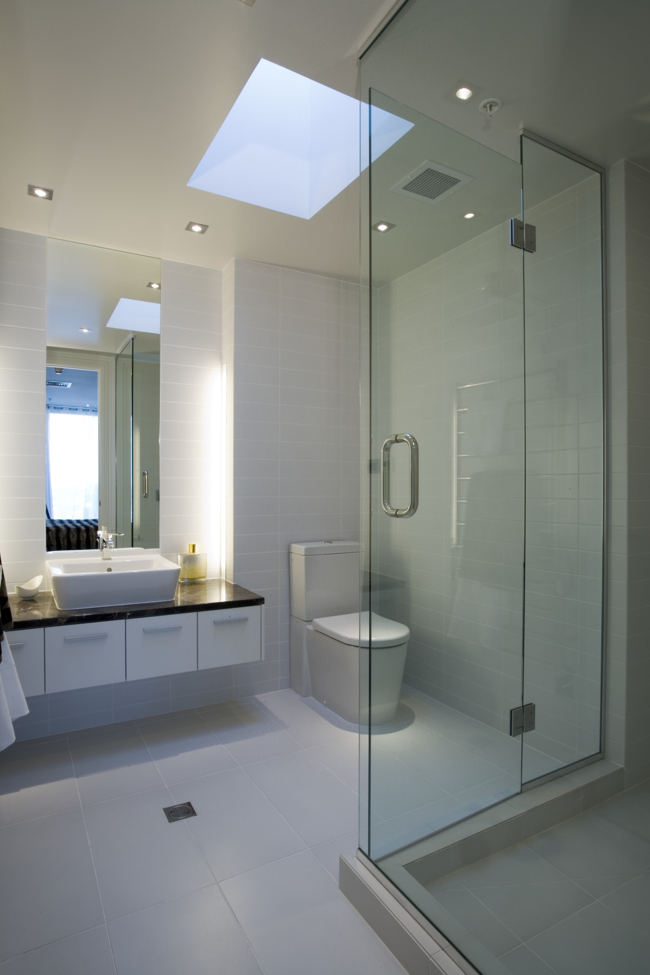
Not surprisingly, the apartments are designed to maximise the expansive views of the city, harbour and museum. Floor-to-ceiling glazing also ensures the interiors are light and airy.
Space Studio designed three distinctive colour schemes for the apartments, which embody both the history and whimsy of the former sweet factory. Named after confectionary lines, the Liquorice, Barley Sugar and Toffee palettes complement the contemporary architectural features.
The apartment on these pages highlights the Liquorice colour scheme, which contrasts slick white finishes with rich dark-brown wood floors and a distinctive marbled island and hearth. Designer Vee Smit says all the interiors were designed to impart a simple, classic look that is in keeping with the heritage nature of the building.
Credit list
Developer
Interior design
Main contractor
Carpet
Kitchen benchtops
Splashback
Hearth
Story by: Trendsideas
Home kitchen bathroom commercial design
