Strike a balance
A mix of contemporary and traditional materials allowed the owners of this kitchen to have the best of both worlds
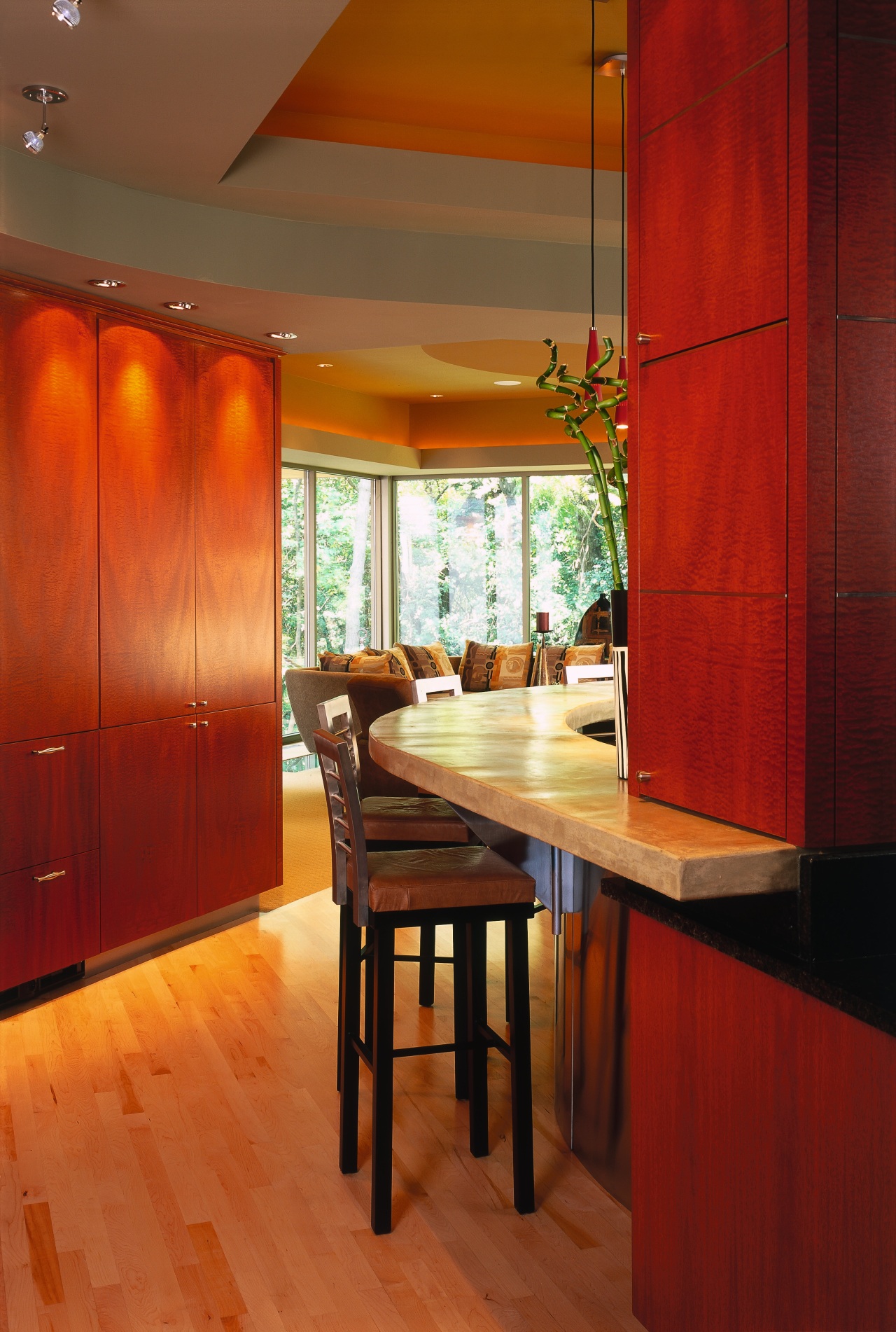
Modern materials, such as concrete and stainless steel, can often make contemporary kitchens seem cold and sterile. One solution is to combine these modern finishes with traditionally warm materials such as wood.
When architect Tim Bjella from Arteriors Architecture spoke to the owners of this home about their kitchen remodel, a major requirement was to design the kitchen so it would fit comfortably with the rest of the house.
"The owners were trying to maintain the contemporary feel of the existing house, but they didn't want to go cold. Material selection played a big part in that," Bjella says.
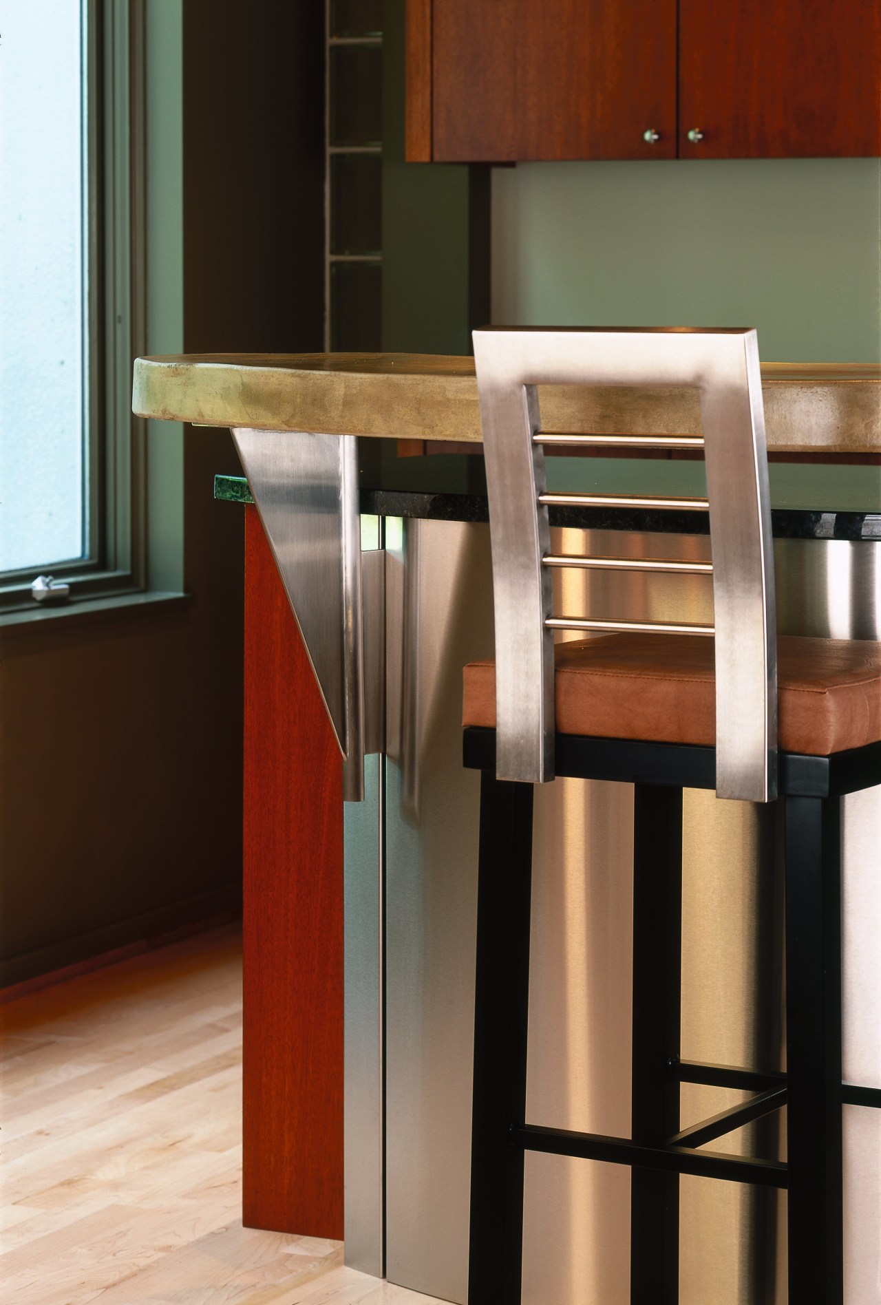
A concrete countertop was chosen for its rugged qualities, and stainless steel for its fresh, contemporary look.
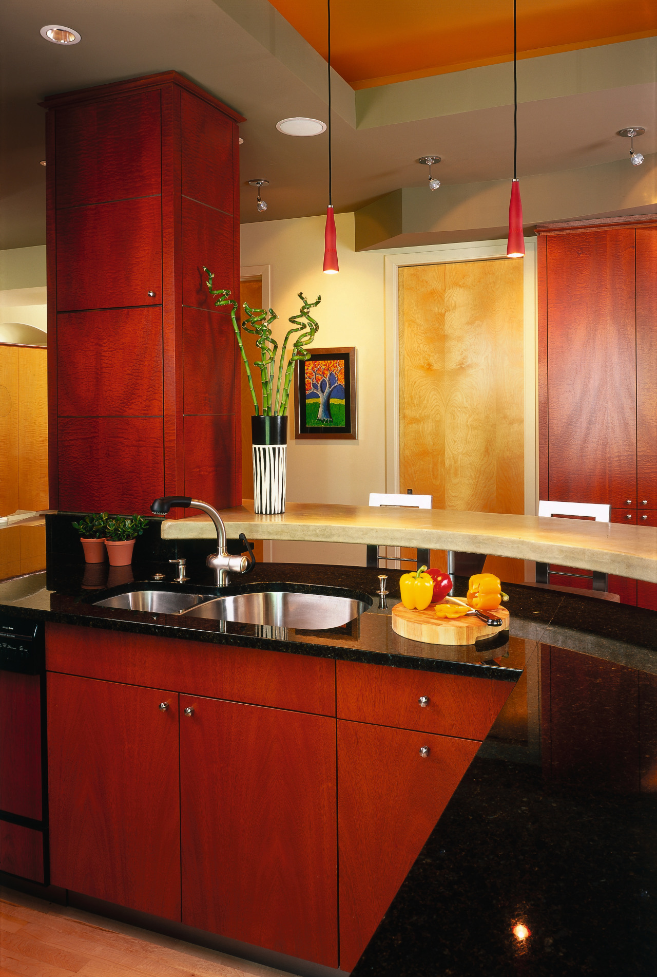
The owners wanted to see stainless steel used somewhere that it wouldn't have to be cleaned too frequently. Bjella suggested using stainless steel on the front of the island, as this is the area of the kitchen least likely to get covered in fingerprints and food splatters.
The contemporary materials are balanced by the extensive use of wood throughout the rest of the kitchen and surrounding areas. Mahogany kitchen cabinets from the original kitchen were kept, and a wall of extra cabinets added to create more storage.
Cost was also taken into consideration when choosing materials. Granite was used for areas in public view, such as the island, but the plastic laminate from the original kitchen was kept, as it was in the rear of the kitchen where it was less visible.
Another reason for the remodel was to create additional space. The entire house was designed by Arteriors 10 years previously, but more space was now needed to accommodate a growing family. The homeowner says the island, in particular, was too small.
"Before, there was only space for two people to sit at the island, and ideally we wanted to be able to seat four to five. There wasn't enough practical kitchen workspace either," he says.
The new, larger island was installed further away from the kitchen cabinets, providing more space for people working in the kitchen. Moving the appliance garage created additional countertop space, and traffic flow was improved by placing a bar outside the main kitchen workspace.
Credit list
Kitchen manufacturer
Paints
Countertops
Backsplash
Single oven, microwave, cooktop, dishwasher
Ventilation
Story by: Trendsideas
Home kitchen bathroom commercial design
Silver moons rising
Vibrant spiral stairs improve penthouse connections
With deep affection

