Step into the jungle
A Trompe L’oeil, or visual illusion, forms part of this interior makeover where soft curves, wood tones and exotic furniture warm up an otherwise cold apartment
Designed by Diego Revollo
From the interior architect/designer:
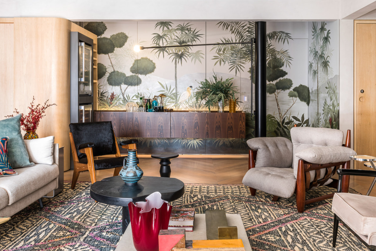
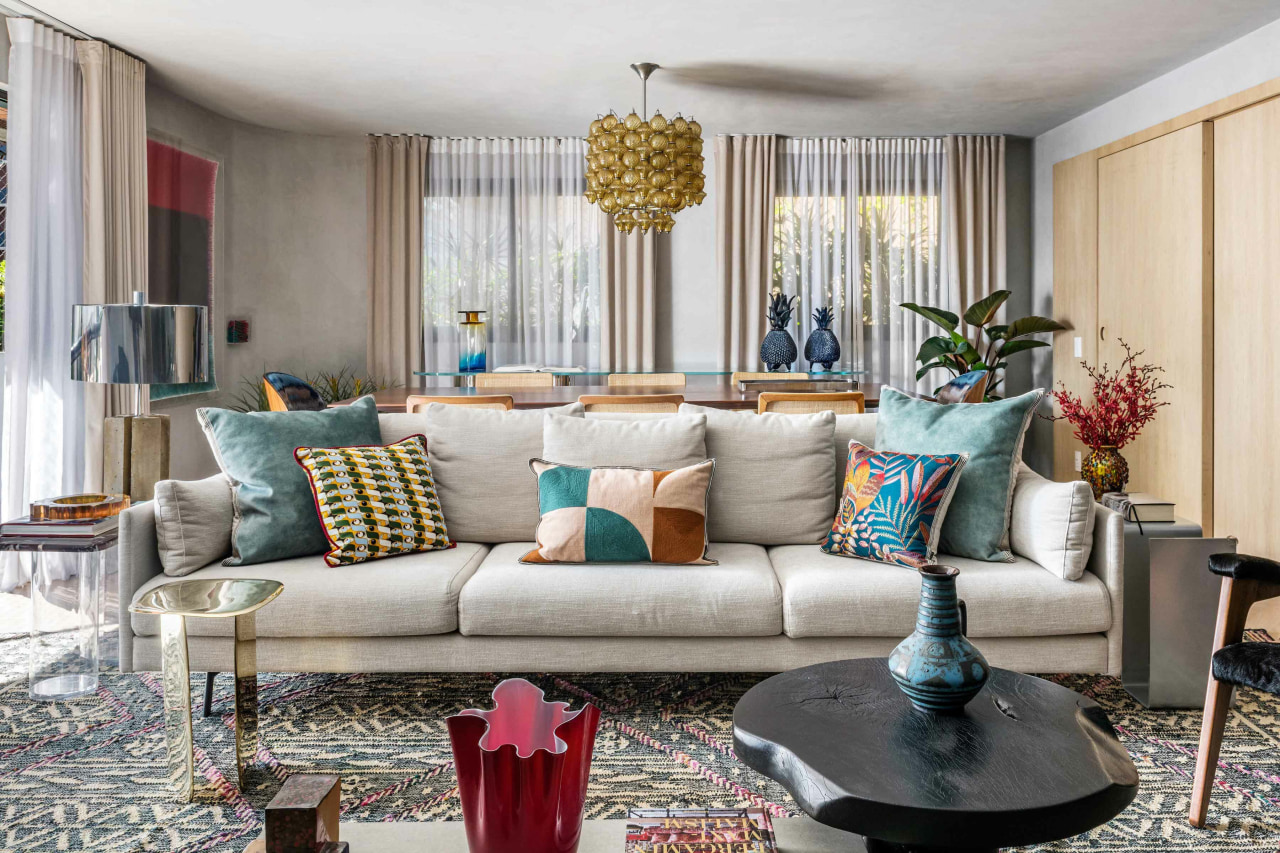
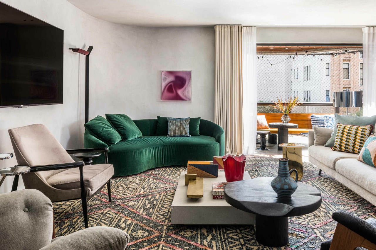
Located in Itaim Bibi in São Paulo, this apartment – measuring approximately 230m² – combines a clean structure with a décor full of personality.
Having worked previously with the designers, the young couple with children entrusted Diego Revollo with the mission of modernising an apartment that was over 30 years old.
As the owners were already familiar with burnt cement, it was chosen to cover almost the entire structure of the apartment.
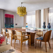
To avoid an excessively minimalist or cold result, in the social area the solid tauari wood floor with chevron layout provides the first counterpoint to the contemporary structure.
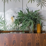
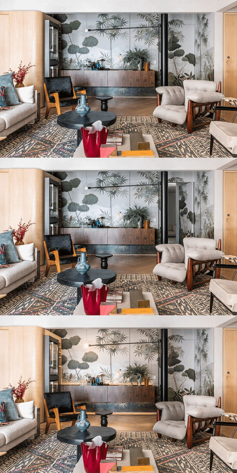
Avoiding simplistic or even common solutions, the greatest merit and risk of the project is the insertion of the artistic technique of Trompe L’oeil in a current context.
Previously a passage gallery, the area attached to the living room was chosen to receive the bar.
The original concept was just for a wooden panel to frame the background and disguise the door leading to the private area.
However, this initial idea was improved upon and transformed into a mural painting.
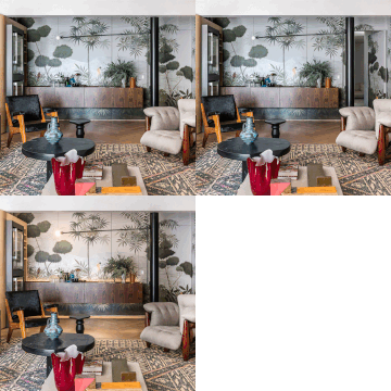
Visible from all points of the social area, the back of the bar – previously a dark and windowless area – became the focal point of the space after the execution of the illusory painting.
Once common in older houses, the technique simulates natural scenes bringing the landscape into the spaces – merging with decorative elements, such as the suspended bar created that crosses the mural.
With curvilinear elements, both in masonry and with the joinery itself, in Scandinavian tones, this subtlety in the design and the option for light tones in the structure reinforce the lightness of the apartment.
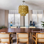
For decoration, neutral off-white tones are broken up by dark wood in the furniture and brushstrokes of blues, reds, and even black; which together with the mural painting bring a unique and original result to the social area.
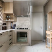
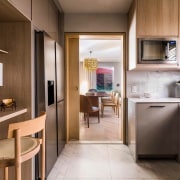
Next to the dining area, the kitchen can be integrated through a large sliding door and its finishes were designed to not compete with the social area decor.
Composed of light woods and laminates in shades of beige and greyish brown, the kitchen is cosy and also an exercise in mixing materials.
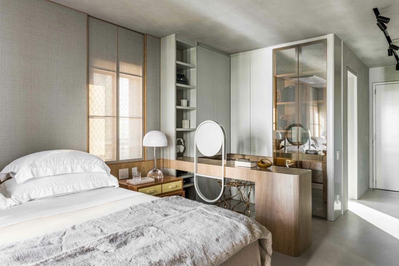
In the intimate area, calming tones reinforce the DNA of the structure chosen for the apartment and a more neutral palette is adopted for the couple’s suite.
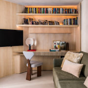
Still in the suite, the office is given a feminine aspect with a makeup counter and cabinets for accessories.
Being open to the rest of the suite, the joinery was carefully considered – resulting in a functional support that is, at the same time, pleasing to the eye.
For the bathrooms, niches and cabinets meet the need to store residents' items, but are designed to not visually weigh down the spaces.
The baby's suite, with a neutral structure and shades of blue, was designed to ensure functionality and accommodation – bespoke cabinets, a bed and even a changing table in woodwork were designed for the space.
At the same time, due to the repetition of the burnt cement and the tones of the wood, the baby's suite also achieves the main characteristics of the apartment's structure – but in a children's version.
Credit list
Mural
Home kitchen bathroom commercial design
Classic dovetails contemporary
Tranquil waters
Small space, big impact
