Slice of heaven
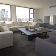
New windows, pivoting doors and louvres ensure the panoramic harbour and city views can be glimpsed from most rooms in this remodelled apartment
Apartment buildings from the 1960s have their own quirks and this Sydney tower was no exception. Apartments in the building were originally defined by small, cramped rooms and arched openings. To add insult to injury, air conditioning units and mullions on the windows detracted from the extensive harbour and city views.
Architect Luigi Rosselli and interior designer Pia Francesca were contracted by the new owners of this apartment to redesign the interior to create a permanent home. Not surprisingly, maximising the spectacular view was high on the list of priorities. But it wasn't the only requirement. The interior also needed to be reconfigured to bring it up to date and to better suit the owners' lifestyle. Rosselli says even the original entry, which was small and dark, needed to be addressed.
"Fortunately, we were able to make considerable changes without contravening the regulations governing the building," he says. "For example, we were able to replace the windows with plate glass. Effectively, the only limitations were the external walls, so we set about finding the best way to interlock the rooms. It was a little like playing with a Rubik's cube inside the building envelope."
Rosselli says a corner was sliced off a bedroom wall to create a more spacious entry. A new wall of decorative shelving in the hallway, which is backed by luminous acrylic panels, allows light to filter through from the kitchen, brightening the entire circulation area.
"We created fluid spaces with no sharp angles," says Rosselli. "Corners are rounded and the hallway is now a long trapezium shape that echoes the building geometry. The suspended ceiling in the hallway has a similar shape partly determined by the need to hide ducting."
Two rooms, including the original kitchen, were joined to create a much larger kitchen with a small cafe-style seating area. Tall louvres can be opened to provide a visual connection to the living and dining area. The owners can now enjoy views in two directions.
To improve the view from the master bedroom, pivot doors were installed in a new wall between the bedroom and living area. These sit above a cantilevered bank of cabinets with double-sided access from both rooms.
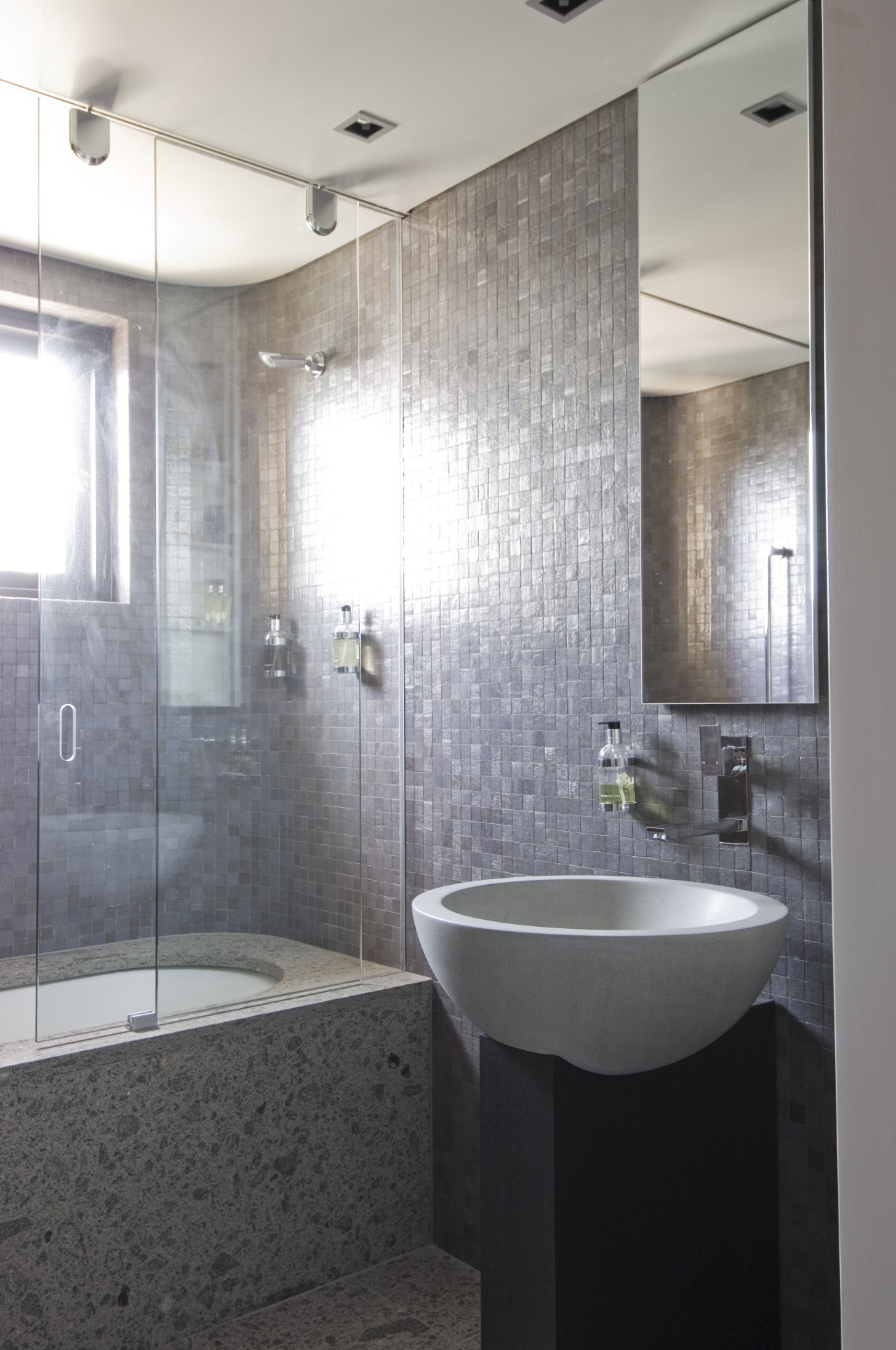
"Good storage was essential to provide the sleek, clutter-free interior the owners wanted," says Francesca. "The apartment also had to be comfortable and inviting, and furnishings needed to be a backdrop to the view. Visual interest is provided by textural contrasts and bright accents of burnt orange."
Story by: Trendsideas
Home kitchen bathroom commercial design
Silver moons rising
Vibrant spiral stairs improve penthouse connections
Radical yet respectful


