Shaped by the land This house by Jim Fraerman is at home in its setting
This house by Jim Fraerman is at home in its setting
Anyone who has ever built a home will have encountered local authority planning regulations some are easy to deal with, but others can be frustrating.
When the owners of this new house approached architect Jim Fraerman to devise a design, their suburban lot included a rather substantial setback.
"Given that the site is also on a low ridge, these two factors together seem rather restrictive at first glance.
"However, the owners were realistic about creating a program that maximized the long, narrow building platform. So, rather than being constrained, we used the conditions to generate a plan for the house that met the family's needs and celebrated the natural setting."
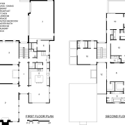
Fraerman's design comprises a series of grouped volumes of varying heights with smaller linking circulation spaces.
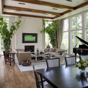
"The centerpiece of the house is the great room a single-story, double-height volume that reads as self-contained. The other structure is a two-story, L-shaped volume that folds around the great room."
While the house has a contemporary look to it, the architect says the impetus was more about creating a series of harmonious elements, rather than adhering to a particular style.
"The design explores a number of relationships between the built and natural environments, between the buildings themselves and even, on an experiential level, between the ways people interact with the buildings.
"For example, the site is a corner block with two street frontages, one higher than the other. The driveway, as well as the main pedestrian access path were set out on the higher side, but secondary access from the lower side was also desirable.
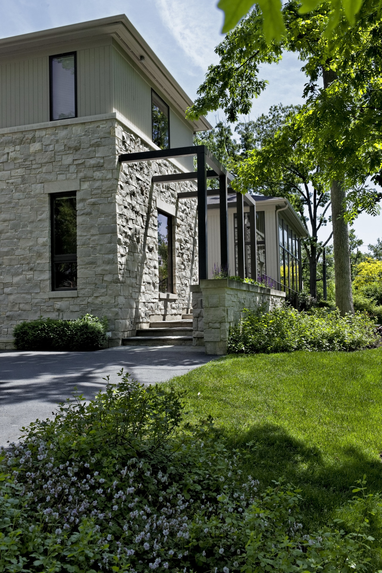
"Resolving this dichotomy neatly became pivotal. From the drive there is a nice sequence of spaces, framed by the trellis structure, that follow a linear built' path, while for the lower frontage, a more organic rambling experience was devised with both paths coming together at the open, courtyard-style entry."
Complementing the setting is the choice of materials on the exterior a mix of locally sourced stone and cedar, offset by the industrial steel elements.
"The owners wanted natural materials both inside and out as a way of keeping the natural environment to the fore.
"Ample glazing and open sightlines throughout the house ensure a natural vista from every angle. This is achieved dramatically in the great room with floor-to-ceiling windows," says Fraerman. "You can't help but feel the room itself is part of the environment."
For interior designer James Dolenc the natural setting was also key to the project.
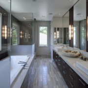
"We were very conscious of not detracting from the setting, so the material and color palettes are quite pared back. Sumptuous yet simple forms are teamed with solid fabrics and patterned accents.
"The architecture is very crisp with an international feel, but is also accessible, so that's what we set out to achieve with the interior. It is an orderly scheme without being cold.
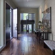
"Almost imperceptible touches such as hand-scraped edges to the wood flooring lend textural character akin to a patina; without cluttering up the color palette."
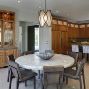
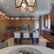
Similarly, the sapele cabinetry in the kitchen, and the patterned fabric chosen for the bar stools, impart a sense of organic texture, which is balanced by the solid plane created by the porcelain tiles on the floor in this part of the house.
"Texture, texture, texture it became a mantra for this project, and pieces such as the Martha Sturdy resin-top table are timeless exponents of this."
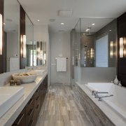
Moving upstairs, Dolenc introduced blue and gray tones to the mix to create a calming environment.
"The view from the upper level is more of the tree canopy and sky, so while it is still about texture, the color palette becomes less varied, lending itself to a muted, intimate scheme.
"Tone-on-tone features such as the custom headboard, bedside lamps with quartzite bases and side tables with leather accents echo the texture over color principle of the rest of the design."
"Ultimately, there is great respect for aesthetics, which begins with the architecture and carries through all the finishes including aspects such as the lighting plan," says Dolenc. "Multilamp fixtures more typical in retail or commercial settings have been incorporated here to give maximum coverage without dominating the ceiling plane."
Says the architect, "It is one of those happy occasions where the vision has been surpassed by the reality, thanks to the input of all involved."
Story by: Trendsideas
Home kitchen bathroom commercial design
Tranquil waters
Continuity meets subtle separation
'Worthy of Architectural Digest'
US Home & Architectural Trends Vol. 28/7
Home & Architectural Trends highlights great residential architecture. This book provides prospective home builders ...
Read More
