Shape-shifting bathroom delivers space and spa-like feel
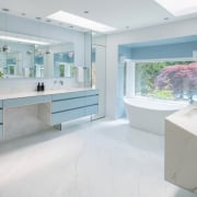
This comprehensive design wasn't shy to rearrange walls and utilise lost space to create a pale toned bathroom retreat with tub as focal point
Designed by Jennifer Gilmer Kitchen & Bath
From the designer:
This project is located in Potomac, Maryland.
The total area is 22m² after having captured some additional space from a hall closet and from unused space next to the living room fireplace.
This master bath had been remodelled in the 90s.
It was jam packed with cabinets and mirrors and had a tub that was set into a very large tiled platform with many steps.
As a result, this nice sized bathroom seemed much smaller than its square meterage.
If it hadn’t been for the plethora of mirrors, it would have felt even smaller.
However, even though the cabinets were mirrored and the tile/counters were a medium white/grey tile, the space had been dark and cluttered.
The one window in the room was cramped by the tub deck and had lost its sparkle by being overtaken by the clutter.
In addition, the shower and toilet room were on an angle which ate up a lot of the available space.
The goal was to simplify and open up the space while attaining a 'spa' feel.
We took down the angled walls and discovered more space that was unused.
By taking out the tub deck, tearing down walls to square off the room and by utilising lost space it seemed like the bathroom grew in size exponentially.
We disguised the only angled wall that was left by enclosing it in the toilet room.
Plus, we placed the curbless shower next to the toilet room and used the same sized glass doors on both – making the toilet room door frosted.
A free standing tub, centred under the window as well as in the room was the new focal point.
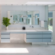
Light blue floating cabinets mirror each other, separating the his and hers vanities.
There are two storage areas at the ends of each vanity, both appearing as mirrored columns which helps them to disappear while adding light and sparkle to the space and, of course, providing full length mirrors.
One of these is a small walk-in linen closet, the other a narrow storage cabinet.
Large 1.2m x 1.2m porcelain tiles were used on the floor as well as walls while the benchtops were also made from large format porcelain that blends nicely with the tile.
For texture and interest, we added embossed white tiles on the two opposing walls from shower to tub.
Home kitchen bathroom commercial design


