Sense of arrival
This remodeling project puts the focus firmly on the formal entrance, rather than the prominent garage elements that typically dominate suburban design
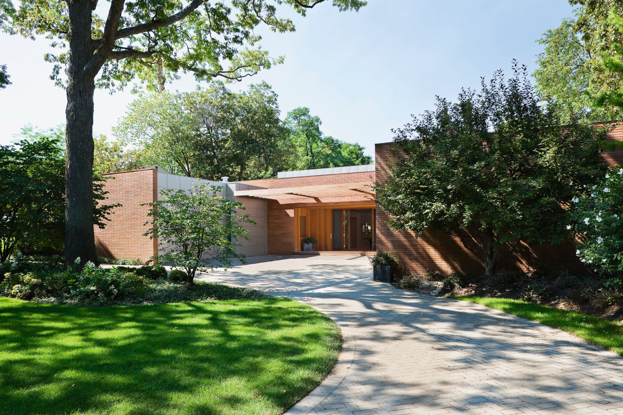


Stroll down any suburban street and it's easy to see the priority given to the automobile. Large garages fronting the road are commonplace their presence often detracting from the look of the house.
It doesn't have to be this way, however. As this project shows, it's possible to reclaim that curb appeal and put the emphasis back on the people who live in the house, rather than the cars they drive.
Architects Mark Weber and Chris-Annmarie Spencer of Wheeler Kearns Architects say creating a clearly defined formal entrance was a priority.
"Like many suburban homes, the original house bowed down to the service entrance for the cars," says Weber. "The garages were the dominant feature at the front. And the actual entry featured a curved wall that had the effect of pushing people away, rather than welcoming them in."
Weber says the owners also wanted a more contemporary aesthetic and had a preference for a masonry exterior. The original synthetic stucco siding was very homogenous with not a lot of character, or a sense of scale.
"This type of siding is also prone to water infiltration, which was another reason to replace it," Weber says.

Horizontal copper-colored bricks, which tone in with the natural landscape, were chosen to accentuate the long, low shape of the house. These have been laid with minimal exposed grouting on vertical mortar joints to further enhance the horizontal lines of the house.
The garage doors and adjacent walls and the east-facing wall opposite have been clad with zinc-coated copper panels.
"We wanted to provide a very strong sense of closure with the garage door plane, so we have made these ends of the house look as similar as possible," says Weber. "The panels are flush with the adjacent walls, so the recess of the garage door is not articulated you would scarcely know it was there."
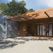
The entrance was also transformed by a new trellis that spans the entire width of the entry court, providing visual texture and shadows.
"This was a way to foreshorten the very deep forecourt," says Spencer. "Immediately beyond the trellis is the new wood-lined entry, which encloses you, almost like a cigar box. It is a processional element that breaks down the volume of the space and leads you into the house and the gallery beyond. It also ensures there is no ambiguity about the entrance."
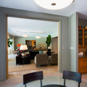
Spencer says the original high, vaulted ceiling of the gallery was replaced with a wood ceiling of a similar height and style to the entrance.

"Texturally, the wood is a visual link to the trellis that precedes it. Its dark tone also makes the space more intimate, and the flat ceiling reinforces the horizontal lines of the architecture."
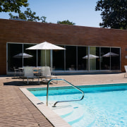
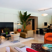
The gallery leads directly to the expansive public area of the house, which opens up to a landscaped pool. The living room, which has a high ceiling in keeping with the room's proportions, has been enlarged by the removal of a wall that separated the formal dining room. The dining table is now on the same axis as the gallery, which enhances its formality.
"This space simply begged to be one large open room," says Weber. "It has a symmetry that we have encouraged."
Other changes in this area include new flush cabinetry, and subtle lighting, similar to the gallery, which washes the flat wall planes.
The rear wall has also been transformed by a bank of windows and glazed doors.
"We took the whole rear elevation and created a single expression with one huge opening and the new brick siding," says Weber. "It was a way to unify this facade and connect it with the changes at the front and on the interior."
Credit list
Architect
Structural engineer
Trellis
Entry doors and entry porch windows
Door thresholds
Exterior lighting
Audiovisual
Flooring
Fireplace surround
Builder
Siding
Garage door
Paints and varnishes
Interior lighting
Gallery and living room cabinetry
Drapes
Story by: Trendsideas
Home kitchen bathroom commercial design
Eclectic meets elan
More than an addition
At home in the country