Revamped Havas Chicago interiors improve connectivity and the work environment
Reinvented interiors ironically bring a sense of space in this downsizing and rejuvenating fit-out of a major advertising company

Downsizing a studio can have advantages from economy to connectivity. And pro-active interior design may actually enhance the sense of space even as the staff numbers stay the same and the square meterage drops.
Such was the case with the transformative fit-out of advertising firm Havas Worldwide's Chicago studio. Havas wanted to reduce the floor space for this agency and tasked Gary Lee Partners (GLP) with finding a solution. Design principal David Grout says that after assessing Havas' real estate options at various buildings, GLP recommended staying in the current building, giving up a floor, and redesigning the studio's floor plan and aesthetic.
"The existing Havas studio had ranged over three floors and was outdated in terms of both looks and functionality," says Grout. "Over 70 per cent of the existing spaces were devoted to individual offices and the central staircase had been an outmoded 1990s cable-and-tension design. There had also been an unsightly bridge running alongside.
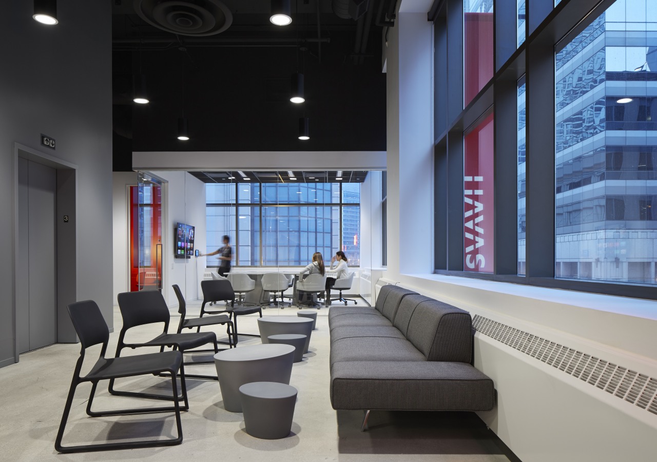
"By removing all private offices from the studio perimeter and installing glass in all conference rooms, we were able to open up the Havas space and provide it with much-needed natural light. The transparent black-glass walls on the meeting rooms contributed to a new-found spaciousness.
With only the original treads remaining, the interior designer completely reshaped the stairs as a bold, sculptural swirl.

"This provides for impromptu staff interactions and offers an event' within the space. At the same time we removed the bridge and part of the floor to open up visual connections between the levels.
"We also stripped out the ceilings and painted the exposed services black. As black recedes, this also added to the sense of volume."
With most offices gone, the new lower-level open floor plan is ideal for collaboration across departments and for impromptu meetings. GLP implemented a common "town hall" space for large, all-office gatherings. Innovative seating options, such as the retractable bleachers incorporated into partitions, were installed for the extra seating required for large gatherings.
To fulfil the advertising firm's desire that every surface have functionality, GLP installed magnetic glass, backpainted glass and tackable materials throughout the office, from walls to columns.
The colour palette, from the black ceilings down to the newly polished existing concrete floors is strictly black, white and grey. These colours follow Havas' branding but also perform another function.
"The studio's colour scheme is serene and not distracting," says Grout. "And, these subdued tones allow advertising pitches or artwork to stand out when pinned or held up against the walls."
By combining design best practices with Havas' own culture of innovation, GLP delivered a space that is true to the firm's brand and employees," says the design principal.
"Every element, from the colour palette to the implementation of modern technology, was carefully planned with the client's goals as a target. The result is an energetic, innovative studio space where ideas can quickly grow and travel."
Credit list
Interior design
Flooring
Lighting
Workstations
Main furniture manufacturer
Construction
Carpet
Task chairs
Ancillary furniture
Story by: Charles Moxham
Photography by: Steve Hall of Hedrich Blessing
Home kitchen bathroom commercial design
AU Commercial Design Trends Vol. 32/02C
Commercial Design Trends is aimed at our professional readers, and showcases commercial buildings. The book features reg...
Read More


