Resene colours reflect palette of the landscape
Resene paints complement landscape


Designing a house to complement its surroundings doesn't mean it has to be earthy and dull. On the contrary, as this project, shows, a colour scheme can reflect nature it all its glory.
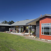
Designer Jenny Harris of Yellowfox teamed up with design-and-build company Location Homes to create this home. Harris says the owners had a vision of their house that drew from the immediate landscape the colour palette found on the doorstep.
"They especially wanted cladding colours that would reference the red clay of the landscape," Harris says. "For this reason, red-orange Resene Japanese Maple was chosen as an accent colour on the exterior, with dark grey Resene Woody Bay stain used on the weatherboards."
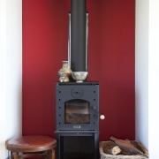
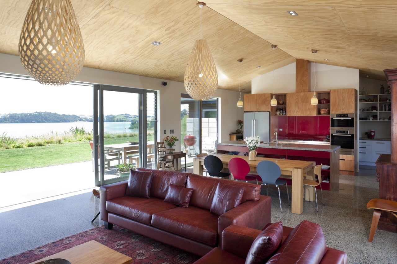
Colour also informs the interior, where the warm red of Resene Pohutukawa provides lively accents in the living areas and splashback. This is contrasted by Resene Half Parchment, a subdued, warm neutral.

Karen Warman, marketing manager, says Resene SpaceCote Low Sheen is recommended for interior broadwalls. This waterborne Environmental Choice-approved paint provides a soft sheen and is easy to keep looking good.
For more details, contact Resene, phone tollfree 1800 738 383 or visit a Resene ColorShop. Website: www.resene.com.au.
Story by: Trendsideas
Home kitchen bathroom commercial design
Only the stars above us
Rinse, repeat and refine
At one with the forest
