Renovation and extension make the most of wide valley views and indoor-outdoor living
The post and beam construction of an existing Mid-century Modern home was the starting point for the design of a substantial addition to this property
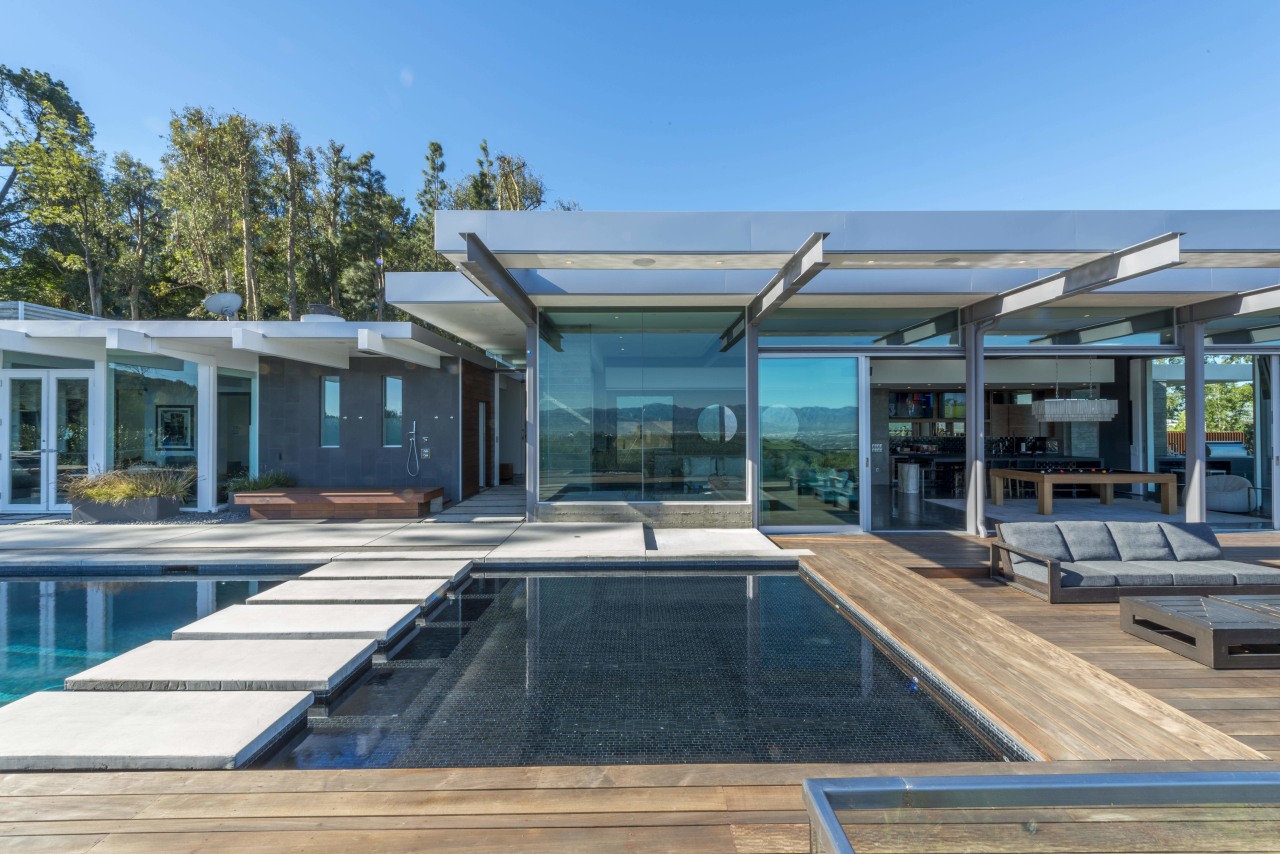
Faced with designing an addition to a home that has an established style, an architect usually has two options replicate the existing building's features for the design of the extension, or create a strongly contemporary addition that stands out from the original.
However, in the home featured here, Christopher Mercier of architects (fer) studio took the middle ground of these two approaches merging Mid-century Modern with more contemporary architecture in the design of a guest house addition.
Mercier says the project started out as a series of site improvements to a 280m² single storey, Mid-century Modern home dating back to 1959. Initially, he was asked to add a carport plus a swimming pool, deck and cabana in the rear yard to take advantage of valley views below.
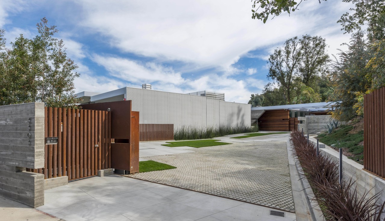
"We had just started construction and had dug the hole for the pool, when the owner photographer and Smashbox Cosmetics founder Davis Factor purchased the lot next door," says Mercier.
"This changed the whole shape of the property and the project expanded greatly in size and scope."
With the property now doubled in size to just over 6000m², there was an opportunity to create a nature trail leading to a small pavilion further up the hill.
But it also allowed for much more substantial changes to be made to the existing building expanding it horizontally with the addition of completely new 250m² guest wing.
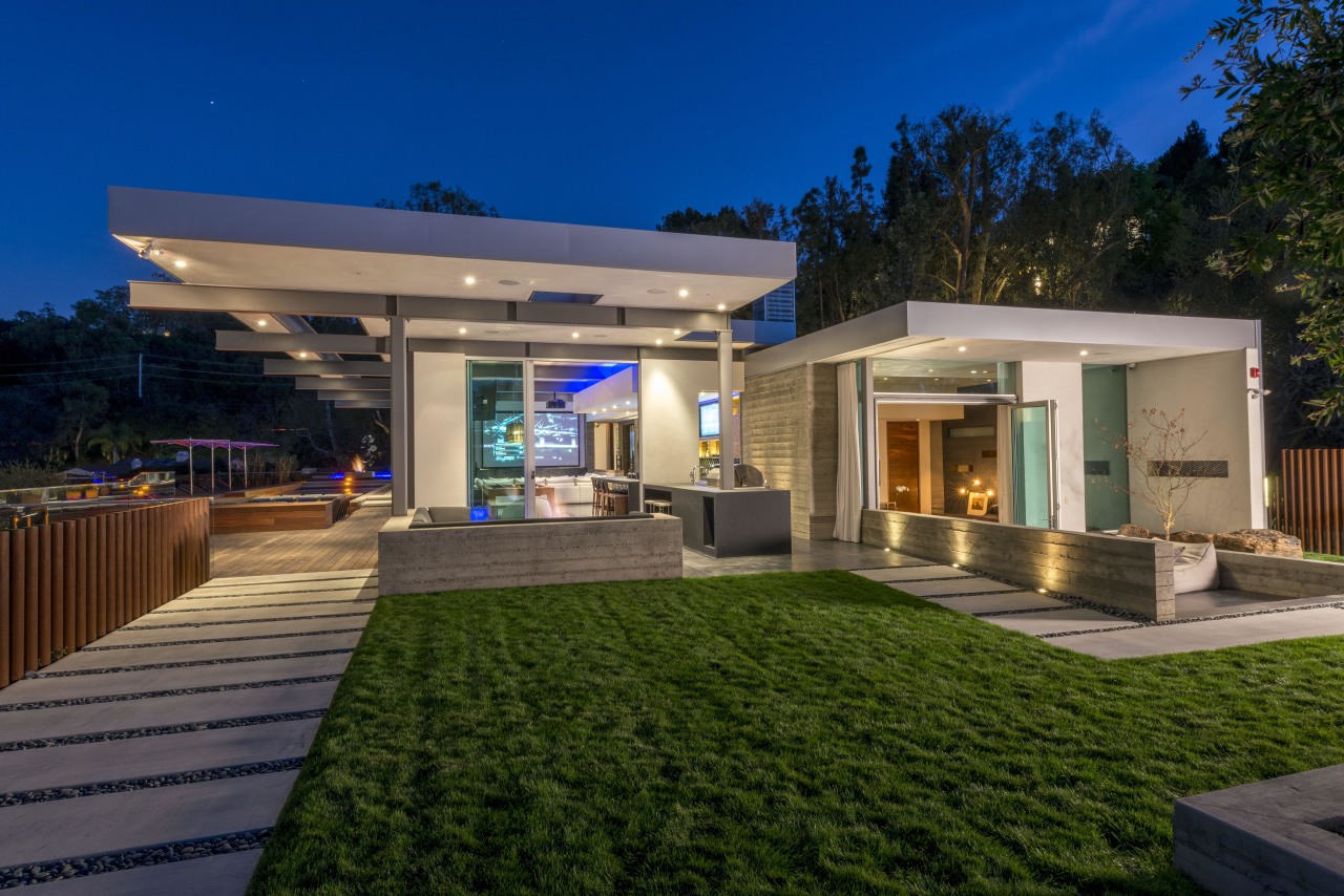
"The design of the whole house was driven by the post and beam construction of the original Mid-century Modern home," says Mercier.
The addition is post and beam too, but this time in exposed steel instead of wood. Plus the ceiling height was raised in this new section of the house.
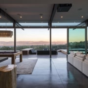
"We played off the linearity of the existing home, so the new structure also follows the view line. The whole back of the house becomes glass, with views out."
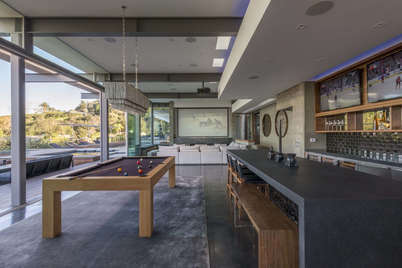
And the design of the pool and deck that the project had started with was also extended along the entire back, tying the two sections of the house together.
As well as the pool, this enormous entertaining space now includes outdoor lounges, a fire pit and barbecue area.
"Indoor-outdoor flow was a huge part of the project. The views are amazing, the lot's amazing, so wherever we could we wanted to link the house to the exterior."
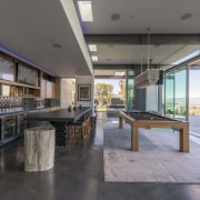
As a result, the whole back of the house is glass, with large sliding glass panels opening to enhance the indoor-outdoor connection.
Inside, a single board-formed concrete wall bisects the new guest house, dividing its public and private spaces.
Positioning the entertaining and living spaces on the view side meant the extension's more private spaces including a new master suite were on the driveway side, potentially compromising privacy.
To overcome this issue, the facade along the driveway has been covered in white metal mesh, screening the interiors from view, while still allowing light in.
Entrance to the home is now at the junction point of the two structures, with the guest house to the left and the existing home to the right.
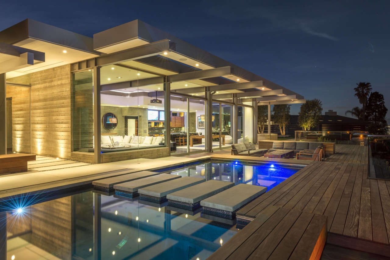
Continuing straight through the entrance hall leads to the view side, with a line of concrete pavers on this axis crossing the pool and linking to the newly established nature trail.
"There are pocket doors at the entrance to the existing structure," says Mercier.
This means the house can be used as one large home, or the pocket doors can be pulled closed to separate the two structures, for example if there are guests staying. Essentially it can become two houses when needed."
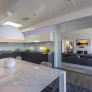
The interior finishes of the Mid-century Modern section have been largely left intact with a stone tile floor, and the tongue and groove ceiling painted white.
For Mercier, the success of his design comes from tying the two forms of the home together so it presents as one.
"It's how they integrate, yet they don't integrate," he says. "They meld, but not blatantly. People don't often pick it up until you explain it to them."
Credit list
Architect
Builder
Landscape architect
Entry hall bench
Family room sliding doors
Office table
Kitchen chairs
Kitchen pendant
Audio visual
Interior designer
Structural engineer
Siding
Flooring
Family room sofa
Office chairs
Kitchen cabinets
Kitchen table
Outdoor furniture
Story by: Paul Taylor
Photography by: Joshua White
Home kitchen bathroom commercial design
Radical yet respectful
Sculptural centrepiece
Silver moons rising
Home Trends Vol. 33/6
Renovating a tired and dated kitchen will not only add to your enjoyment of cooking – it can also totally transform the ...
Read More


